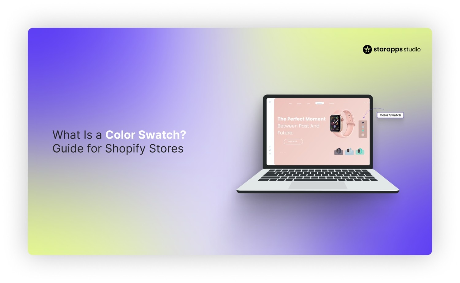

What is a color swatch? Learn how color swatches work on Shopify stores, their types, common uses, and how they improve product selection and browsing.
Online shoppers expect to see product options clearly before making a choice, especially in categories with multiple colors or styles. For Shopify merchants managing large variant catalogs, the way options are presented can directly affect browsing behavior, product clarity, and purchase decisions.
color swatches help stores present choices visually rather than relying on text, making product pages easier to scan and compare. This guide explains where color swatches are used, how they work in ecommerce, and why they matter for stores built on Shopify.
Key Takeaways
- A color swatch is a visual way to show product variants, allowing customers to select colors or styles without using text-based dropdowns.
- Swatches help shoppers compare options faster, improve clarity on product pages, and make browsing easier.
- Different types of swatches include solid color blocks, image swatches, texture or pattern swatches, and hybrid text-based options.
- On Shopify stores, swatches connect directly to variants, updating images, availability, and product details when selected.
- Well-implemented color swatches improve product presentation, reduce confusion, and support better purchase decisions for stores with multiple variants.
What Is a Color Swatch?
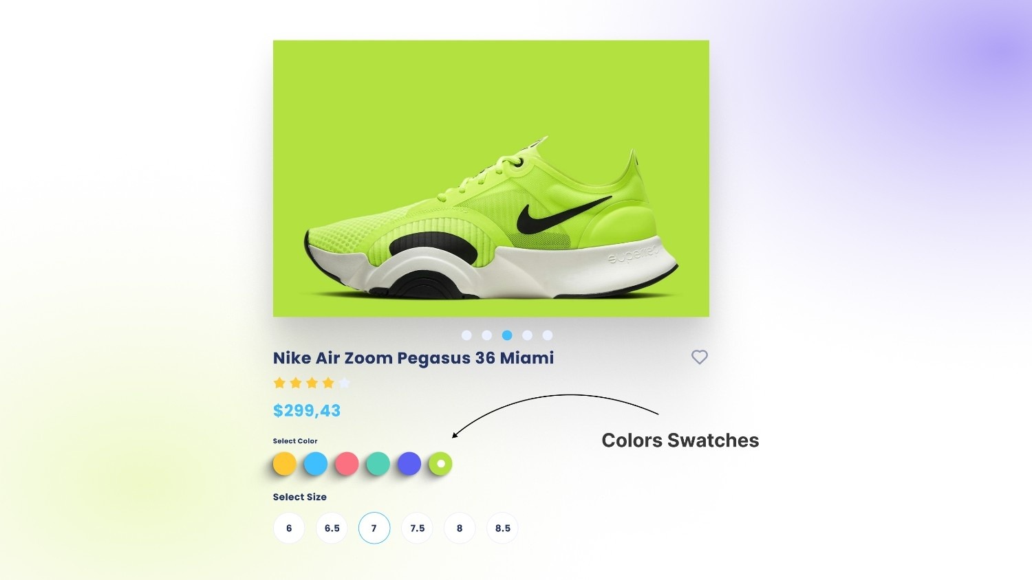
A color swatch is a visual representation of a product variant, shown as a small clickable element on a product or collection page. Instead of selecting options from a text-based dropdown like “Red” or “Blue,” shoppers can click on a colored square, pattern preview, or miniature image that reflects the actual variant.
For example, in a clothing store, selecting a blue swatch instantly updates the product image to show the item in blue rather than relying on a written label alone. Technically, a color swatch is a UI element linked to a product variant that triggers a change in images, pricing, or availability when selected.
Swatches turn abstract choices into visual decisions, making selection faster and clearer for shoppers.
Where Are Color Swatches Used?
Color swatches appear across several industries, but their most visible and practical use today is in ecommerce. They help present visual options clearly, especially when products come in multiple colors, patterns, or finishes.
1. Ecommerce and Online Stores
In online retail, color swatches are used to simplify product browsing and selection. Instead of relying on dropdown menus, stores display clickable visual options that instantly reflect the selected variant.
You’ll typically see swatches used on:
- Product pages: Selecting a swatch updates the product image, price, and availability.
- Collection pages: Shoppers can preview available colors without opening each product.
- Filters and search results: Customers refine listings by color using visual selectors.
- Image switching: Product galleries update automatically when a new color is selected.
This approach reduces extra clicks and browsing friction. Shoppers can compare options quickly, which improves clarity and keeps them engaged longer on the page.
2. Fashion and Product Design
In fashion and product development, swatches are used for:
- Fabric and material previews
- Shade comparison across collections
Designers and buyers rely on swatches to assess tone, texture, and variation before production or purchasing decisions.
3. UI/UX and Digital Design
Color swatches are also common in digital interfaces. They are used for:
- Interface color selection (themes, customization tools)
- Branding systems and design libraries
In this context, swatches ensure visual consistency and accurate color selection across digital products. Color swatches can appear in different formats depending on the product and how much visual detail customers need.
Different Types of Color Swatches and When to Use Them
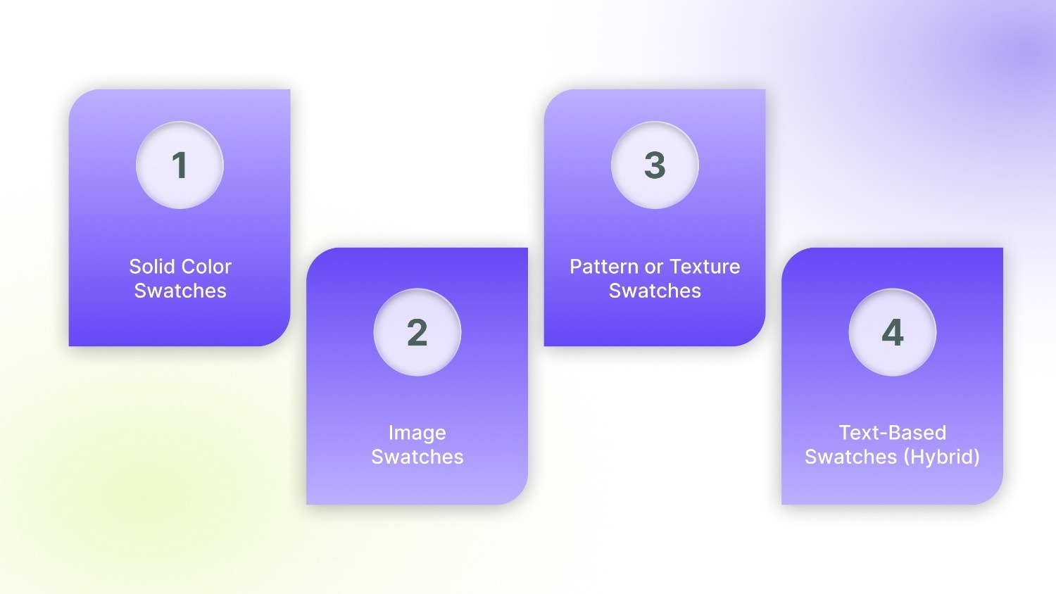
Stores choose different formats depending on the product type, catalog size, and how much visual detail customers need before selecting a variant.
1. Solid Color Swatches
Solid color swatches are simple color blocks, usually generated using a hex code that matches the product variant (for example, #000000 for black or #FF0000 for red).
These are commonly used when:
- The product color is clear and consistent
- Visual texture is not important.
- Stores want a clean, minimal layout.
They work well for basic apparel, accessories, or products where shade accuracy is straightforward.
2. Image Swatches
Image swatches use small product thumbnails instead of plain color blocks. When selected, they often display a full product image reflecting that variant.
These are ideal when:
- The product’s appearance changes significantly between variants
- Details like stitching, gradients, or finishes matter
- Visual merchandising plays a key role in decision-making.
Fashion, footwear, and home decor brands often rely on image swatches to give shoppers a clearer preview.
3. Pattern or Texture Swatches
Pattern or texture swatches show fabric weaves, prints, wood grains, or other material surfaces. Instead of a flat color, customers see a realistic preview of the material.
These are best suited for:
- Fabric-based products
- Printed apparel
- Furniture, wallpapers, or textured finishes
They help customers understand how the material looks beyond a simple shade.
4. Text-Based Swatches (Hybrid)
Hybrid swatches combine a visual element with the color name. For example, a small blue square labeled “Ocean Blue.”
This format works well when:
- Shades are similar and need clarification
- Branding uses custom color names.
- Accessibility and clarity are a priority.
Hybrid swatches balance visual clarity with descriptive labeling, reducing confusion when multiple shades appear close in tone. Each type serves a different purpose, but the real value of color swatches appears in how they improve the shopping experience.
The Role of Color Swatches in Ecommerce UX
Color swatches improve how customers interact with product pages by making options easier to understand and compare. Instead of relying on text selections, shoppers can make quicker visual decisions, which directly affects browsing behavior and purchase outcomes.
- Faster product comparison: Customers can instantly compare available colors or styles without opening multiple product pages or switching between dropdown options. Visual selection shortens decision time, especially for products with many variants.
- Better shopping experience: Visual choices reduce the mental effort required to interpret product options. Shoppers no longer need to imagine how a color might look based on its name, making browsing smoother and easier to follow.
- Higher conversions and engagement: Clear visual feedback helps customers feel certain about what they are selecting. Faster decisions and clearer expectations often lead to more interaction with product pages and a higher likelihood of completing a purchase.
- Reduced returns: Showing accurate visual representations helps customers understand what they are buying before checkout. When expectations match the actual product, returns related to color or variant confusion become less common.
The benefits become clearer when you look at how swatches are connected to product variants on Shopify.
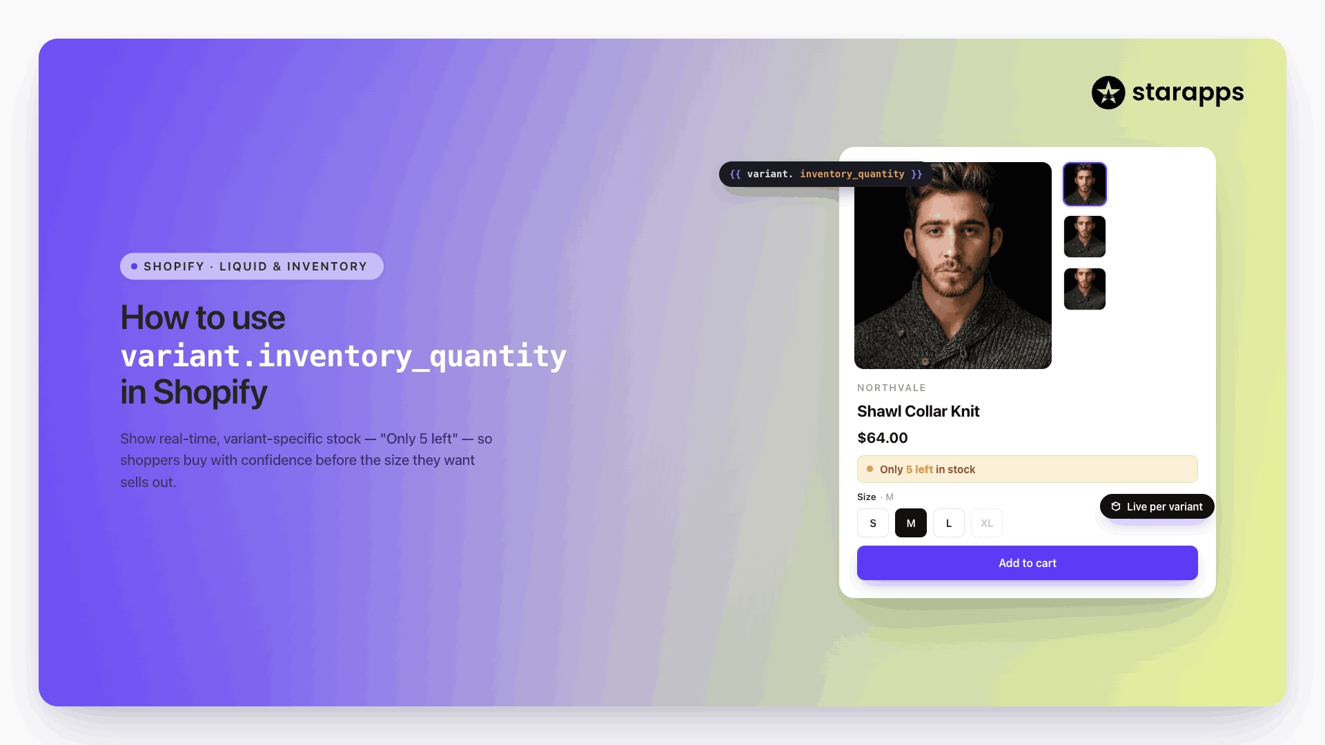
How Color Swatches Work on Shopify Stores
On Shopify stores, color swatches are connected directly to product variants. Each swatch represents a specific variant, and selecting it triggers changes across the product page to reflect that choice accurately.
- Variant selection logic: Every swatch is linked to a variant, such as a specific color or style. When a customer clicks a swatch, the store automatically selects that variant and updates related product details like price, availability, and SKU.
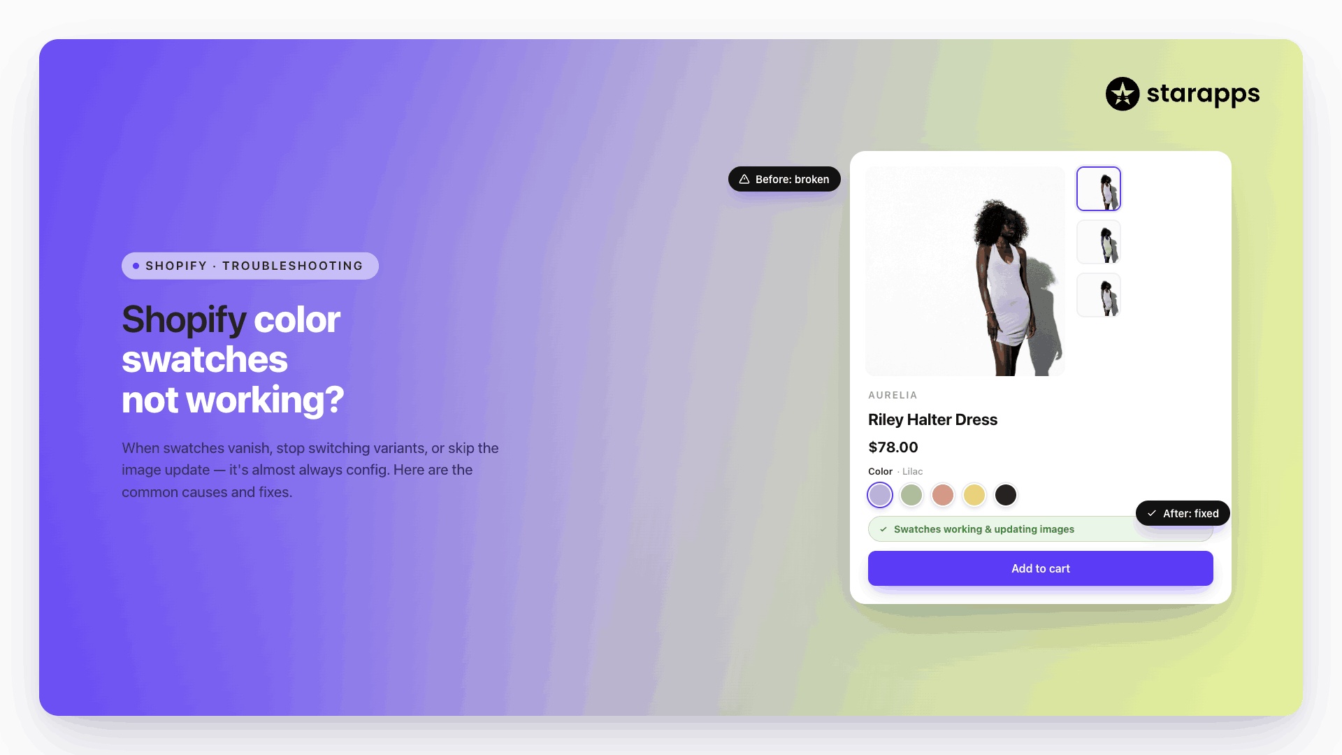
- Image updates on selection: Swatches are commonly connected to variant images. Selecting a color updates the product gallery to show images that match the chosen option, helping customers view the correct version of the product instantly.
- Inventory synchronization: Swatches also reflect inventory status. If a variant is out of stock, stores can hide or disable the corresponding swatch to prevent customers from selecting unavailable options.
- Collection page swatches: Many stores extend swatches beyond product pages by displaying them on collection pages. This allows shoppers to preview available colors and move directly to the variant they want without extra clicks.
In practice, swatches stay synchronized with product images and variant selections, ensuring customers always see accurate visual information while browsing.
Common Mistakes Store Owners Make With Color Swatches
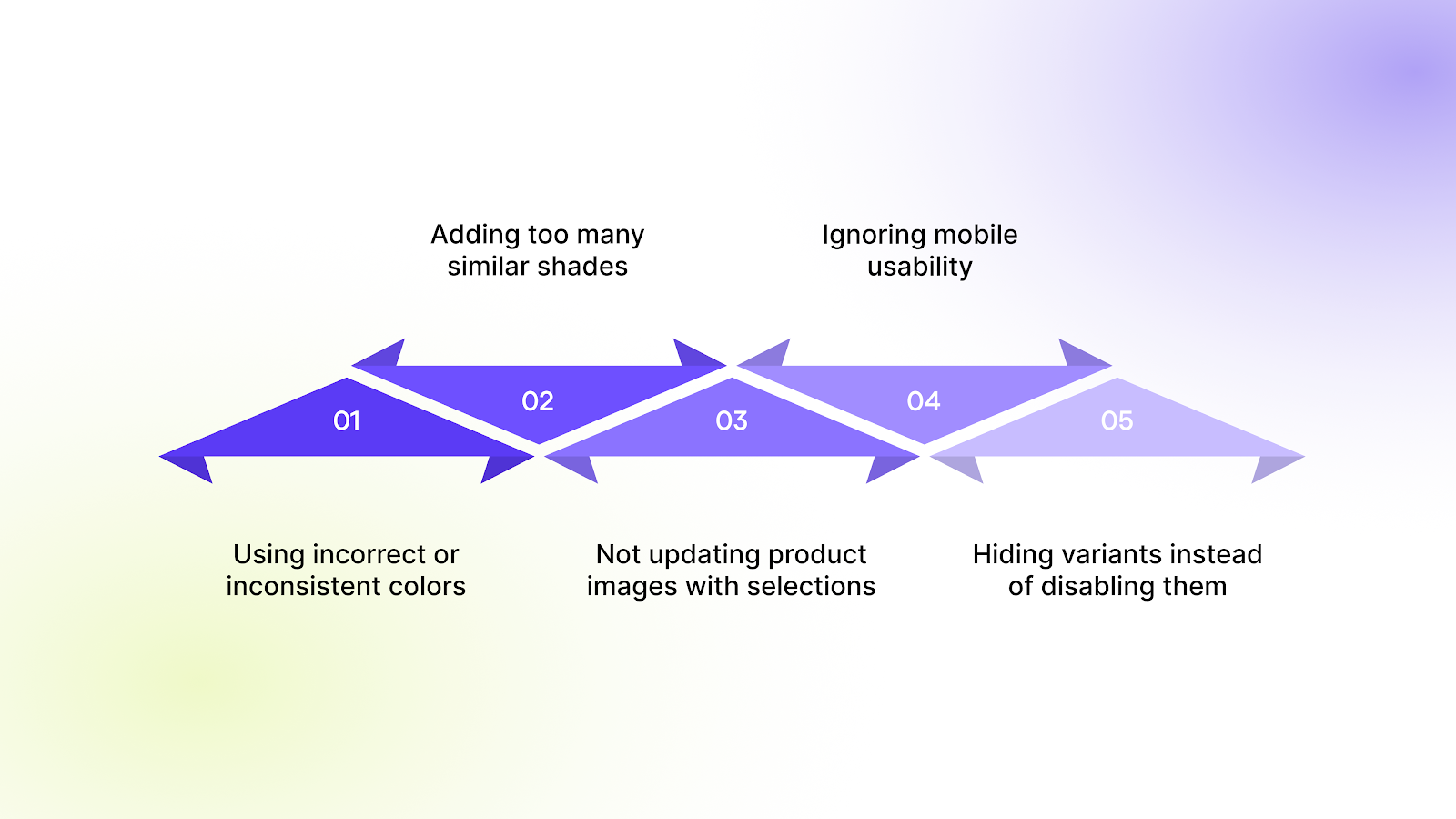
Color swatches improve product selection when implemented correctly, but small mistakes can create confusion and affect purchasing decisions. Many stores treat swatches as a visual add-on rather than a functional part of the product experience.
- Using incorrect or inconsistent colors: Swatches that do not accurately match the actual product create mismatched expectations. When customers receive a product that looks different from what they saw online, dissatisfaction and returns increase.
- Adding too many similar shades: Showing multiple colors that look nearly identical makes comparison difficult. Customers may struggle to tell the difference between options, slowing down decision-making instead of helping it.
- Not updating product images with selections: If selecting a swatch does not update the product images, customers cannot confirm what they are choosing. This breaks the visual flow and forces shoppers to guess how the variant looks.
- Ignoring mobile usability: Swatches that are too small or placed too close together become difficult to tap on mobile devices. Since a large share of ecommerce traffic comes from mobile, poor spacing can lead to frustration and missed selections.
- Hiding variants instead of disabling them: Completely removing unavailable variants can confuse returning customers who expect to see certain options. Disabling or marking them as out of stock maintains clarity while still communicating availability.
In many cases, these issues come down to choosing the wrong way to present product options.
When Should You Use Color Swatches Instead of Dropdowns?
Color swatches and dropdown menus serve different purposes. Choosing the right format depends on how customers evaluate the product and how many options need to be displayed.
- Visual products → use color swatches: Products where appearance plays a major role benefit from swatches. Apparel, accessories, furniture, and home decor are easier to browse when customers can see colors or patterns directly instead of reading option names.
- Technical or specification-based products → use dropdowns: Products defined by specifications such as storage size, dimensions, or technical configurations are often clearer in dropdown menus. These options rely on text clarity rather than visual comparison.
- Large variant catalogs → use a hybrid approach: Stores with many variants often combine both methods. Color or style options can be shown as swatches, while sizes or technical details remain in dropdowns. This keeps the interface clean while still allowing customers to make quick visual selections where it matters most.
When used thoughtfully, the right selection method makes product pages easier to browse and decisions easier to make.
Conclusion
Color swatches play an important role in how customers understand product options online. Clear visual selection helps shoppers compare variants faster, view accurate product images, and make decisions without confusion. For stores with multiple colors, styles, or large variant catalogs, the way swatches are implemented can directly influence browsing experience and purchase outcomes.
Many Shopify merchants struggle with managing swatches across product pages and collections while keeping images, variants, and availability aligned. This is where the right tools make a difference. StarApps Studio helps merchants implement color swatches that stay accurate, visually consistent, and easy to manage at scale.
If you want to improve how customers select variants and present product options more clearly, connect with us to see how we can help you set up color swatches that work smoothly across your storefront.
FAQs
1. Do color swatches affect website loading speed?
Color swatches themselves do not slow down a store when implemented correctly. Performance issues usually happen when large or unoptimized images are used for variant previews. Using properly sized images and optimized apps ensures swatches load quickly without affecting page speed.
2. Can color swatches improve product discovery?
Yes. When swatches are displayed on collection pages or in filters, customers can quickly identify available variants without opening multiple product pages. This makes browsing faster and helps shoppers find the exact variant they want earlier in their journey.
3. Are color swatches useful for stores with few variants?
Even stores with a small number of variants benefit from swatches. Visual selection reduces guesswork and helps customers confirm their choice instantly, which can improve engagement and reduce hesitation before purchase.
4. How do color swatches help with accessibility?
Well-designed swatches include clear labels or alt text along with visual indicators. This helps screen readers interpret variant options and ensures customers who cannot rely solely on color cues can still understand product choices.
5. Can color swatches be customized to match store branding?
Yes. Most Shopify themes and apps allow customization of swatch shape, size, borders, and display style. Merchants can adjust swatches to align with their store’s design while keeping variant selection clear and consistent for customers.
Heading

End-to-end traceability
To ensure regulatory compliance, you must have a complete overview of your products from production to shipping. Book a demo to see how Katana can give you full visibility of your operations.

.png)
.png)