How to Get Shopify Colors to Show as Swatches: A Complete Guide
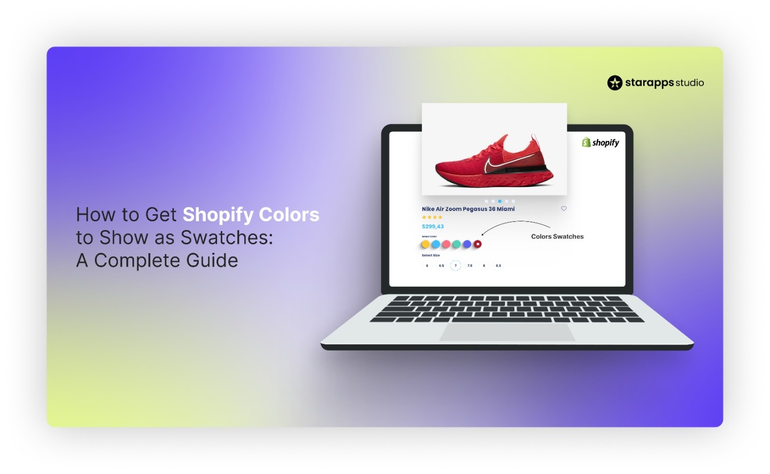

Learn how to get Shopify colors to show on color swatches to boost conversions. Follow our guide to replace text dropdowns with visual swatches easily.
Shoppers land on your product page excited to buy, but a boring text dropdown greets them instead of vibrant visuals. They have to click multiple times just to see if the "Crimson Red" they want is actually the shade they expect. This friction leads to frustration and abandoned carts.
85% of shoppers place color as a primary reason for why they buy a particular product. If you are not displaying these options clearly, you are hiding your best-selling point behind a click.
In this guide, we will show you exactly how to get shopify colors to show on color swatches to improve your store's design and sales.
Quick Look
- Text dropdowns hide product variations and force unnecessary clicks from potential customers.
- 85% of shoppers say colour is the primary reason for purchasing a product, according to consumer colour psychology studies.
- Visual swatches reduce return rates by setting accurate expectations for color and texture.
- Most free Shopify themes do not support swatch mapping out of the box without apps.
- You can implement swatches via theme settings, custom coding, or automated apps.
- StarApps studio's Color Swatch King automates the entire process and works on collection pages instantly.
Understanding Color Variants in Shopify
Knowing how to get Shopify colors to show on color swatches requires a grasp of its backend structure. Shopify organizes product variations using "Options" and "Variants" in the backend. When you add a color option, the platform defaults to displaying these choices as simple text labels or dropdown menus.
This standard setup treats a visual attribute like color the same way it treats a numerical size, failing to show the customer what the product actually looks like until they make a selection.
Also read: How to Change Swatch Border Colors on Shopify Product Pages
Once you know how the backend handles these options, you need to understand why changing the frontend display is critical for sales.
Why Color Swatches are Essential in Shopify
Replacing text lists with visual elements is one of the highest-impact UX changes you can make. It bridges the gap between the physical in-store browsing experience and the digital storefront.
Here is why upgrading to visual swatches is a non-negotiable step for modern brands:
1. Instant Visual Confirmation
Shoppers process visual information faster than text, allowing them to scan your inventory instantly. Seeing the actual color eliminates guesswork and reduces the cognitive load required to browse your catalog.
2. Reduced Click Fatigue
Dropdown menus require two clicks to simply view an option, whereas swatches require just one. Reducing friction in the browsing process keeps users engaged and lowers the bounce rate on product pages.
3. Accurate Expectation Setting
Text labels like "Blue" are vague and can lead to disappointment upon delivery if the shade differs. Visual swatches show the exact hue or pattern, helping to lower return rates caused by color discrepancies.
Also read: How to Add Color Swatches in Shopify Dawn Theme
You might wonder if your current theme can handle this upgrade without any extra work or costs.
Does Shopify Support Color Swatches by Default?
Shopify does not have a special “colour” field in its core backend data structure. The platform stores variant data as text strings (for example, “Color: Red” or “Color: Midnight Navy”), so there’s no built-in place to upload a specific hex colour code or texture file for a variant option.
However, many modern “Online Store 2.0” themes add their own logic on top of this. They read the text values for options like “Color” and map them to standard colour swatches inside the theme. This works well for simple use cases, but it can be limiting if you want precise control over custom shades, patterns, or how swatches behave on collection pages.
Because of these constraints, most stores that want full control over how to get Shopify colors to show on color swatches, especially for complex catalogues, rely on theme customizations or dedicated apps.
Want shoppers to select colors right on the collection page? Upgrade to StarApps Studio's Color Swatch King to enable fast selection and instant Add-to-Cart functionality. Download the app here.
How to Add Color Swatches on Shopify: 3 Key Methods
Getting your colors to appear correctly involves bridging the gap between your backend text data and frontend visuals. Depending on your technical skill and budget, you can achieve this through three primary methods.
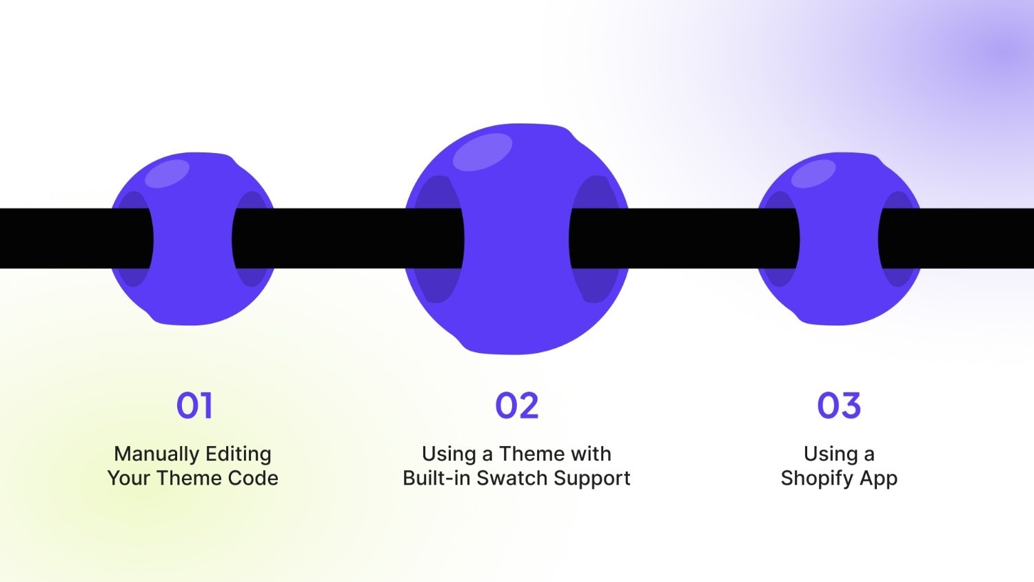
Here are the specific ways to implement visual swatches on your store:
1. Manually Editing Your Theme Code
This method involves directly modifying your theme's Liquid, HTML, and CSS files. It offers maximum control and customization.
- Access Your Theme Code: From your Shopify admin, go to Online Store > Themes. Click "Actions" and select "Edit code."
- Locate the Product Template: Find the main product template file, often named product-template.liquid or product.liquid within the Sections or Templates folder.
- Replace the Dropdown Code: Find the code generating the variant selector (usually a select tag). You will need to replace this section with new code that outputs a list of buttons or div elements for each color option.
- Style the Swatches with CSS: Create or modify a CSS file (like theme.scss.css) to style the buttons as colored squares or circles. You must assign background colors or images based on the variant option values.
- Add Interactive Functionality: Write JavaScript to make the swatches clickable. This script should update the variant selection and mimic the behavior of the original dropdown.
Also read: Shopify Product Variants: How to Manage and Optimize Them
2. Using a Theme with Built-in Swatch Support
Some premium Shopify themes include built-in settings for color swatches.
- Choose a Compatible Theme: Before purchasing, confirm the theme advertises "variant swatches" or "color swatches" as a feature.
- Configure the Theme Settings: After installing the theme, navigate to its settings in the theme editor. Look for a section related to "Product" or "Variants."
- Map Your Options to Swatches: Within these settings, you can often define which product option (e.g., "Color") should display as swatches and choose a style.
- Assign Swatch Values: You will typically need to define what color or image represents each option value (e.g., assign the hex code #FF0000 to the option value "Red").
3. Using a Shopify App (Recommended)
This is the fastest and most reliable method for most store owners. The Shopify App Store has several apps dedicated to creating swatches. StarApps Studio’s Color Swatch King removes this technical burden by automating the visual display of your variants instantly.
It replaces standard dropdowns with high-quality, customizable swatches that match your brand aesthetic perfectly.
The tool handles complex logic like out-of-stock visibility and collection page display without you touching a single line of code. Here are the key features:
- Automated Swatch Generation: The "SupaEasy Variant Image Swatch" feature automatically pulls the correct visual from your product images to create the swatch.
- Collection Page Capability: Allow customers to browse and switch colors directly on collection grids without visiting the product page.
- Advanced Customization: Choose from buttons, pills, or circular swatches and customize their size and shape to fit your theme.
- Bulk Management: Upload specific color codes or image files via CSV to update thousands of variants in minutes.
- Smart Out-of-Stock Logic: Automatically hide or strike through variants that are unavailable to keep the shopping experience fluid.
With Color Swatch King, you ensure your store looks professional and functions flawlessly.
Now that you know the technical methods for adding swatches, let us look at the merchandising best practices that turn a simple visual element into a conversion machine.
Also read: Step-by-Step Guide to Hiding Product Variants in Shopify
Best Practices for Maximizing Color Swatch Impact
Implementing swatches is only the first step; maximizing their impact requires strategic merchandising decisions. You should view swatches as a key component of your user interface, not just a cosmetic upgrade.
Focusing on speed, clarity, and consistency will significantly enhance the customer experience. Here are the best practices for driving performance with visual color swatches:
1. Display Swatches on Collection Pages
Allowing shoppers to select a variant directly from the collection grid minimizes clicks and speeds up the path to purchase. This feature, often requiring an app, lets users view a product page variant simply by hovering or clicking the swatch.
Example (Allbirds):
When browsing the "Men's Runners" collection, Allbirds uses small color swatches below each shoe. Clicking a swatch instantly changes the product image on the collection page itself. This avoids forcing the customer to load the main product page just to preview the "Limestone" color versus the "Natural Black."
Impact:
- Creates a faster, more direct path from browsing to adding items to the cart.
- Keeps shoppers engaged on collection pages by providing key information upfront.
- Enables quick visual comparison of colors and styles across multiple products at once.
2. Use Image Swatches for Texture and Pattern
If a variant is a specific texture (like "Heather Gray Knit") or a pattern (like "Floral Print"), use a small image swatch instead of a solid color block. This sets accurate visual expectations immediately.
Example (Bombas):
Bombas sells many socks with intricate striping, melange textures, or subtle marled yarns (like "Heather Gray"). Instead of a solid gray swatch, they use a tiny cropped image of the actual fabric. This image swatch clearly conveys the texture and weave, ensuring the customer is not surprised by the material when the product arrives.
Impact:
- Significantly reduces the number of returns due to "color or pattern not as expected."
- Conveys the tactile quality of the product that standard hex codes cannot capture.
- Offers a richer browsing experience that mirrors physical shopping.
3. Prioritize the Swatch Order Logically
Organize your swatches by a clear and logical progression, such as light-to-dark or neutrals first. Avoid random arrangements, which confuse the eye and slow down selection.
Real Brand Example (Fenty Beauty):
Brands with extensive shade ranges follow a strict, logical order. For foundation or concealer, swatches are arranged consistently, usually starting with the lightest cool tones, progressing through neutrals, and ending with the darkest warm tones. This predictable flow allows the customer to immediately navigate to their specific shade range without hunting across the row.
Impact:
- Improves product scannability and reduces cognitive load for the customer.
- Creates a more professional and aesthetically pleasing product page layout.
- Guides the customer's eye through the options in an intuitive way.
Even with the best intentions and tools, it is easy to make simple errors that sabotage your swatch's effectiveness. Pay close attention to these common pitfalls before launching your new design.
Stop forcing product page clicks. Upgrade to Color Swatch King to enable fast color selection right on your collection page. Use it to map exact HEX codes and texture images, guaranteeing customer confidence and leading to fewer returns.
Also read: How to Change Image Based on Shopify Variant Selection
Common Mistakes to Avoid When Implementing Color Swatches

A poorly implemented swatch system can actually be more frustrating than a simple dropdown menu. Attention to detail is required to ensure your new visual elements function smoothly across all devices.
Avoid these specific errors when designing your variant selectors:
1. Using Low-Contrast or Tiny Images
Small 20px swatches are often too tiny for users to distinguish between subtle shade differences like navy and black.
- Tip: Ensure swatches are at least 40px wide and have a subtle border to separate them from the background.
2. Forgetting Tooltips on Hover
Users may not know what "Midnight" or "Obsidian" looks like just by seeing a dark circle.
- Tip: Enable a text label that appears when a user hovers over or selects the swatch to confirm the color name.
3. Ignoring Out-of-Stock Logic
Frustration peaks when a user falls in love with a color swatch only to find it is sold out after clicking.
- Tip: Visually cross out or dim swatches that are out of stock so users do not waste time clicking unavailable options.
Avoiding these pitfalls manually requires constant code updates, which is why smart merchants automate the process.
Also read: Show Color Variants As Products on Shopify Collection Pages
Building a World-Class Shopping Experience with StarApps Studio
Color swatches are a powerful start, but they are just one part of the modern, high-converting Shopify store. Shoppers expect a seamless, intuitive, and visually rich experience from the collection page all the way to checkout. Managing this experience manually, especially with complex product catalogs, is a significant operational challenge.
That is where StarApps Studio comes in. We are not just a single-app solution; we are a complete suite designed to solve the complex storefront challenges faced by scaling DTC brands. Our six powerful apps work together to automate, optimize, and enhance every facet of your product presentation and variant management.
Here is how our suite empowers you to build a superior store:
- Color Swatch King: Variants: Transform clunky dropdowns into beautiful, clickable color, image, and button swatches. Display them on product and collection pages to let shoppers browse visually and select options instantly.
- SA Variant Image Automator: Automatically show the correct product images when a customer selects a variant. If a shopper clicks "Blue," your gallery instantly updates to show only images of the blue product.
- SA Variants: Combined Listings: Boost your SEO and product discovery by splitting product variants into individual listings on collection pages. Each color and size gets its own URL, title, and images, making it easier for customers and search engines to find the exact product they want.
- Variant Alt Text King: SEO: Automatically generate and optimize ALT text for every variant image. This improves your store's accessibility for screen readers and drives more organic traffic from Google Image Search, all without manual effort.
- Variant Title King: Color, SKU: Dynamically update the product title on the page to show the selected variant details, like "Classic T-Shirt - Navy Blue - SKU123." This provides crystal-clear information, reduces customer confusion, and aids in inventory management.
- Variant Descriptions King: Display unique, detailed information for each variant (like size charts or fabric care) in organized tabs or accordions. This reduces page clutter, answers customer questions upfront, and helps minimize returns by setting accurate expectations.
By integrating these tools, you move beyond a simple visual upgrade to creating a fully optimized, automated merchandising system.
Conclusion
Visual swatches are no longer just a "nice-to-have" feature; they are a standard expectation for online shoppers. They reduce friction, clarify product options, and significantly improve the aesthetic appeal of your storefront.
For scaling brands, manually managing these assets is a bottleneck that slows down inventory updates. StarApps Studio provides the reliability and automation needed to keep your merchandising sharp.
Ready to modernize your variant display and stop losing customers to clunky dropdowns? Get in touch with us today.
FAQs
Q. What is the easiest way to add color swatches to Shopify?
The easiest way is to use a dedicated app from the Shopify App Store. Apps like Color Swatch King offer a visual setup with no coding required. You install the app, configure the look in a dashboard, and it automatically applies to your products.
Q. Can I add color swatches for free on Shopify?
Yes, but it requires technical skill. You can add swatches for free by editing your theme's code (HTML, CSS, JavaScript, and Liquid). This method has no monthly cost but requires time and knowledge to implement and maintain correctly.
Q. Do color swatches work on mobile devices?
Yes, but they must be designed for mobile. Well-implemented swatches will be large enough to tap easily on a touchscreen. Most quality apps and modern themes ensure their swatch designs are fully responsive for mobile.
Q. How do I handle out-of-stock colors with swatches?
Your system should automatically update swatches for out-of-stock variants. Good apps provide options to show them as grayed-out, add a "sold out" badge, or hide them completely. This prevents customers from selecting unavailable options.
Q. Can I show swatches on collection pages, not just product pages?
Yes, but this typically requires an app or advanced theme customization. A key feature of apps like Color Swatch King is the ability to display functional swatches directly on collection pages. This allows customers to select a variant and add it to their cart much faster.
Heading

End-to-end traceability
To ensure regulatory compliance, you must have a complete overview of your products from production to shipping. Book a demo to see how Katana can give you full visibility of your operations.
.png)
.png)