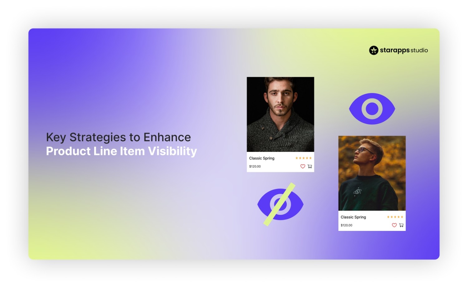

Learn how better line item visibility helps shoppers find key variants and lifts engagement on high-traffic Shopify stores. Get actionable techniques!
Ever stared at your Shopify cart, wondering why that "Medium Blue Tee" looks identical to "Large Black Tee"?
You're not alone, 70.19% of carts get abandoned due to unclear line items, costing hefty sums to DTC stores.
More than 90% of information transmitted to the brain is visual, and humans process visuals 60,000× faster than text. Research also shows that 70% of buying decisions are based on how products are presented visually.
It means that if product options aren’t easy to see and compare, shoppers often abandon their journey.
Understanding how to enhance product line item visibility helps businesses boost discoverability, improve user experience, and increase conversions. This blog breaks down key strategies to make every product and variant clearer, more findable, and easier to buy.
Key Takeaways
- Product line item visibility determines how much of your real inventory shoppers can see, understand, and buy. Hidden variants mean lost revenue.
- Visual discovery at the collection and product level reduces friction and accelerates decision-making. Shoppers choose faster when options are recognisable.
- Variant-aware images, titles, and selectors build trust by keeping every choice clear and consistent across the journey.
- Treating variants as discoverable entities improves both UX and SEO, allowing high-intent options to surface in browse, search, and image results.
What is Product Line Visibility?
Product line item visibility refers to how clearly individual products, and their variants such as colour, size, material, or style, are surfaced across your storefront. It is not limited to whether a product exists in your catalog. It measures how easily a shopper can discover, recognise, and compare the exact option they intend to buy.
In practical terms, it answers three critical questions:
- Can a shopper see that multiple variants exist?
- Can they distinguish one option from another without guessing?
- Can they reach the right variant in one or two interactions?
Poor product line item visibility typically shows up in subtle but costly ways across the storefront:
- A single, generic product card represents multiple variants, leaving shoppers unaware that other colours, styles, or formats even exist.
- Collection pages lack swatches or visual cues, forcing customers to click into each product just to explore their options.
- The same image set appears across all variants, making it difficult for shoppers to confirm what they will actually receive.
- Product titles remain generic, so once a variant is selected, customers lose clarity about which version they are viewing or adding to cart.
Each of these gaps adds friction. Instead of guiding shoppers forward, the storefront asks them to guess, backtrack, or abandon the journey altogether.
Once you understand where visibility breaks down, the next step is knowing what actually controls it across your storefront.
The Core Elements That Drive Product Line Item Visibility
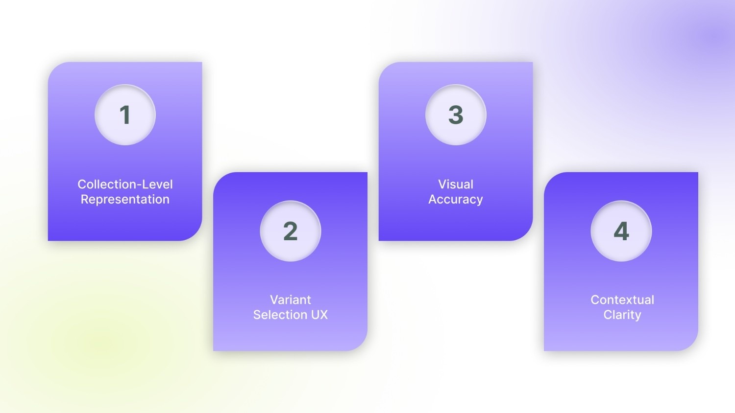
Product line item visibility is governed by four interconnected layers of the storefront. When even one of these underperforms, variants become harder to find, compare, or trust.
1. Collection-Level Representation
Most buying journeys start on the collection page, not the product page. This is where visibility is either established or lost.
High-performing stores surface variety early:
- Colour or style swatches appear directly on product cards
- Variant thumbnails preview key differences
- Shoppers can assess options without opening multiple pages
When variants stay hidden, browsing becomes guesswork, and large portions of your catalog never enter consideration.
2. Variant Selection UX
Once a shopper opens a product, clarity becomes the priority. The variant selector is no longer a design detail, it is the decision interface. Effective UX makes differences visible, not just readable:
- Swatches show colours as they truly appear
- Buttons clearly separate sizes or formats
- The selected option is unmistakable
3. Visual Accuracy
Images are the final proof point before a purchase. If visuals do not match the selected option, confidence breaks. High-clarity stores ensure that:
- Every variant displays its own image set
- Non-relevant images are removed as soon as a variant changes
- The gallery always mirrors the active selection
When a shopper clicks “Red” and still sees blue, trust erodes. The buyer pauses, rechecks, or leaves. Visual accuracy removes doubt and lets intent flow straight to checkout.
4. Contextual Clarity
As shoppers move through a product, they need constant confirmation that they are on the right version. That clarity comes from:
- Titles that update to reflect the selected variant
- Descriptions that adapt for size, material, or fit
- URLs and metadata that remain aligned with the chosen option
Without this context, even confident shoppers hesitate. They wonder whether the cart holds what they meant to buy.
When visibility fails, it is rarely because of one broken element. It is the result of small gaps across discovery, selection, and confirmation. Fixing those gaps requires deliberate, system-level changes.
5 Strategies to Enhance Product Line Item Visibility
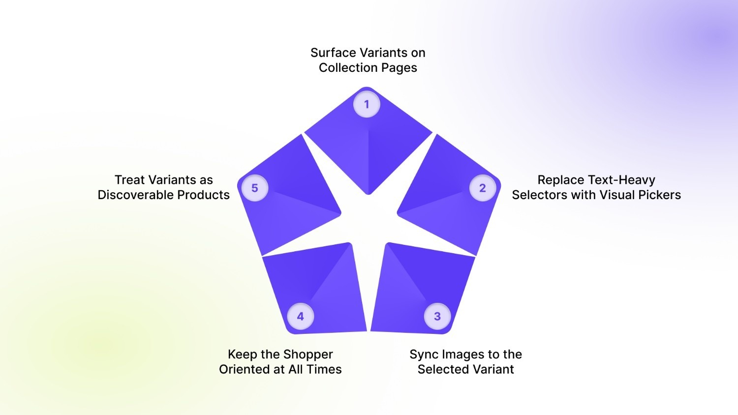
These strategies focus on making every product and variant visible, distinct, and easy to choose, from the first scroll to the final click.
1. Surface Variants on Collection Pages
Most shoppers decide what to explore while scanning a collection page. If they see only one generic product tile, they assume limited choice, even when dozens of variants exist behind it.
Surfacing variants at this stage changes how customers browse:
- Colour or style swatches on the card instantly show the range.
- Thumbnail previews hint at different finishes, patterns, or models.
- Shoppers understand what is available before committing to a click.
For instance, Allbirds uses visual cues (such as colour swatches and secondary product images) within listings to show available options at a glance, rather than relying solely on dropdowns or hidden variants. This type of visual representation accelerates browsing and helps customers instantly recognise the options available for each product.
2. Replace Text-Heavy Selectors with Visual Pickers
Dropdowns force shoppers to read and imagine. Visual pickers let them recognise and decide.
When options such as colour or finish appear inside a dropdown, customers must open the list, read each label, and mentally picture the difference. This slows momentum and increases uncertainty, especially on mobile, where dropdowns hide most of the context.
High-clarity stores redesign this moment:
- Colours appear as true-to-life swatches
- Sizes and formats are shown as clearly separated buttons
- The active choice is visually distinct and persistent
A strong example is Nike’s product pages, where shoe colours are presented as image swatches rather than text. Shoppers do not need to interpret “Midnight Navy” or “Photon Dust”; they see the option and understand it instantly.
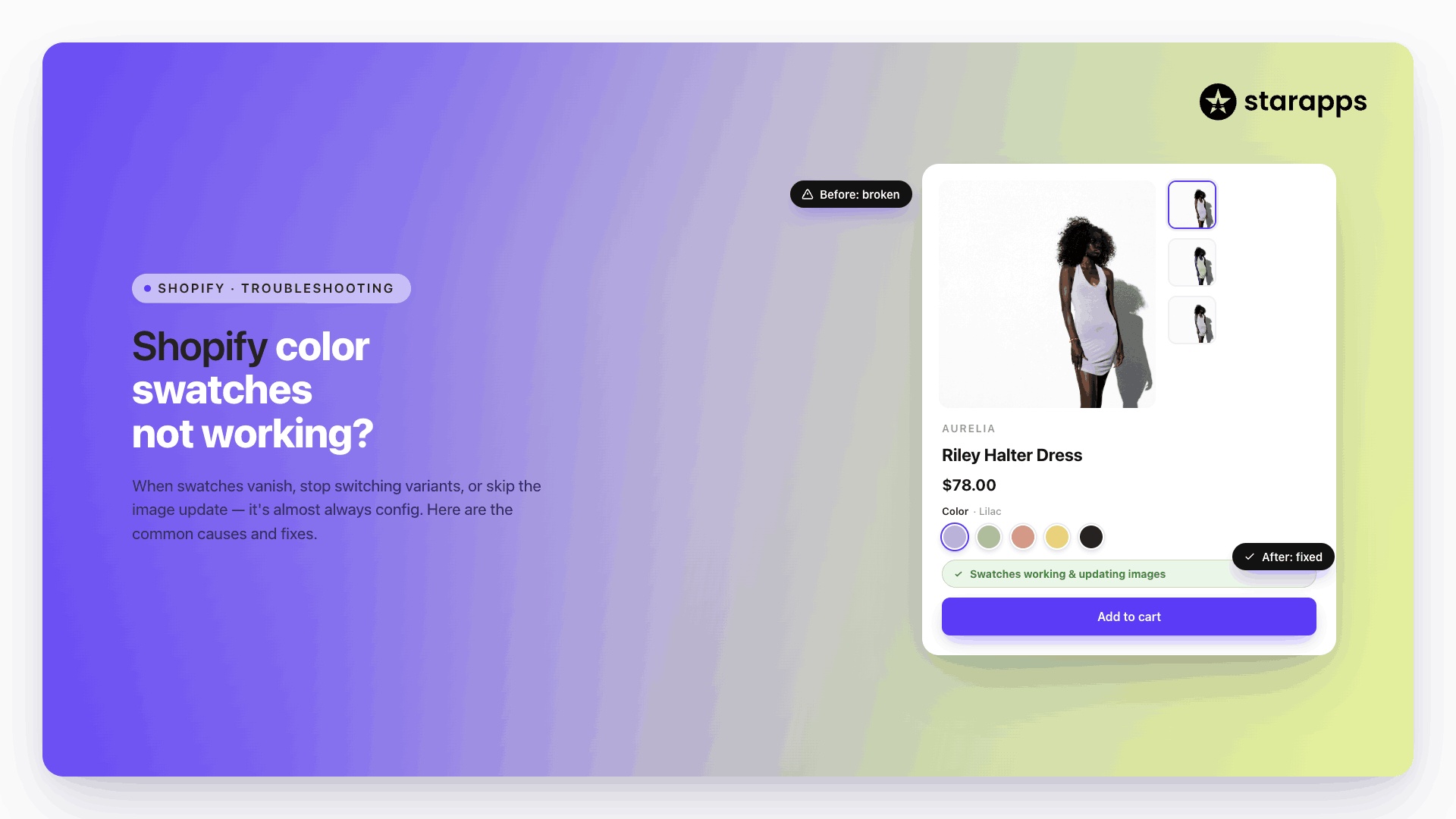
3. Sync Images to the Selected Variant
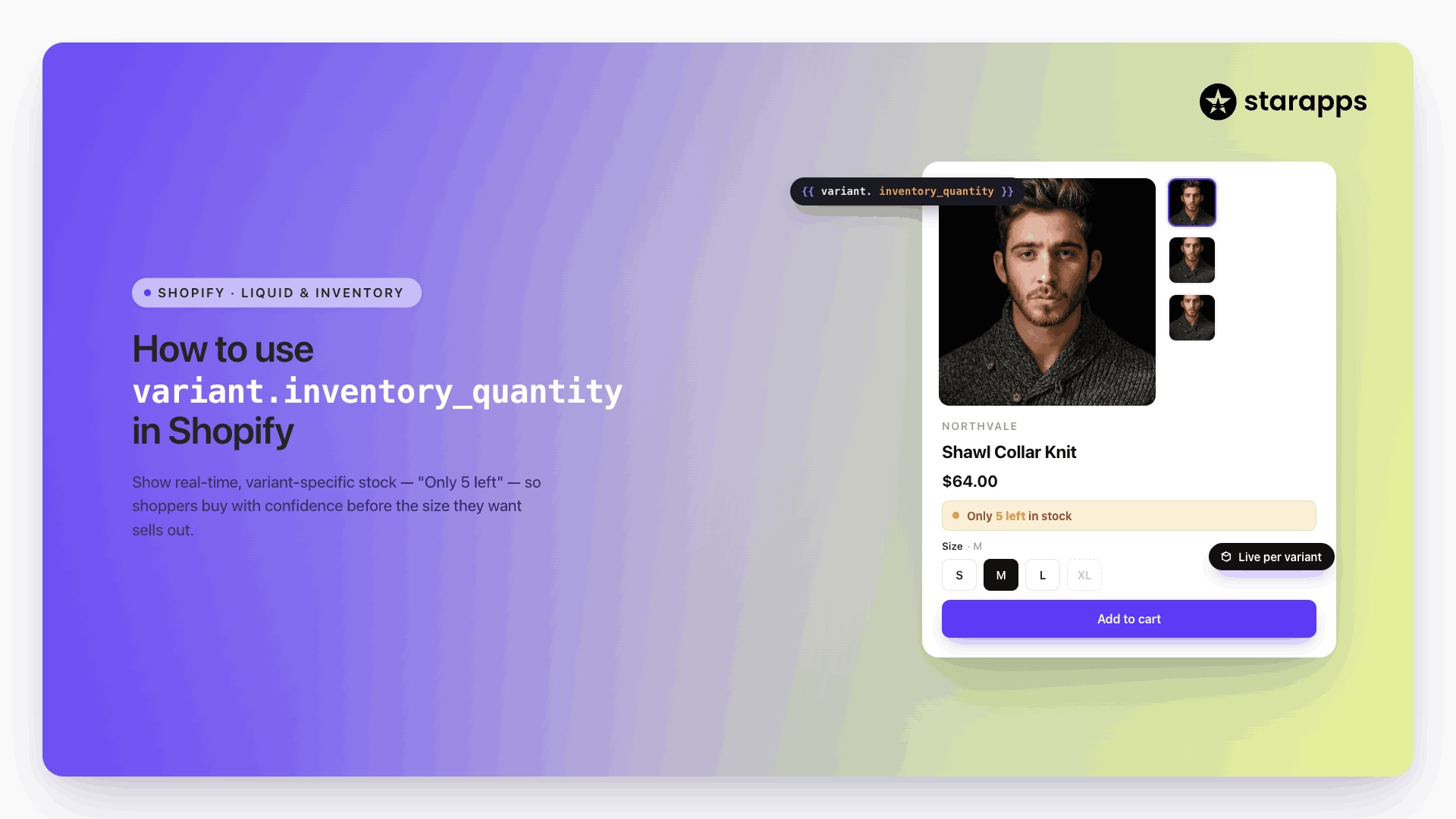
The moment a shopper changes an option, the page should visually confirm that decision. If the gallery remains unchanged, uncertainty creeps in. A reliable variant experience works like this:
- Selecting a colour instantly loads only that colour’s images
- Images from other variants disappear
- The first visible frame always matches the chosen option
This is the standard set by brands such as Apple. When a customer switches the colour of an iPhone or MacBook, the hero image updates immediately. There is no ambiguity about what is being viewed or purchased.
4. Keep the Shopper Oriented at All Times
As shoppers move through a product, the interface must continuously reassure them that they are on the right version. Orientation is not a courtesy; it is a conversion safeguard. Effective stores ensure that:
- The product title updates to reflect the selected colour, size, or format
- Descriptions adjust when specifications differ between variants
- URLs and metadata remain aligned with the chosen option
This is common on marketplaces like Amazon, where selecting a different size or configuration updates the product context immediately. The buyer never wonders what is in their cart.
Without this reinforcement, even confident shoppers pause. They scroll back, recheck, or abandon. Clear, persistent context removes that friction and keeps momentum intact.
5. Treat Variants as Discoverable Products
In large catalogs, collapsing all options into a single tile hides scale and limits discovery. High-performing stores allow variants to behave like products:
- Individual colours or styles appear in collections
- Search results surface specific options, not just parent items
- Filters work at the variant level, not only at the product level
This is how global retailers such as ZARA structure browsing; each colourway or style is visible during exploration, not buried behind a click.
Visibility does not end at the storefront. If search engines cannot clearly understand and index your variants, they remain invisible long before a shopper ever arrives.
Technical SEO Factors for Line Item Visibility
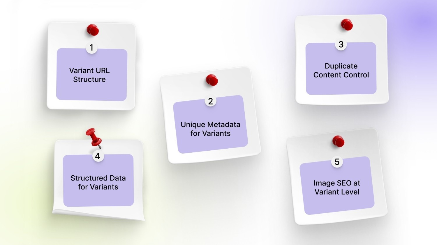
Product line item visibility is shaped as much by your site’s technical structure as by its design. Search engines need clear signals to recognise, rank, and surface individual variants. Without them, even well-designed storefronts lose discoverability.
The most impactful technical factors are:
1. Variant URL Structure
Search engines treat a URL as a distinct page. If all variants live under one generic product URL, only one version is indexed. Each meaningful option, such as colour, size, or configuration, should resolve to a stable, crawlable URL that reflects that choice. This allows search engines to recognise “Blue Linen Sofa” as different from “Grey Linen Sofa,” rather than collapsing both into a single result.
2. Unique Metadata for Variants
Meta titles and descriptions define how a page appears in search. At variant level, they should mirror the exact option being viewed. Including attributes such as colour, size, or pack format increases relevance and improves click-through. A result that reads “Running Shoe – Black – Size 9” matches intent far more precisely than a generic parent title.
3. Duplicate Content Control
Variants often share descriptions, specifications, and layout. Without control, this creates dozens of near-identical pages that compete with each other. Canonical tags should clearly indicate which variants deserve independent indexing and which should defer to a primary version. This preserves authority while still allowing high-intent variants to rank.
4. Structured Data for Variants
Schema markup translates your product data into a format search engines can interpret. At variant level, this means defining attributes such as size, colour, SKU, price, and availability. These signals enable rich results and ensure each option is understood as a distinct purchasable item rather than a vague variation.
5. Image SEO at Variant Level
Images often drive discovery before text does. Each variant image should carry alt text and filenames that match the exact option shown. When “Leather Backpack – Tan” and “Leather Backpack – Black” share the same generic image data, search engines cannot distinguish them. Variant-specific image optimisation allows individual styles to surface in image search and visual results.
Search engines may surface your variants, but it is the on-site experience that decides whether shoppers act on them.
UX Strategies That Boost Visibility and Engagement
Strong product line visibility depends on how quickly a shopper can see, understand, and trust what is available. The goal is not to add more interface elements, but to remove the moments where customers pause to interpret.
Well-designed UX achieves three things at once: it reduces cognitive load, accelerates comparison, and keeps the shopper oriented from browse to checkout.
Here's how each UX strategy works:
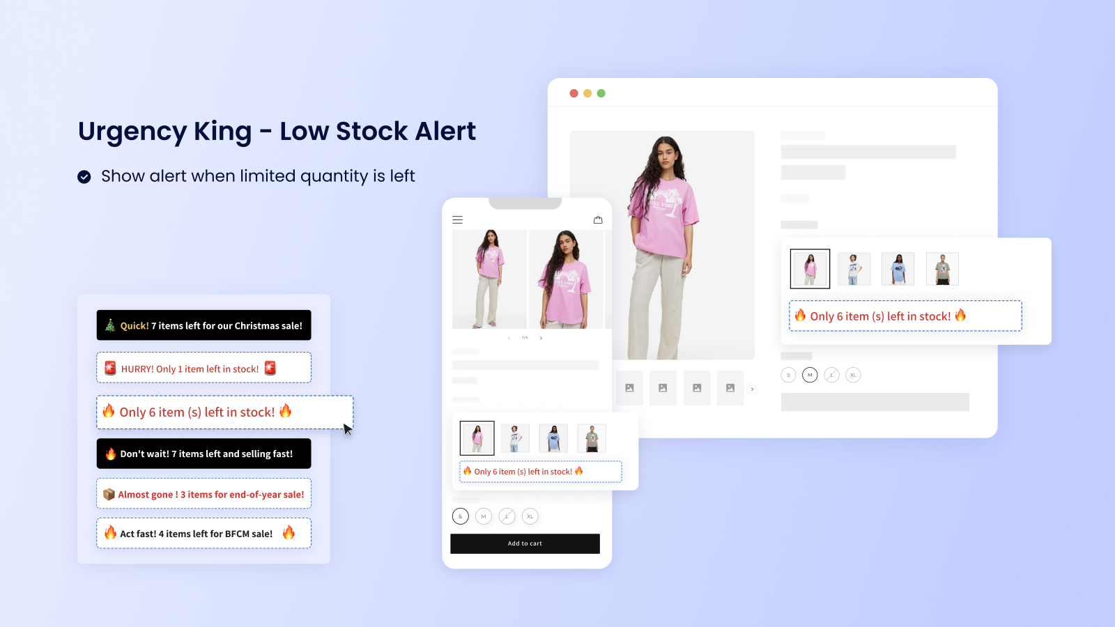
- Thumb-Friendly Swatch Targets: Place color dots or mini images right next to each line item in the cart. Customers can tap these 44-pixel targets (Apple's minimum thumb size) to instantly swap variants, no squinting at tiny dropdown menus on iPhone or Android screens.
- Sticky Line Item Headers: When customers scroll through a long cart, keep the column headers ("Image | Title | Qty | Price") fixed at the top. Shoppers always know which column shows what without getting lost or confused
- .Progress Circles Per Line: Show small loading circles under each product thumbnail that say "2/3 images loaded" when pictures take time to appear. This eliminates blank white space that makes customers think "Is it broken?" during slow connections.
- Inline Edit Buttons: Add tiny "Change Size" or "Swap Color" text links that appear when customers tap or hover over each line item. They can fix their selection right there without leaving the cart page or going back to the product page.
- Micro-Animations on Swap: When a customer changes "Blue Tee → Red Tee," make the image, title, and price smoothly fade and update over 200 milliseconds. This visual confirmation tells their brain "Yes, the change worked perfectly."
Starapp’s studio Color Swatch King delivers 44px thumb-friendly swatches, sticky variant headers, and smooth micro-animations across your entire cart flow. Talk to us today!
Even well-designed stores lose revenue when small structural choices quietly hide inventory. These issues rarely feel dramatic, yet they consistently suppress discovery, comparison, and confidence across the catalog.
Common Mistakes That Suppress Product Line Item Visibility
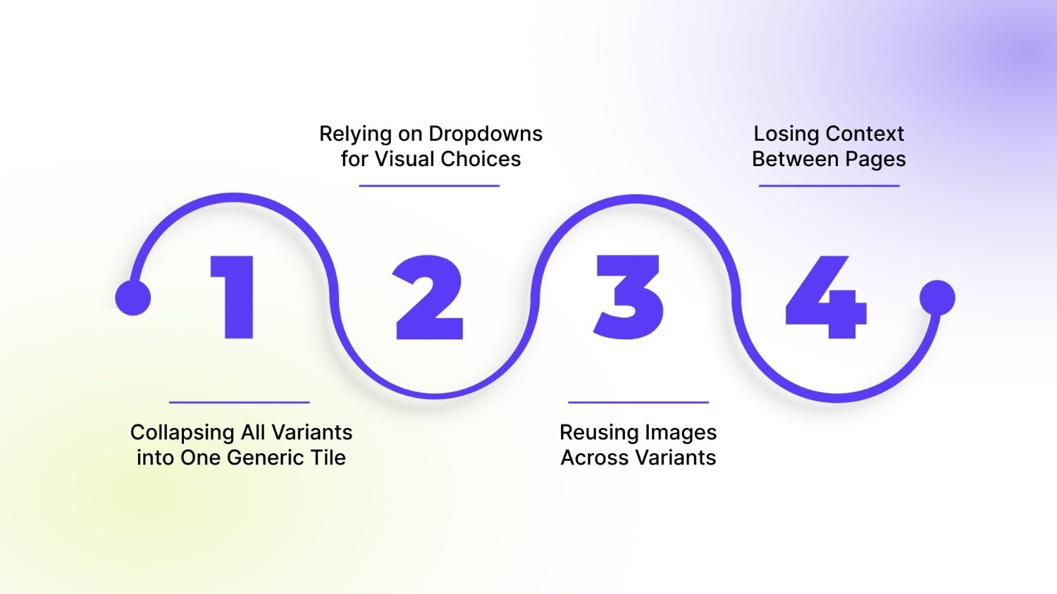
Most visibility problems are not caused by a lack of products; they are caused by how options are compressed, mislabeled, or disconnected across the storefront. The result is a catalog that exists in theory but remains invisible in practice.
Here are the top four visibility killers:
1. Collapsing All Variants into One Generic Tile
Collection pages often compress rich catalogs into a single product card. A shirt with twelve colours appears as one item. From a shopper’s perspective, that category looks limited before it has even been explored.
What disappears is not inventory, but awareness:
- Alternate colours never surface
- Style variations remain hidden
- High-demand options do not compete for attention
2. Relying on Dropdowns for Visual Choices
Text dropdowns turn visual decisions into cognitive work. Instead of seeing differences, shoppers must imagine them. This friction shows up quickly. When a shopper sees labels like “Forest Green” or “Ivory,” they are forced to imagine the shade instead of recognising it. Each option becomes a mental exercise, guessing tone, brightness, and difference, slowing decisions and increasing doubt.
3. Reusing Images Across Variants
When every option shares the same image gallery, the interface stops confirming intent. The shopper selects “Blue” and still sees “Black.”
A quiet doubt appears:
“Is this actually what I’m buying?”
That moment of uncertainty is powerful. It slows momentum, invites second-guessing, and often ends the session. Images are the buyer’s proof. When they do not respond, confidence erodes.
4. Losing Context Between Pages
Variant clarity often disappears after the product page. In the cart or checkout, details collapse back to a generic name.
The shopper sees less than what they selected. They pause. They re-check. Some abandon. It is a trust gap. Visibility must persist across every step, especially where payment happens.
By this point, one pattern is clear: visibility is not a design detail. It is a system. And in Shopify, that system must work across themes, templates, and thousands of SKUs, without slowing the store.
How StarApps Studio Can Help You Enhance Product Line Item Visibility
StarApps Studio builds Shopify-native solutions for merchants who outgrow what themes can handle. Its apps do not replace your theme; they extend it. Each tool is designed to work across popular Shopify themes with zero code and no performance trade-offs, making them ideal for growing DTC brands with complex catalogs.
Here is how the ecosystem works in practice:
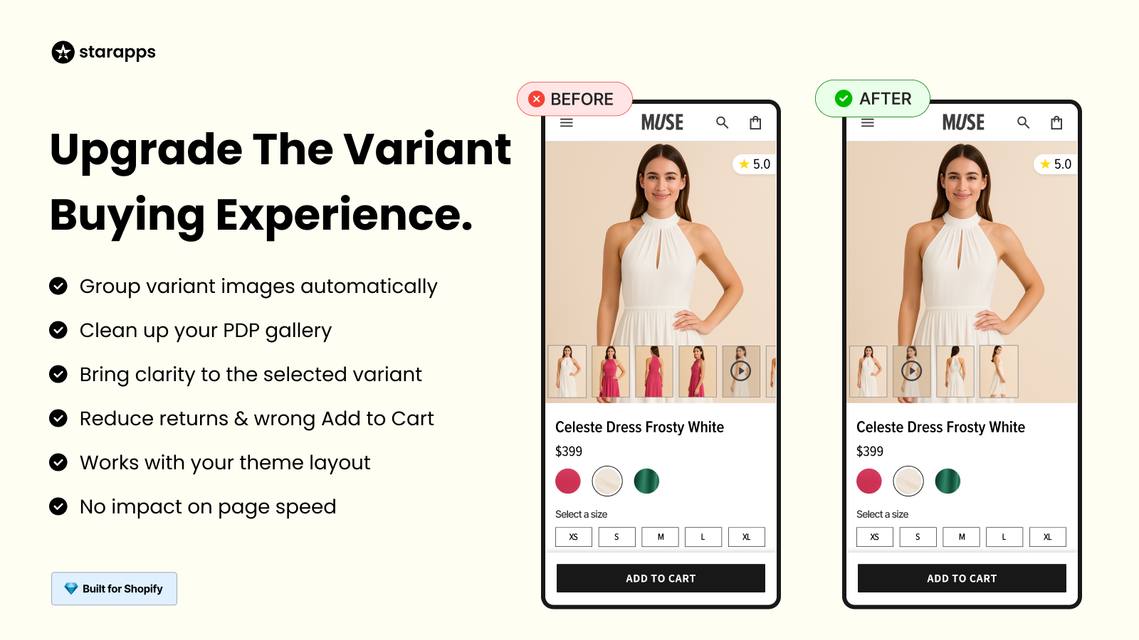
- Variant Image Automator: Ensures every variant displays its own correct images, removing mismatches and confusion. Each selection instantly reflects the chosen option across any Shopify theme.
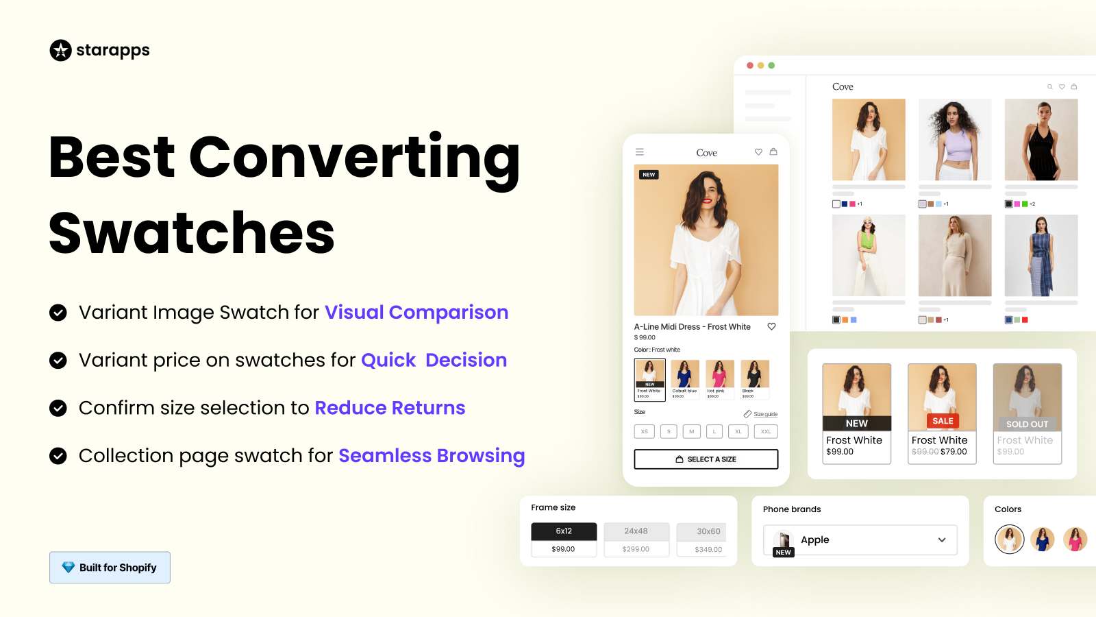
- Variant Options Swatch King: Replaces dropdowns with visual selectors, turning colours, sizes, and styles into recognisable choices. Shoppers see differences instantly and decide faster.
- Auto Hide Sold Out Products: Keeps collections clean by removing unavailable items from browse paths. What shoppers see is always purchasable, reducing friction and wasted clicks.
Turn hidden options into a visible opportunity.
Explore StarApps Studio and start building a storefront where every product line item earns its place in the journey.
Final Thoughts
Product line item visibility determines how much of your catalog shoppers actually see. When variants are hidden behind generic tiles, text-heavy selectors, or static images, real inventory never enters consideration. Every missed option is a missed opportunity.
Improving visibility is not about adding complexity. It is about removing friction—so each colour, size, and style can be discovered, understood, and chosen with confidence.
StarApps Studio helps Shopify stores achieve this with precision. From variant-aware images to visual selectors and clean collections, every tool is built to make your full product range visible, usable, and conversion-ready.
Start revealing your full catalog today. Visit StarApps Studio today and let every variant work for your revenue.
FAQs
1. What does product line item visibility mean in eCommerce?
Product line item visibility refers to how clearly each variant, such as colour, size, or style, is displayed and discoverable across collections, product pages, search, and checkout. It determines how much of your actual inventory shoppers can see and choose from.
2. Why is product line item visibility important for conversions?
When variants are hidden or unclear, shoppers hesitate or abandon them. Clear, visual, and consistent variant presentation reduces friction, builds confidence, and shortens decision time, directly improving add-to-cart and checkout rates.
3. How can I show variants on Shopify collection pages?
You can surface variants using visual swatches or split listings that display colours and styles directly on product cards. Apps like Variant Options, Swatch King, and SA Variants: Combined Listings enable this without theme changes.
4. How do I ensure images change correctly for each variant?
Each variant should control its own image set so the gallery updates instantly on selection. StarApps’ Variant Image Automator automatically maps and filters images per variant across all Shopify themes.
5. Can improving variant visibility help SEO?
Yes. Variant-level URLs, metadata, and image alt text allow search engines to index meaningful options individually. Tools like Variant Alt Text King and SA Variants: Combined Listings help make each variant more discoverable in search.
Heading

End-to-end traceability
To ensure regulatory compliance, you must have a complete overview of your products from production to shipping. Book a demo to see how Katana can give you full visibility of your operations.

.png)
.png)