How to Display Product Variants With Images in Your Ecommerce Store
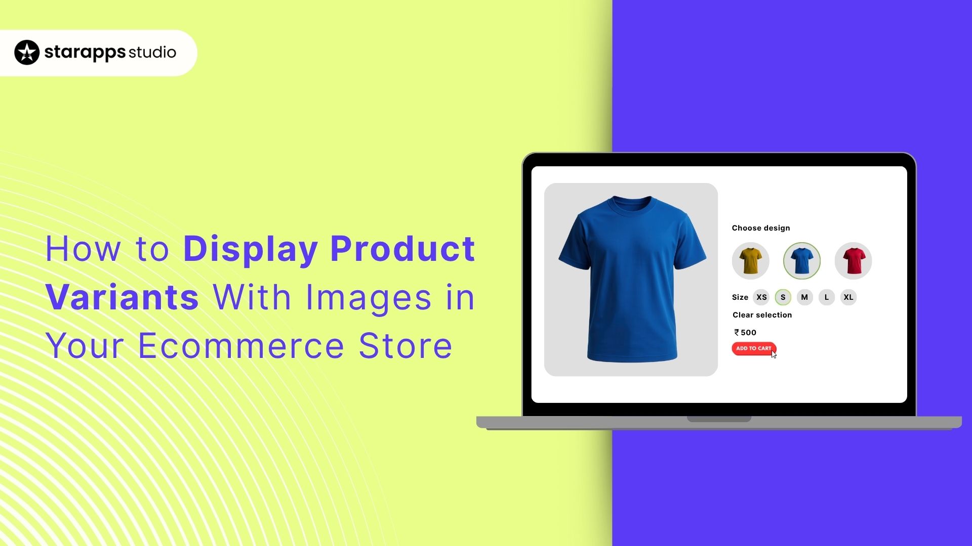

Boost your eCommerce store's appeal with variant images next to them. Assign distinct images per variant to enhance product understanding. Consolidate listings for smooth navigation and use swatches for quick picks. Optimize image quality and SEO. Click to refine your online showcase now!
Every moment a shopper hesitates is an opportunity lost. When someone lands on your product page and sees a dropdown labeled “Color” with ten indistinct names, they pause. Unlike browsing in-store, where you see swatches, online, you must bridge that gap with visuals.
Research shows many stores hover between a 2.5% and 3% ecommerce conversion rate, and at that level, even minor friction matters. Meanwhile, 70% of online shoppers say poor product visuals, especially unclear options, can stop a purchase before it even begins.
That’s where variant images matter. Imagine each product variant, whether “Midnight Blue,” “Lipstick Red,” or “Stripe Pattern", with its own thumbnail right beside the option. No guessing. No click-throughs just to see another color.
This guide walks you through setting up variant images that load right, look right, and help customers choose instantly. Read on if you want faster decisions and smoother shopping journeys.
Key Takeaways
- Clear visuals reduce hesitation: Variant images help shoppers make faster, more confident decisions.
- Multiple display styles work: Swatches, color dots, thumbnails, and variant tiles each serve different product types.
- Accuracy beats aesthetics: Match swatches to real photos and keep naming consistent for clarity.
- Mobile experience matters most: Larger tap targets and instant switching improve conversions.
- StarApps simplifies everything: With six specialized apps trusted by 25,000+ merchants, you can implement variant clarity without coding or complexity.
Why Showing Variant Images Improves Shopping Experience
Think about how you shop online. If you’re choosing between “Sky Blue,” “Ocean Blue,” and “Midnight Blue,” a dropdown with text doesn’t help much. But a row of clear images? Instantly, you know which one you want. No clicking back and forth, no zooming in, no guessing. Your customers feel the same way.
Showing variant images right where the choice happens makes everything easier:
- It gives shoppers instant clarity. They don’t have to open multiple pages just to see the color or pattern they like.
- It leads to faster, more confident decisions because they’re choosing based on visuals, not labels.
- On mobile, it saves precious time. Swatches are easier to tap and compare than dropdowns.
- It reduces mistakes and returns since people see exactly what they’re selecting.
The easier you make it for people to choose, the more likely they are to buy, and showing variant images does exactly that.
With the benefits clear, the next step is understanding how you can actually show variant images in a clean, user-friendly way.
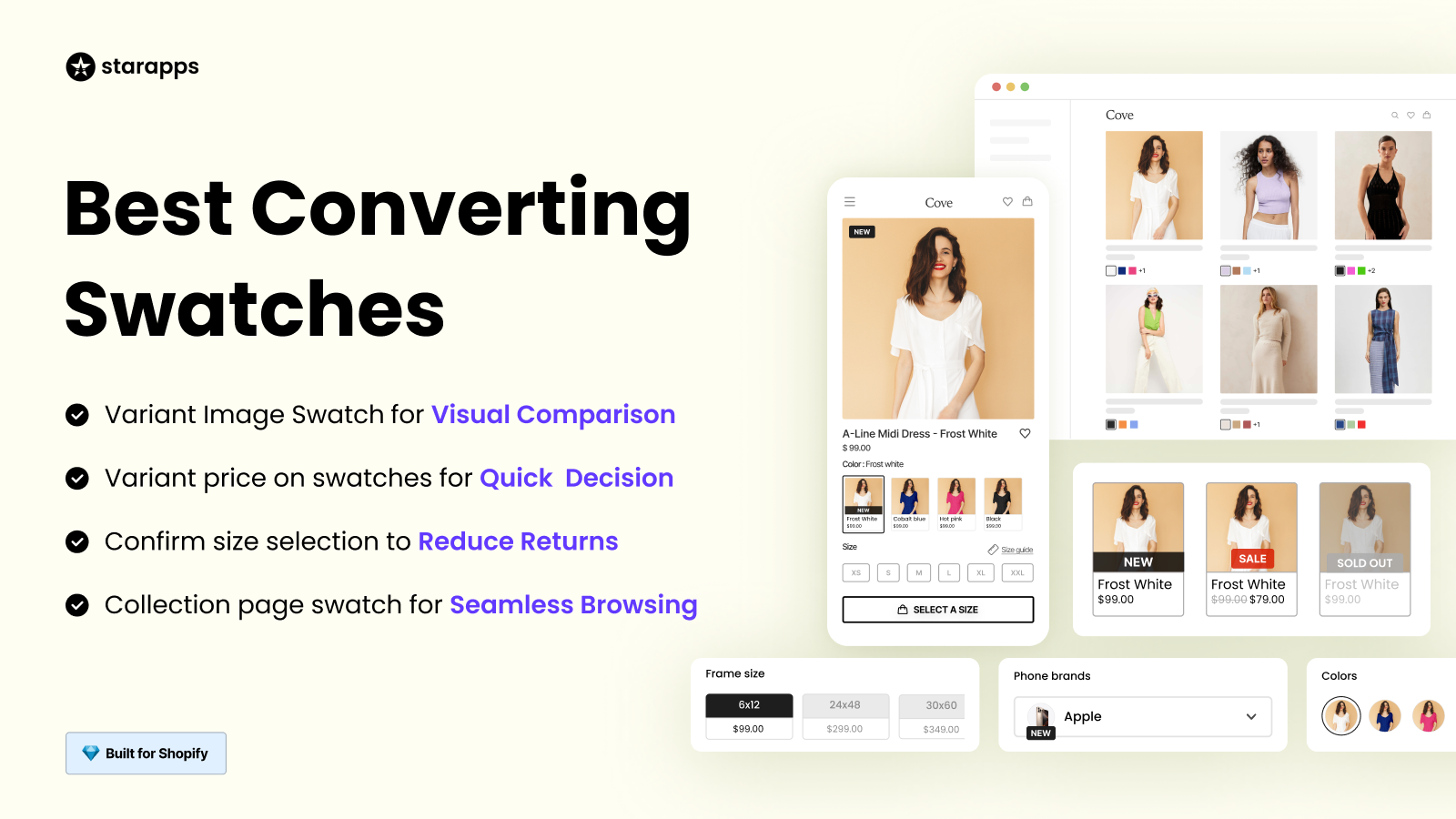
Common Ways to Display Variant Images Next to Options
There isn’t one “right” way to show variant visuals; you pick the style that fits your catalog, theme, and how your shoppers decide. Here are the patterns that consistently work well.
- Image swatches beside the option name: Small thumbnails show the exact color or pattern, making choices instantly clear.
- Color dots with image switching: Simple color circles paired with automatic image updates offer fast confirmation without extra clicks.
- Swatches on collection pages: Displaying swatches under product cards helps shoppers compare options before opening the product page.
- Variant-as-product tiles: Showing each color or finish as its own tile improves discovery and filtering for large catalogs or standout colorways.
- Hover or tap preview: Let the main thumbnail change when a shopper interacts with a swatch for quick visual verification.
- Thumbnail strips near the selector: A mini-gallery of variant thumbnails helps compare textures, prints, and details at a glance.
- Pattern or material samples with labels: Small visual samples paired with text labels make it easy to recognize specific finishes or fabrics.
- Variant badges (e.g., low stock, new): Adding useful context next to variant visuals helps guide decisions and set expectations early.
Also Read: Show Color Variants As Products on Shopify Collection Pages
Once you’ve decided how you want your variants to appear, it’s time to bring it to life in your store.
How to Set Up Variant Images in Your Ecommerce Store
The goal is simple: when a shopper picks an option, they should instantly see the right image; on product pages and, where helpful, on collection cards. Here’s a practical setup that balances clarity, speed, and accessibility.
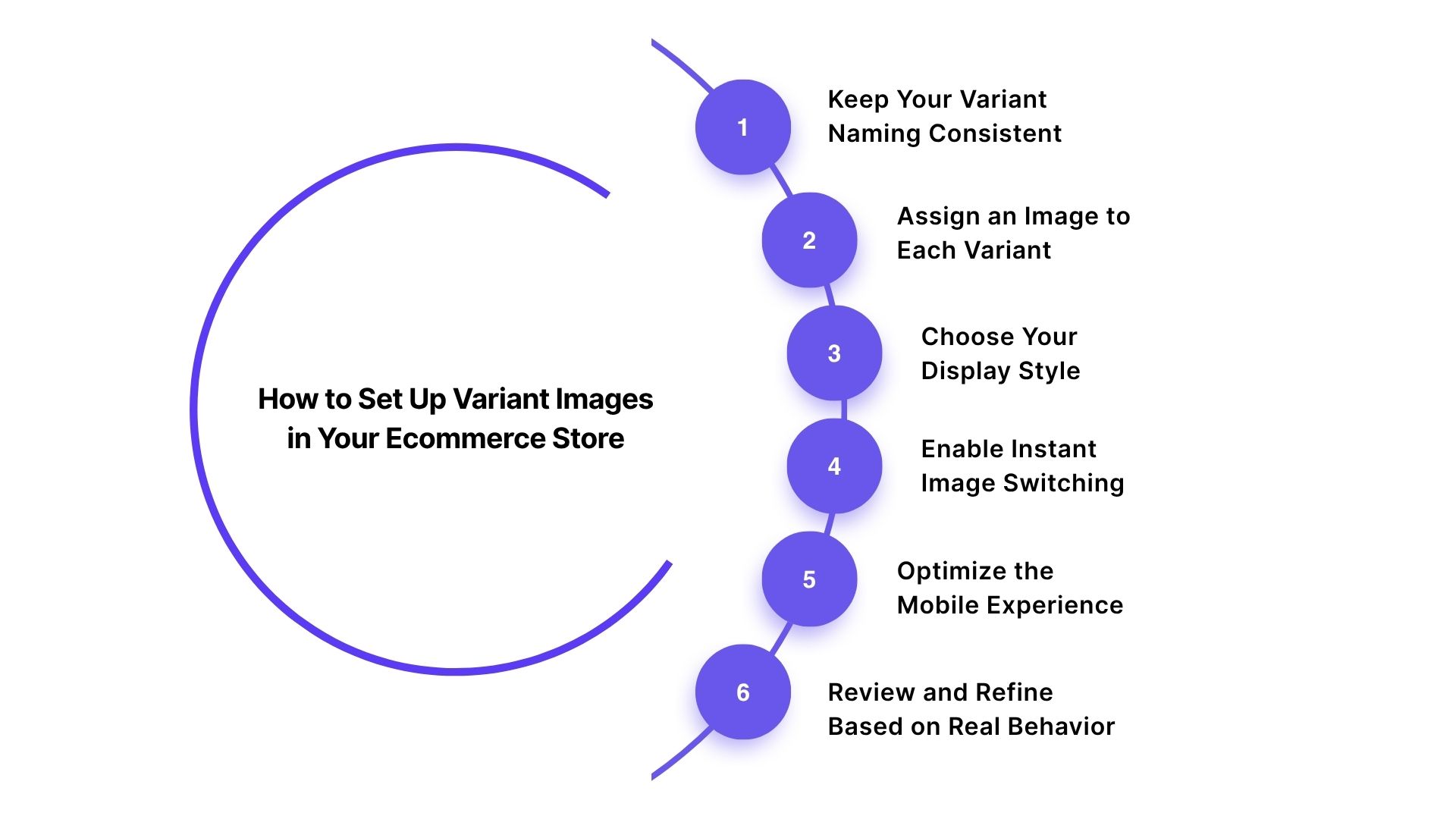
Step 1: Keep Your Variant Naming Consistent
Use the same option name across your catalog (like “Color”). Consistency helps your store display the correct visuals without confusion.
Step 2: Assign an Image to Each Variant
Upload a clear, accurate image for every variant. This ensures the correct photo appears instantly when a shopper selects an option.
Step 3: Choose Your Display Style
Decide how you want variants to appear:
- Swatches
- Color dots
- Thumbnails
Pick the format that suits both your product type and your customer’s browsing habits.
Step 4: Enable Instant Image Switching
Make sure the main image updates the moment a variant is selected. Fast visual feedback builds confidence and keeps shoppers moving forward.
Step 5: Optimize the Mobile Experience
Check spacing, tap targets, and responsiveness. Most shoppers browse on their phones, so make sure variant images are easy to tap and update smoothly.
Step 6: Review and Refine Based on Real Behavior
Watch how customers interact. If certain options are overlooked or cause confusion, adjust the layout, size, or labeling of your variant visuals.
With these steps in place, your variant images become a reliable way to guide shoppers, reduce hesitation, and create a smoother path to purchase.
Suggested Read: Ecommerce Store: Display Variant Images with Dropdown Options
Once your variant images are ready, it’s worth fine-tuning the details to create an even smoother experience.
Best Practices for Variant Image Display
A good setup is only half the story. To make variant images feel seamless and intuitive, you need to fine-tune how they look, behave, and load. The goal is to help shoppers scan quickly, trust what they see, and interact without friction, especially on mobile.
Here are a few focused best practices to keep everything polished:
- Prioritize the “hero” variant first: Put the most popular or highest-converting color upfront so shoppers see your strongest option first.
- Use real product textures—not stock gradients: Textured materials (denim, wood, knits) should show real detail, not flat, simplified swatches.
- Color-match swatches to actual photos: Calibrate swatches using the product photos so they don’t look misleading or artificially bright.
- Show pattern scale accurately: For prints, include mini previews that show scale (tiny floral vs bold geometric), preventing mismatched expectations.
- Keep variant order logical: Group similar shades together to make comparison easier (all blues → all neutrals → all bright tones).
- Add micro-interactions: A slight highlight or border on swatch selection increases clarity, especially for small screens.
- Consider edge-case shoppers: For customers with color-blindness, add patterns or labels so choices still make sense visually.
- Avoid over-stylizing swatches: Rounded, shadowed, or overly decorative swatches distract from the product—simplicity wins.
- Use motion sparingly: Animations should be subtle; shoppers care more about accuracy than effects.
- Match variant names with visuals: If the shade looks “Soft Cream,” don’t label it “Moonlight Ivory.” Keep naming intuitive and tied to what’s shown.
Of course, doing all of this manually can take time. That’s where StarApps steps in with a simpler, more reliable approach.
StarApps for Easy Variant Image Display
When you’re managing multiple variants, keeping visuals accurate and consistent across your store can get complicated.
That’s where StarApps Studio steps in. Our suite of Shopify-focused tools is built to handle everything from swatches and variant images to titles, descriptions, and SEO details. This helps save you time while providing shoppers with a clearer and smoother experience.
Here’s how each product contributes to better variant visibility:
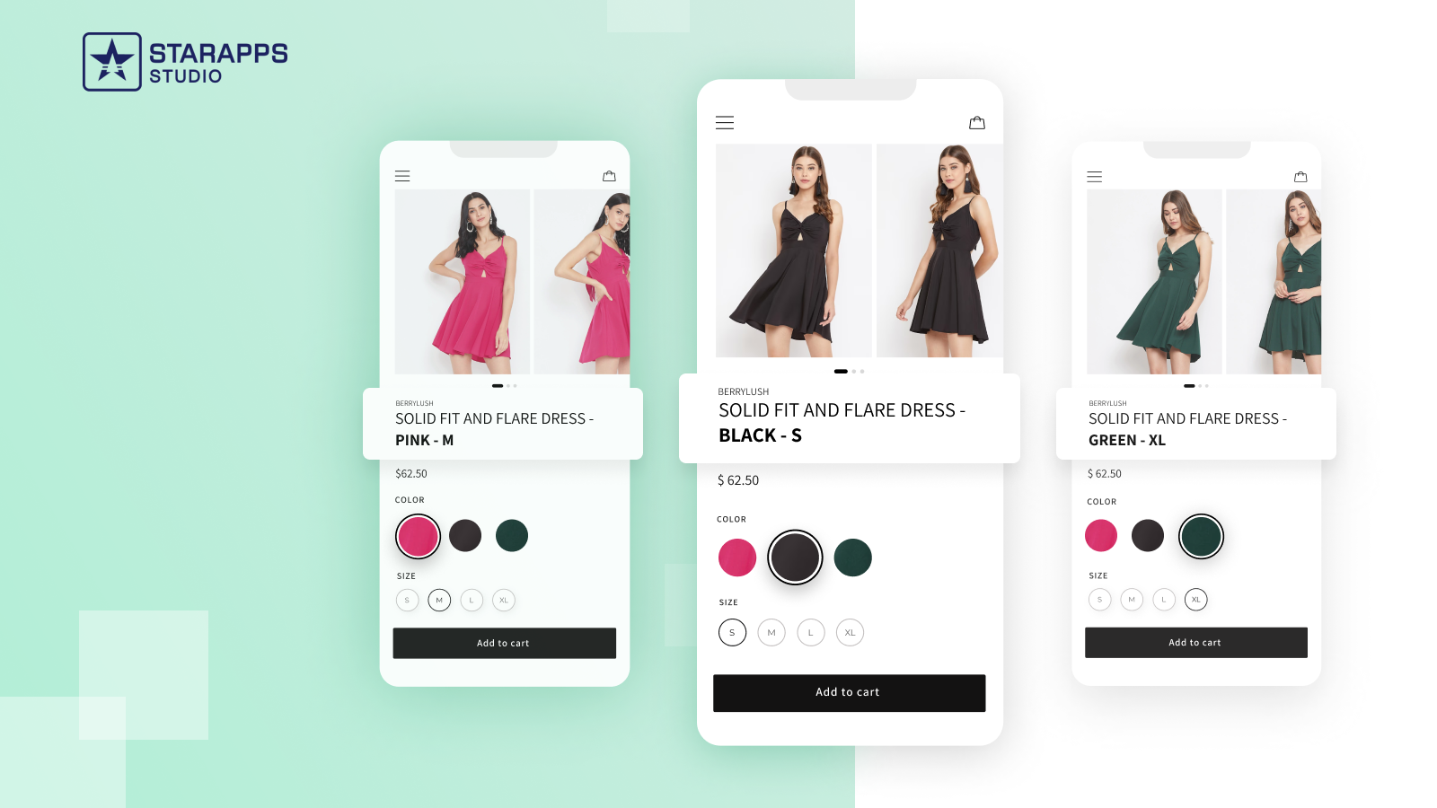
1. Color Swatch King
This app makes it simple to show clean, accurate swatches on product pages and collections. Whether you use color dots or image swatches, it helps shoppers instantly recognize their options and choose without guesswork.
2. Variant Image Automator
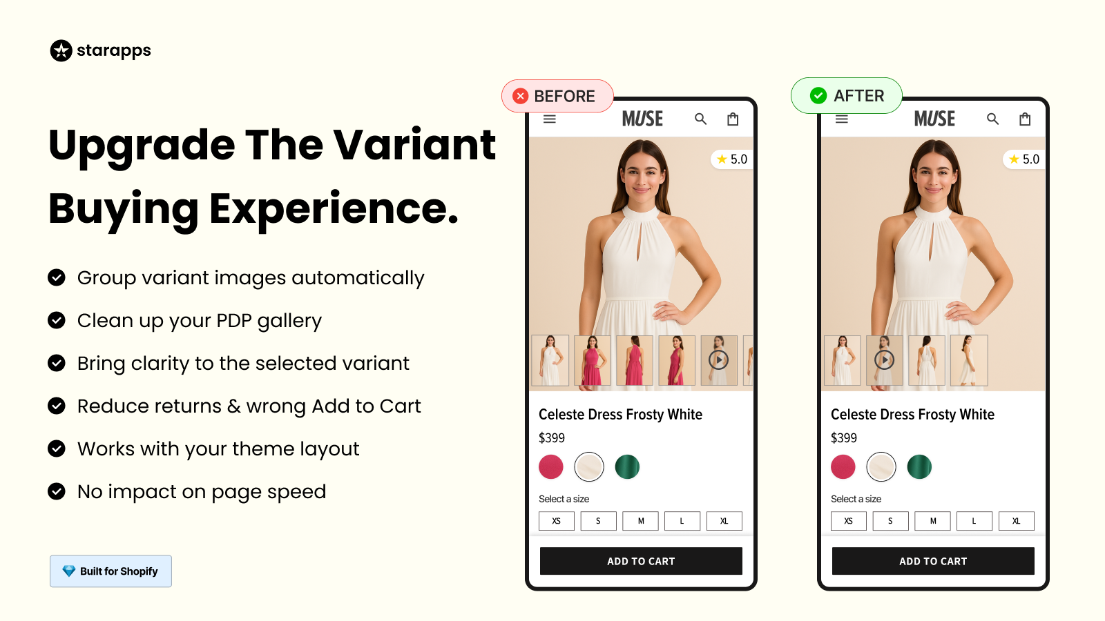
If you want the correct images to appear automatically when a shopper selects a variant, this app handles it for you. It organizes variant galleries, updates the main image instantly, and keeps everything aligned with your theme.
3. SA Variants: Combined Listings

For stores where each color or style deserves its own presence, this app gives every variant a dedicated listing. That means its own image, title, and URL, making it easier for customers to find exactly what they’re searching for.
4. Variant Title King
Clear titles reduce confusion. This app updates product titles dynamically based on the selected variant, so customers always know exactly which version they’re viewing.
5. Variant Descriptions King
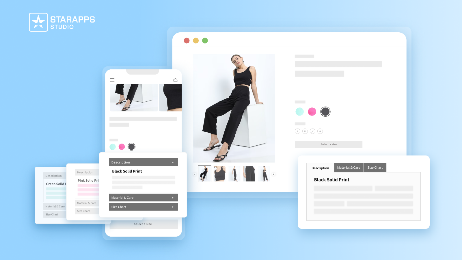
Some products need variant-specific details. This app lets you add structured, organized descriptions for each variant using clean tabs or accordions, helping shoppers understand differences clearly without clutter.
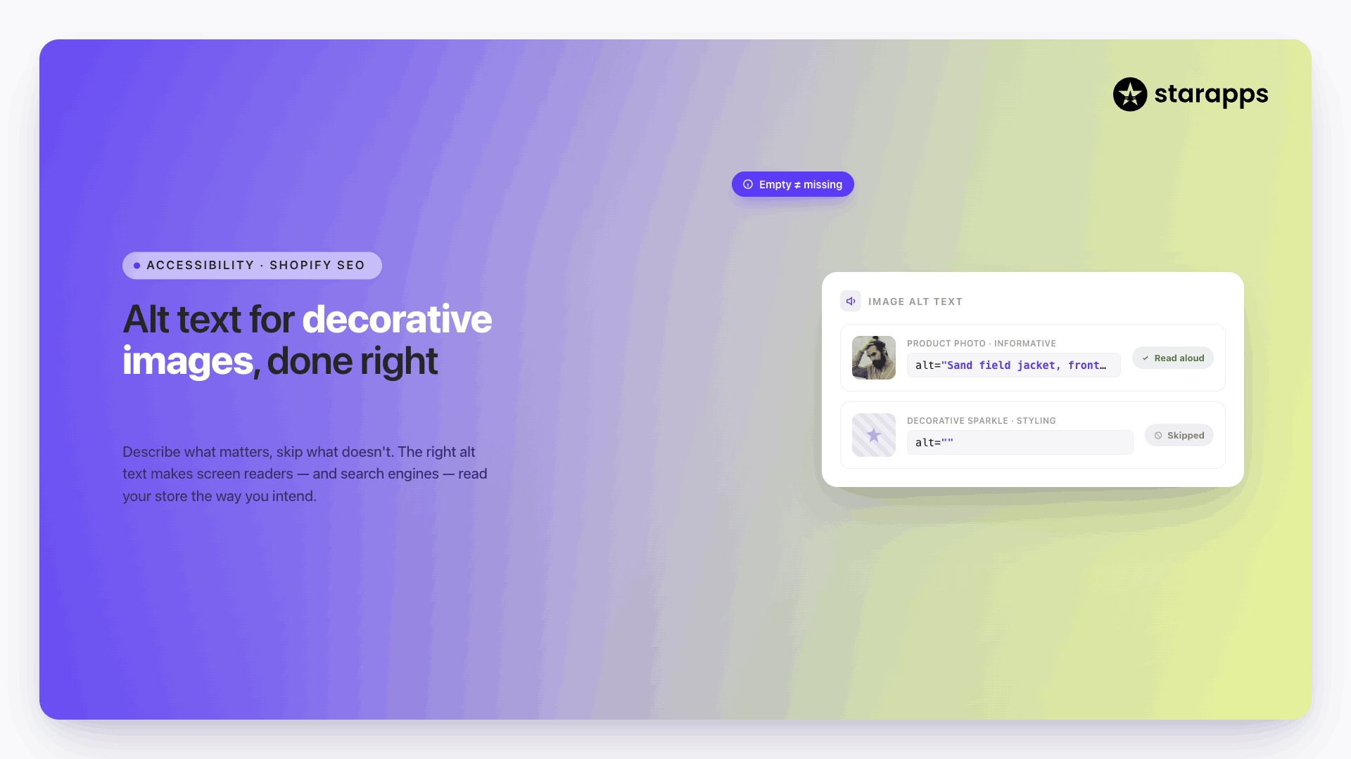
6. Variant Alt Text King
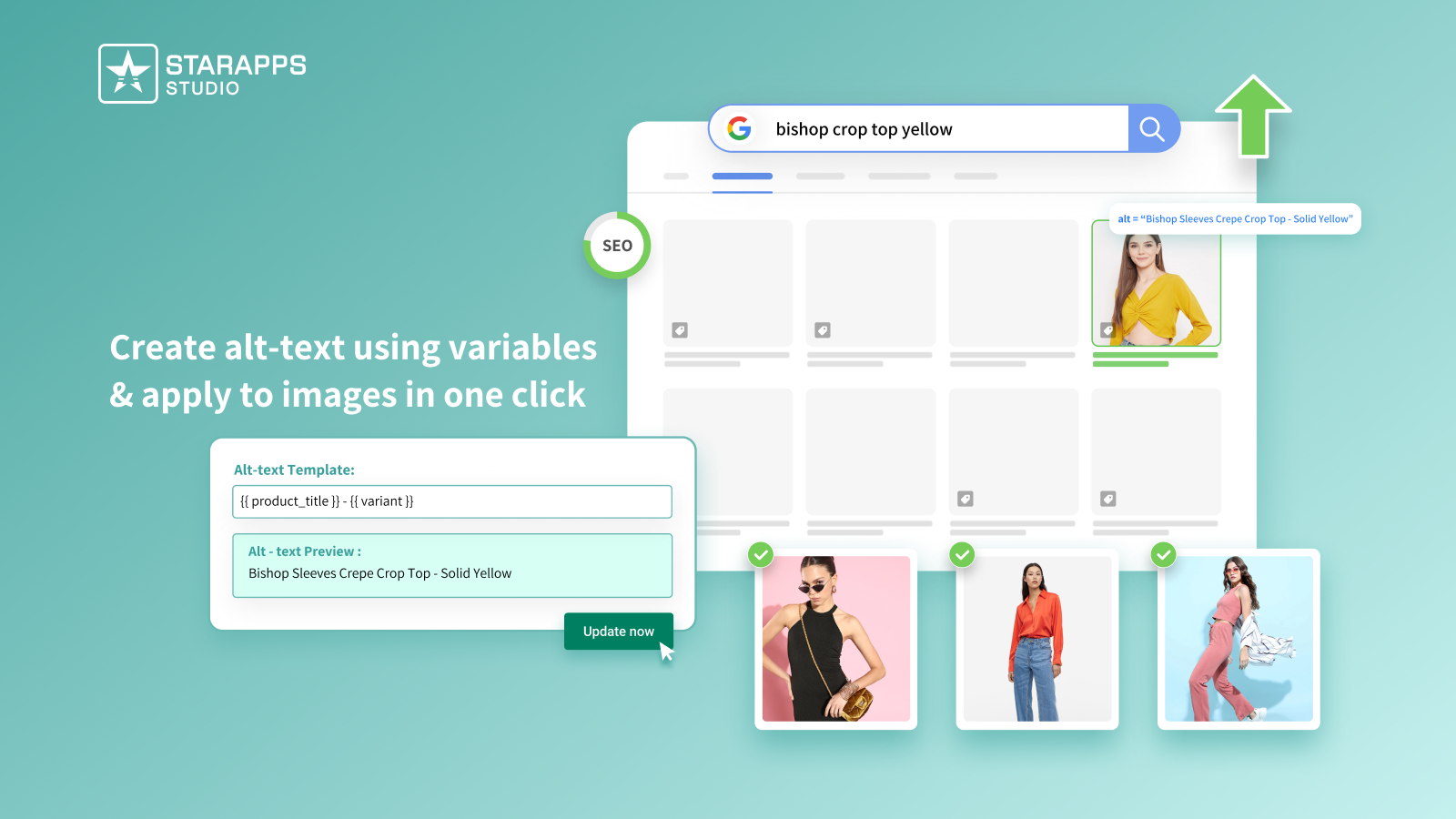
Accessibility and SEO matter. This app automatically generates descriptive alt text for all your variant images, helping search engines understand them and making your store more inclusive for all shoppers.
Also Read: How to Write Alt Text for Product Images
Now, before you perfect your setup, it helps to be aware of the common mistakes that can weaken the shopper experience.
Mistakes to Avoid When Showing Variant Images
Variant images don’t fail because they’re missing; they fail because of the tiny details shoppers pick up on without thinking.
A swatch that looks off, a tap that doesn’t respond, a shade that’s too similar to another; these micro-moments create doubt faster than any broken button. The good news? Most of these issues are easy to avoid once you know what to look for.
Here are the ones that matter most:
Conclusion
Great variant images don’t just look good; they remove uncertainty. When shoppers can instantly recognize the option they want, they move through your store with confidence, spend less time second-guessing, and feel more satisfied with their choices. Clear visuals turn browsing into momentum, and momentum is what leads people from “maybe” to “yes.”
The real secret? Keep refining. Test on real devices. Watch how shoppers interact. Small adjustments, like clearer labels or better swatch placement, can make a bigger difference than redesigning an entire page.
And if you’d rather not juggle the technical pieces on your own, there’s a smoother path. StarApps Studio makes variant clarity effortless with tools trusted by 25,000+ active merchants and a suite of 6 powerful apps built specifically for Shopify.
From swatches and image automation to variant organization and accessibility, everything is designed to work together and keep your store fast, clean, and reliable.
Need help choosing the right setup? Get in touch, and we’ll guide you toward the best solution for your store.
FAQs
1. Do I need separate product listings for each color or variant?
Not always. If colors differ dramatically or act like separate styles, individual tiles can help. Otherwise, swatches and variant images under one listing keep browsing clean and organized.
2. How many images should I assign to each variant?
At least one clear, accurate image per variant is essential. If the product has details or textures, adding 2–3 supporting images can improve clarity and reduce returns.
3. Will adding more variant images slow down my store?
It can if images are not optimized. Compressed file sizes, responsive images, and lazy-loading help maintain speed while still offering rich visuals.
4. What’s the best format for displaying variant options—swatches, dots, or thumbnails?
It depends on your product type. Use image swatches for patterns and textures, color dots for solids, and thumbnails when detail matters. Choose the format that makes differences instantly clear.
5. How do I ensure a good experience for mobile shoppers?
Enlarge tap targets, space swatches properly, and make sure the main image switches instantly when a variant is selected. Mobile users rely heavily on speed and visual clarity.
Heading

End-to-end traceability
To ensure regulatory compliance, you must have a complete overview of your products from production to shipping. Book a demo to see how Katana can give you full visibility of your operations.
.png)
.png)