How to Get Shopify Colors to Show on Color Swatches: 2026 Guide


Learn how to get Shopify colors to show on color swatches in 2026, with tips, theme setups, and apps for accurate, visual product displays.
Running a Shopify store with many variants isn’t easy. Shoppers judge products quickly. Research shows that up to 90% of a product’s first impression comes from color alone. When those colors sit inside dropdowns, customers can’t compare options fast. That delay creates friction, and friction reduces conversions.
Color swatches solve this. They display variants as visual chips, thumbnails, or texture tiles. Customers see every option instantly. Mobile users tap once instead of opening menus. The result is a faster, clearer path to purchase.
This guide gives you three reliable ways to add color swatches in Shopify. You’ll see how to use native theme settings, Liquid and JavaScript, or a dedicated Shopify app.
Key Takeaways:
- Swatch Importance: Color swatches let customers quickly compare product variants, improving speed and clarity in decision-making.
- Three Setup Methods: Choose between using Shopify’s native theme, custom coding with Liquid, or a dedicated app for flexible swatch solutions.
- Mobile-Friendly: Swatches offer a better mobile experience with one-tap selection and faster browsing.
- Bulk Options: Apps like Color Swatch King allow you to manage swatches at scale, saving time and ensuring consistency across variants.
- Best Practices: Use clear names, accurate images, and consistent designs to improve user experience and drive sales.
What Color Swatches Are?
Color swatches are small visual selectors that help customers choose a variant without reading a dropdown. Each swatch shows a color, texture, or image that matches the product option. Customers click the visual cue instead of scanning text like “Red,” “Olive,” or “Sandstone.”
Swatches work well for fashion, cosmetics, décor, and any product where visual detail matters more than a label. They reduce guesswork and help customers understand options faster.
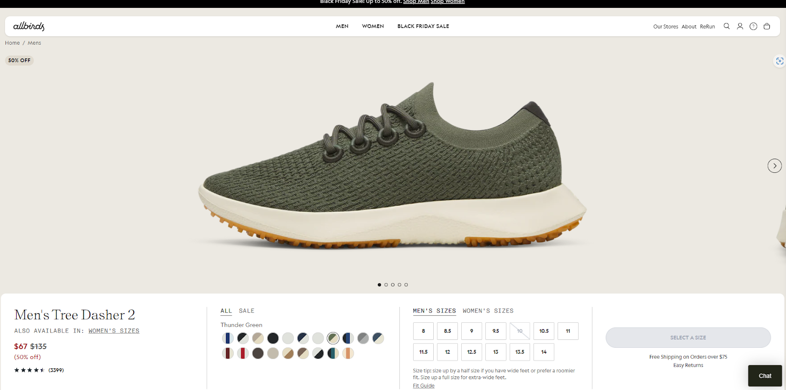
Example 1: Simple Color Circles
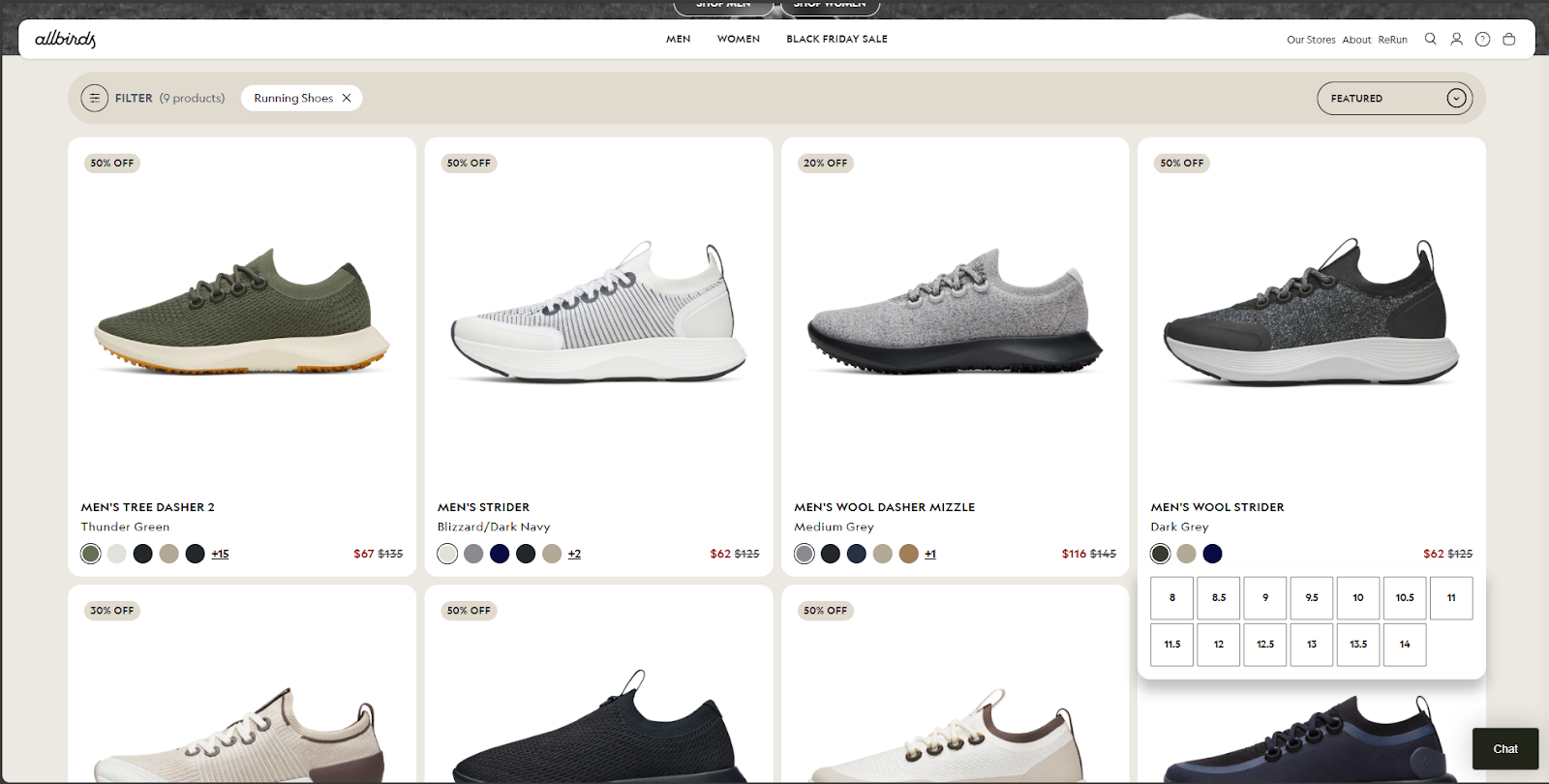
Allbirds uses simple circular swatches under each shoe. Customers switch between wool, eucalyptus, and seasonal colors with one tap. This setup is clean, responsive, and very easy to use.
Example 2: Custom Image or Texture Swatches
Walmart uses image-based swatches for products like furniture. Instead of plain color circles, each swatch shows a fabric or material thumbnail. Shoppers see the exact texture or finish before they select it.
Now that you understand the value of color swatches, it's time to explore how to implement them on your Shopify store. There are several ways to get color swatches up and running depending on your preferences and store setup.
How to Add Color Swatches in Shopify: 3 Simple Options
There isn’t one universal way to show color swatches in Shopify. Your options depend on your theme, custom setup, and how much control you need. Most stores choose one of three paths: native theme settings, manual coding, or an app. Each method suits a different skill level and catalog size.
Below is a clear overview to help you select the right starting point before diving into setup steps.
Method 1: Setting Up Color Swatches with Shopify’s Built-In Theme Tools
If you’re using a Shopify 2.0 theme like Dawn, Craft, Ride, Studio, or Sense, you can enable color swatches without writing code. These themes convert standard color names into simple visual circles. This gives you a fast, built-in setup that works well for most stores.
This method is ideal when your color names follow common terms such as “Black,” “Red,” “Olive,” or “Navy.” The theme matches these values with CSS colors and displays them automatically.
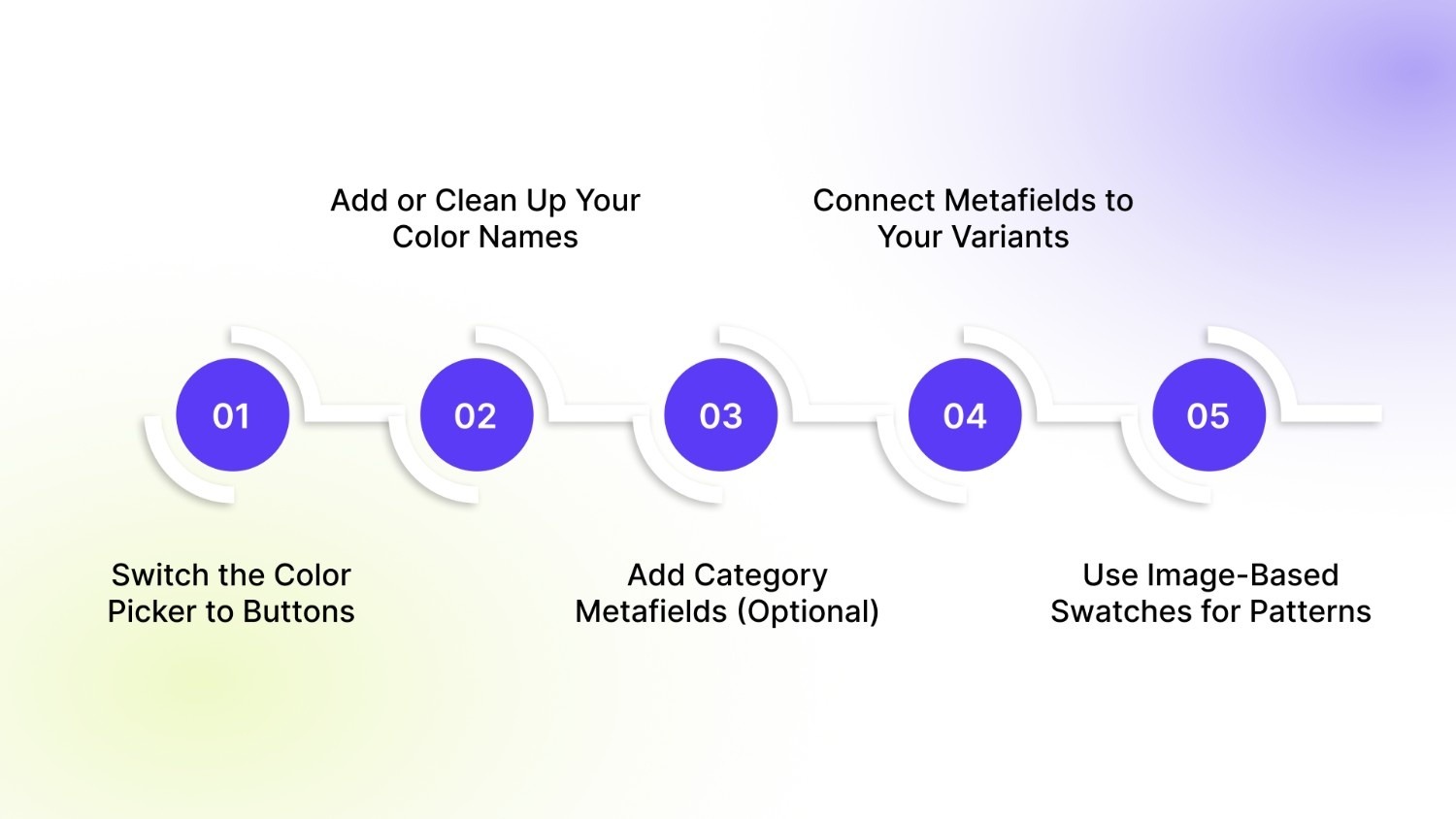
Below is the full process, including optional metafield steps for stores using custom color names.
Step 1: Switch the Color Picker to Buttons
Your theme must use the “Buttons” variant picker for swatches to appear.
How to do it:
- Go to Online Store → Themes → Customize.
- Open a Product Page template.
- Select the Variant Picker block.
- Change the picker style to Buttons.
- Save your changes.
If your color names match standard CSS colors, the swatches appear instantly.
Step 2: Add or Clean Up Your Color Names
Make sure your variant names are spelled cleanly. For example:
- Good: Black, Sand, Olive
- Risky: Black 01, Olive-New, SS-Green
- Won’t work: Sunset Red, Ice Water, Stone 2
If your color names don’t match a known CSS value, your theme won’t generate swatches. That’s where metafields help.
Step 3: Add Category Metafields (Optional)
Category metafields allow you to connect custom colors, hex codes, or image thumbnails to a color option.
This gives you control over:
- Brand-specific shades
- Complex tones
- Patterns or textures
- Fabric or finish samples
How to set it up:
- Go to Settings → Custom Data → Categories.
- Pick the category assigned to your product (e.g., Shirt).
- Add a new Color metafield definition.
- Choose either:
- Color (for hex values), or
- File (for image thumbnails).
- Add preset entries such as:
- “Sky Heather” → #AFC4D7
- “Autumn Plaid” → plaid-pattern.jpg
Step 4: Connect Metafields to Your Variants
Now link each color variant to its swatch value.
Steps:
- Go to Products → Select a Product.
- Scroll to the Variants section.
- Click a variant.
- In the sidebar, look for Color metafield or Swatch Image metafield.
- Bind the metafield to its correct entry.
- Repeat for each variant.
Your theme (if it supports dynamic sources) now displays accurate swatches even for custom colors or textures.
Step 5: Use Image-Based Swatches for Patterns
If your product uses textures, prints, or materials, hex codes may not show enough detail. Image-based swatches work better.
Steps:
- Create a File-type metafield called “Swatch Image.”
- Upload small image thumbnails in Settings → Files.
- Assign the file to each variant through the same dynamic source panel.
This method is popular with fashion, décor, and accessories stores that need accurate visual detail.
While Shopify’s native theme settings are simple to use, more flexibility can be achieved by incorporating custom code. For a deeper level of customization, consider using Liquid and CSS.
Method 2: Customizing Shopify Color Swatches with Liquid and CSS
Custom code gives full control. Store swatch data in metafields. Prefer variant-level metafields for one-to-one mapping. Use a product-level JSON summary for collection cards. The snippets below assume those patterns.
Assumptions
- Variant image files stored in a file metafield: variant.metafields.swatches.image (file reference).
- Variant hex colors stored in a color/string metafield: variant.metafields.swatches.color.value (string like #af3b2c).
- Product-level summary stored as JSON: product.metafields.swatches.summary.value.
- Theme supports Shopify 2.0 metafield reads.
Swatch render snippet (snippets/swatch.liquid)
Use this snippet to render a single visual swatch. It reads passed-in values and falls back safely.
{% comment %}
snippets/swatch.liquid
Params expected:
- swatch_color (hex string, optional)
- swatch_image (file reference or url, optional)
Renders color or image swatch. Renders unavailable state otherwise.
{% endcomment %}
{% assign swatch_type = nil %}
{% assign swatch_style = '' %}
{% if swatch_image %}
{% assign image_url = swatch_image | image_url: width: 48 %}
{% assign swatch_type = 'image' %}
{% assign swatch_style = "background-image: url('" | append: image_url | append: "'); background-size: cover;" %}
{% elsif swatch_color %}
{% assign swatch_type = 'color' %}
{% assign swatch_style = "background: " | append: swatch_color %}
{% endif %}
<span
class="swatch-item {% if swatch_type 'image' %}swatch--image{% endif %} {% if swatch_type nil %}swatch--unavailable{% endif %}"
style="{{ swatch_style }}"
aria-hidden="true"
></span>
Accessible swatch input (snippets/swatch-input.liquid)
This wrapper keeps native inputs, provides roles, and forwards metafield values to the renderer.
{% comment %}
snippets/swatch-input.liquid
Params expected:
- id
- value (label)
- checked (true/false)
- input_name
- swatch_color (hex)
- swatch_image (file ref)
{% endcomment %}
<label
id="label-{{ id }}"
for="{{ id }}"
class="swatch-input"
role="radio"
aria-checked="{{ checked }}"
tabindex="0"
title="{{ value }}"
data-swatch-value="{{ value }}"
>
<input
id="{{ id }}"
class="visually-hidden swatch-input__radio"
type="radio"
name="{{ input_name }}"
value="{{ value }}"
{% if checked %}checked aria-checked="true"{% endif %}
/>
{% render 'swatch',
swatch_color: swatch_color,
swatch_image: swatch_image
%}
<span class="visually-hidden">{{ value }}</span>
</label>
Why this works: the hidden input[type="radio"] preserves keyboard and form semantics. The label carries role="radio" and aria-checked so assistive tech reads state reliably.
Loop to render options (example using variant metafields)
This example reads variant metafields defensively and renders per-variant inputs.
<fieldset class="product-form__input product-form__input--swatch" role="radiogroup" aria-label="{{ option.name }}">
<legend class="form__label">{{ option.name }}</legend>
<div class="swatch-list">
{% for variant in product.variants %}
{% comment %}
Defensive reads:
- For primitive metafields use .value
- For file/image metafields the reference works with image_url
{% endcomment %}
{% assign color_hex = variant.metafields.swatches.color.value | default: '' %}
{% assign image_file = variant.metafields.swatches.image | default: nil %}
{% render 'swatch-input',
id: 'swatch-' | append: variant.id,
value: variant.option1,
checked: variant.id == product.selected_or_first_available_variant.id,
input_name: option.name,
swatch_color: color_hex,
swatch_image: image_file
%}
{% endfor %}
</div>
</fieldset>
Tip: If many variants share the same option label, prefer a product-level mapping or normalize data so each visual option maps cleanly.
Keyboard & accessibility JS (horizontal + vertical support)
Add this JS to sync aria state and support arrow navigation in both orientations.
function updateSwatchSelection(radioInput) {
const label = radioInput.closest('.swatch-input');
if (!label) return;
const groupName = radioInput.name;
document.querySelectorAllinput[name="${groupName}"]).forEach((inp) => {
const lab = inp.closest('.swatch-input');
if (!lab) return;
const isChecked = inp === radioInput;
lab.setAttribute('aria-checked', isChecked ? 'true' : 'false');
inp.checked = isChecked;
});
label.focus();
}
document.addEventListener('change', (event) => {
if (event.target.matches('.swatch-input__radio')) {
updateSwatchSelection(event.target);
}
});
// Arrow navigation supporting horizontal and vertical layouts
document.addEventListener('keydown', (event) => {
const active = document.activeElement;
if (!active || !active.classList.contains('swatch-input')) return;
const key = event.key;
if (!['ArrowRight','ArrowLeft','ArrowUp','ArrowDown'].includes(key)) return;
event.preventDefault();
const radiogroup = active.closest('[role="radiogroup"]');
if (!radiogroup) return;
const items = Array.from(radiogroup.querySelectorAll('.swatch-input'));
const idx = items.indexOf(active);
if (idx === -1) return;
let nextIdx = idx;
if (key === 'ArrowRight' || key === 'ArrowDown') nextIdx = (idx + 1) % items.length;
if (key === 'ArrowLeft' || key === 'ArrowUp') nextIdx = (idx - 1 + items.length) % items.length;
const target = items[nextIdx];
if (target) target.querySelector('.swatch-input__radio').click();
});
CSS (basic, accessible focus states)
.swatch-item {
width: 32px;
height: 32px;
display: block;
border-radius: 50%;
background-size: cover;
border: 1px solid #e2e2e2;
box-sizing: border-box;
}
.swatch-input {
margin-right: 8px;
display: inline-block;
outline: none;
}
.swatch-input:focus,
.swatch-input[aria-checked="true"] {
box-shadow: 0 0 0 3px rgba(0,0,0,0.08);
}
.swatch--unavailable {
opacity: 0.45;
filter: grayscale(60%);
}
Collection cards: use a precomputed JSON summary for performance
Rendering product.variants inside collection loops costs server time. Use a product-level JSON metafield for fast, light rendering.
JSON example for product.metafields.swatches.summary:
[
{"type":"color","value":"#1a73e8"},
{"type":"image","value":"swatches/fabric-denim.jpg"},
{"type":"color","value":"#222222"}
]
Liquid to render up to 6 items:
{% assign summary_raw = product.metafields.swatches.summary.value | default: '[]' %}
{% assign summary = summary_raw | parse_json %}
{% if summary.size > 0 %}
<div class="card-swatches" aria-hidden="true">
{% for item in summary %}
{% break if forloop.index0 == 6 %}
{% if item.type == 'color' %}
<span class="swatch-item" style="background: {{ item.value }};"></span>
{% elsif item.type == 'image' %}
{% assign img = item.value | file_url %}
<span class="swatch-item" style="background-image: url({{ img }});"></span>
{% endif %}
{% endfor %}
</div>
{% endif %}
Why JSON? JSON keeps structure. It stores type and value together. It avoids looping over all variants on collection render.
CSV template for variant-level import (example)
Header:
handle,variant_id,swatch_color,swatch_image_file
Example row:
summer-tee,44332211,#ff6b6b,swatches/denim-thumbnail.jpg
Notes: map swatch_color to variant.metafields.swatches.color and swatch_image_file to variant.metafields.swatches.image.
Defensive Liquid and small rules
- Use .value for primitive metafields.
- For file metafields, the file reference often works without .value.
- Use | default: '' or | default: '[]' to avoid null errors.
- Limit collection-card items to 4–6.
- Lazy-load large assets and keep thumbnails small.
When to choose this method
Choose custom code if you need:
- Precise visual control, including patterns and textures.
- Collection-card swatches without an app.
- Lightweight UI without third-party scripts.
- Full accessibility and keyboard control.
If bulk uploads, frequent changes, or multi-theme support matter more, pair this approach with an app or use StarApps Color Swatch King to automate imports and collection previews.
Method 3: Add Color Swatches Using an App (Most Flexible Option)
If you want full control without touching code, a Shopify app is the most reliable solution. Apps handle complex color setups, pattern swatches, image mapping, and real-time interactions that themes and Liquid often miss. They also scale well for stores with large product catalogs, frequent variant updates, or cross-theme setups.
The strongest advantage is consistency. Apps work across custom themes, page builders, headless setups, and Shopify Markets. They also reduce the need for manual metafields when you manage hundreds or thousands of variants.
Below are features you get when using Color Swatch King by StarApps, one of the top tools for variant display and performance.
Variant Image Swatches with Price
Show a small image and price inside each swatch. Customers compare options instantly and understand price differences without opening separate pages.
- Faster decision-making
- Clearer product discovery
- Smooth experience on mobile and desktop
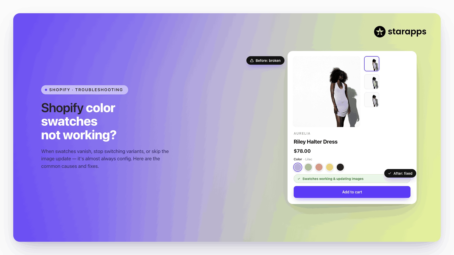
Color / Custom Swatches
Display hex colors or custom image thumbnails. This gives you flexibility across categories:
- Fashion → fabric textures
- Accessories → metal finishes
- Décor → wood grains and patterns
- Beauty → shade swatches
You can upload these values in bulk, which helps stores with large catalogs stay organized.
Dynamic Collection Swatches
Update product details in real time on collection pages. When a customer selects a swatch, the card updates:
- Product image
- Price
- Title
- Badges (e.g., “Sale,” “New,” “Low Stock”)
This reduces page visits and gives customers a clear view of options while scrolling.
Validate Options with Confirmation
Help shoppers avoid mistakes by asking them to confirm size, color, or style before adding the item to their cart. This feature improves order accuracy and reduces returns for products with sensitive sizing or minor visual variations.
Customize Out-of-Stock Variants
Give shoppers clear signals when variants are unavailable. You control how out-of-stock options appear:
- Crossed out
- Greyed out
- Striked through
- Hidden entirely
This prevents wasted clicks and improves the overall shopping flow.
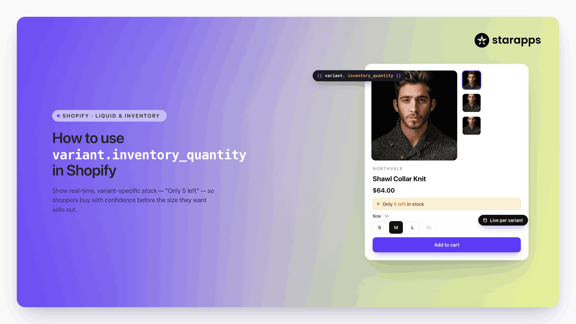
Show Low Stock Alert
Create timely urgency when inventory is running low. The app reads real variant stock and shows a subtle alert near the picker.
- Encourages faster decisions
- Helps customers understand availability
- Keeps pages clear with minimal UI clutter
You can position the alert using a simple app block.
Why Choose an App Instead of Manual Setup
Using an app is often the fastest and safest choice when you want:
- Automatic mapping of colors, images, and patterns
- Swatches on collection pages
- Variant previews with image and price changes
- Bulk uploads through CSV
- Consistent behavior across multiple themes
- Quick fixes without digging into code
- Direct support if something breaks
For stores with high traffic, broad variant ranges, or visual-heavy products, an app provides stable and scalable control.
Now that the methods for adding color swatches have been covered, the next step is to understand how to optimize them.
Strategies for Improving User Experience with Shopify Color Swatches
Color swatches shape how customers browse, compare, and buy. The design, structure, and performance of your swatches directly influence conversions, especially on mobile and during high-traffic periods. The strategies below help you build a fast, accurate, and user-friendly swatch system that works across product and collection pages.
1. Use Clear and Recognizable Color Names
- Customers scan fast. Keep names simple and easy to process.
- Use common names like Black, Olive, Charcoal.
- Skip long internal codes.
- Use tooltips if your brand names are unique.
- Clear labeling shortens the path to a choice.
2. Match Swatches to Real Product Colors
- Accuracy improves trust and reduces returns.
- Map hex codes directly from your product imagery or brand palette.
- Use image swatches for fabrics, metals, textures, and prints.
- Keep swatch image files small for faster rendering.
- Accurate swatches give customers confidence before they choose.
3. Keep Swatch Shapes and Sizes Consistent
- Inconsistent visuals create doubt. Standardization helps customers understand the interface quickly.
- Use one shape (circle or square) storewide.
- Keep all swatches the same size.
- Leave even spacing between each swatch.
- Predictability improves usability across the catalog.
4. Highlight Out-of-Stock Variants Clearly
- Customers should know availability without guessing.
- You can:
- grey out
- cross out
- lower opacity
- hide entirely
Choose one style and apply it consistently. (If you use Swatch King, you can control each state directly inside the app.)
5. Add Dynamic Swatches on Collection Pages
Let customers preview colors before opening a product page. This improves browsing speed and increases engagement.
- Ideal behavior includes:
- instant image updates
- real-time price updates
- updated product titles and badges
Dynamic collection swatches cut friction for high-SKU catalogs.
6. Keep the Mobile Experience Clean
Mobile shoppers tap first and read second. Make sure swatches are easy to use on small screens.
- Use horizontal scroll bars for long swatch lists.
- Keep tap areas large enough for thumbs.
- Reduce clutter by limiting the number of visible swatches if needed.
A clean mobile layout increases conversions.
7. Communicate Scarcity with Stock Alerts
- Low-stock alerts help customers act faster without feeling pressured.
- Display “Only 3 left” or similar messages near the swatch.
- Base alerts on real variant inventory.
- Keep the alert subtle to avoid clutter.
Swatch King includes a variant-level Low Stock Alert block for quick setup.
8. Link Swatches to the Correct Variant Images
- Swatches must always update the main image correctly.
- Assign the right image to every variant.
- Remove outdated or generic photos.
Use a tool like Variant Image Automator when managing large galleries. Accurate switching ensures a smooth journey from browse to buy.
9. Use Bulk Workflows for Large Catalogs
- Handling many variants requires structure.
- Build a color dictionary for consistent naming.
- Use CSVs to bulk-update swatch colors and image references.
- Maintain a JSON summary metafield for fast collection-page rendering.
Use Swatch King’s bulk upload to save hours of manual work. Structured data eliminates inconsistencies across products and seasons.
10. Optimize Performance for Faster Page Loads
- Visual elements add weight. A few small tweaks keep swatches fast.
- Keep image swatches small (under 20–30 KB).
- Use file metafields for patterns to avoid loading unnecessary assets.
- Limit the number of swatches shown on collection cards (4–6 is ideal).
- Precompute swatch summaries in a product-level JSON metafield.
- Lazy-load large images when possible.
Lightweight swatches protect page load times during peak traffic.
11. Improve UX with Accessible Interactions
- Accessibility ensures everyone can use your swatches comfortably.
- Add labels and tooltips for color names.
- Support keyboard navigation (Left/Right/Up/Down).
- Use aria-checked and role="radio" for custom swatch inputs.
- Keep contrast high for darker color variants.
These small adjustments improve usability across all devices.
12. Test Across Devices, Themes, and Page Builders
Before publishing, validate the experience:
- test variant switching
- test out-of-stock states
- check mobile tap targets
- compare color accuracy
- confirm speed on collection pages
- check for flicker or lag when switching images
Testing keeps your presentation polished and dependable.
13. Use an App When You Need Maximum Flexibility
Manual setups work, but apps scale better for large or fast-changing catalogs.
Apps like Swatch King help you:
- upload swatches in bulk
- display image swatches with pricing
- update collection cards dynamically
- confirm variant selections
- manage out-of-stock states
- show low stock alerts
- keep everything consistent across themes
This saves time, reduces errors, and delivers a smoother customer experience.
Conclusion
Color swatches help customers understand options faster and choose with more confidence. A clear setup supports better product discovery and reduces confusion across your store. You can use theme tools, custom code, or an app, depending on how many products you manage and how much visual detail you need.
If you want simple controls, bulk uploads, and steady performance across product and collection pages, Swatch King gives you a direct way to manage everything in one place. Set up once, keep it consistent, and help shoppers find the right variant without extra steps.
Try Swatch King and create a focused, clear shopping experience that supports every visitor.
FAQs
1. How can I set up swatches with custom color names that don’t follow standard color codes?
If using custom color names, add metafields to link each variant to a specific hex color or image. This method ensures that your store displays accurate swatches even for non-standard color names or brand-specific shades. Make sure the metafields are properly assigned to each variant for consistency across all products and pages.
2. Will adding swatches slow down my website?
Swatches, especially those with images, can impact site speed if not optimized properly. To avoid this, use small image files. Also, use lazy loading to ensure swatches do not delay initial page loading, especially on product and collection pages. By minimizing image file sizes and limiting visible swatches, you can reduce any performance issues.
3. Can I add custom images for texture or fabric swatches in Shopify?
Yes, you can use image-based swatches for textures or fabrics by uploading images through metafields, linking them to specific variants. This is especially useful for stores selling products like furniture, apparel, or accessories that require material or texture previews. By associating images with the correct variants, customers can see the texture or finish before selecting a product.
4. Why do some of my color swatches appear incorrectly on mobile devices?
Mobile display issues often happen due to the theme's responsiveness not resizing swatch elements correctly for smaller screens. Check your theme settings to ensure that the swatch elements are optimized for mobile screens and display properly. To enhance mobile functionality, adjust layout options and ensure swatch areas are large enough for easy tapping on mobile.
5. How do I manage color swatches across multiple Shopify themes?
Ensure that metafields for each product are consistent across all themes to maintain a uniform swatch display. You can also use apps that automatically sync your swatches across different themes, saving you from manual updates. By keeping metafields consistent and using syncing tools, you’ll reduce errors and improve the customer experience on all themes.
Heading

End-to-end traceability
To ensure regulatory compliance, you must have a complete overview of your products from production to shipping. Book a demo to see how Katana can give you full visibility of your operations.

.png)
.svg)
.svg)
.svg)
.png)