


Find out how to change variant picker color shopify using multiple methods, including CSS and apps. Make product options clearer, faster, and more appealing.
If you run a Shopify store with products available in multiple colors, sizes, or styles, your variant picker plays a bigger role than you might think. Baymard’s 2025 research shows that 42% of ecommerce sites don’t properly consolidate product variants, making color and size options harder to scan, especially on mobile.
A poorly designed picker can reduce visibility, create inconsistency across product pages, and slow down purchase decisions. For fashion, beauty, home décor, and electronics brands, unclear variant selection can quickly lead to missed sales opportunities.
Changing your Shopify variant picker color can make product options more noticeable, align the shopping experience with your brand identity, and help customers find the right variant faster. Whether you want to update colors through your Shopify theme settings, edit custom code, or create advanced color swatches, there are several ways to achieve the look and functionality you need.
In this article, we'll learn how to change the variant picker color in Shopify, explore different customization methods, create custom color swatches, and choose the best approach for your store.
Key Takeaways:
- Variant picker colors in Shopify influence how easily customers identify product options and interact with different variants like colors, sizes, and styles across product pages.
- There are multiple variant display formats such as color swatches, image swatches, buttons, and dropdown menus, each suited for different product types and catalog needs.
- Before making changes, it is important to review theme capabilities, create a backup, define brand color standards, and ensure mobile-friendly design performance.
- Shopify store owners can change variant picker colors using theme settings, custom CSS, Shopify apps, or advanced methods like metafields and custom logic depending on store complexity.
- Designing effective variant pickers requires focusing on visibility, brand consistency, accessibility, and clear distinction between selected and unavailable options to improve usability.
What is a Variant Picker Color in Shopify?
A variant picker is the interface customers use to select different versions of a product. Depending on your store's design, variant pickers can appear as color swatches, buttons, image swatches, or dropdown menus. The color and styling of these elements influence how easily customers can identify and select product options.
For example, if you sell a hoodie available in Black, Navy, Gray, and Olive, the variant picker allows customers to select their preferred color without navigating to separate product pages.
Brands like Nike and Allbirds use highly visual variant selectors to simplify product discovery and speed up customer decision-making.
Why Should You Customize Variant Picker Colors in Shopify?
Many Shopify themes include default variant picker styles that may not align with your branding or product catalog. While these defaults work for basic stores, growing brands often need more control over how variants are presented.
Customizing variant picker colors can help you:
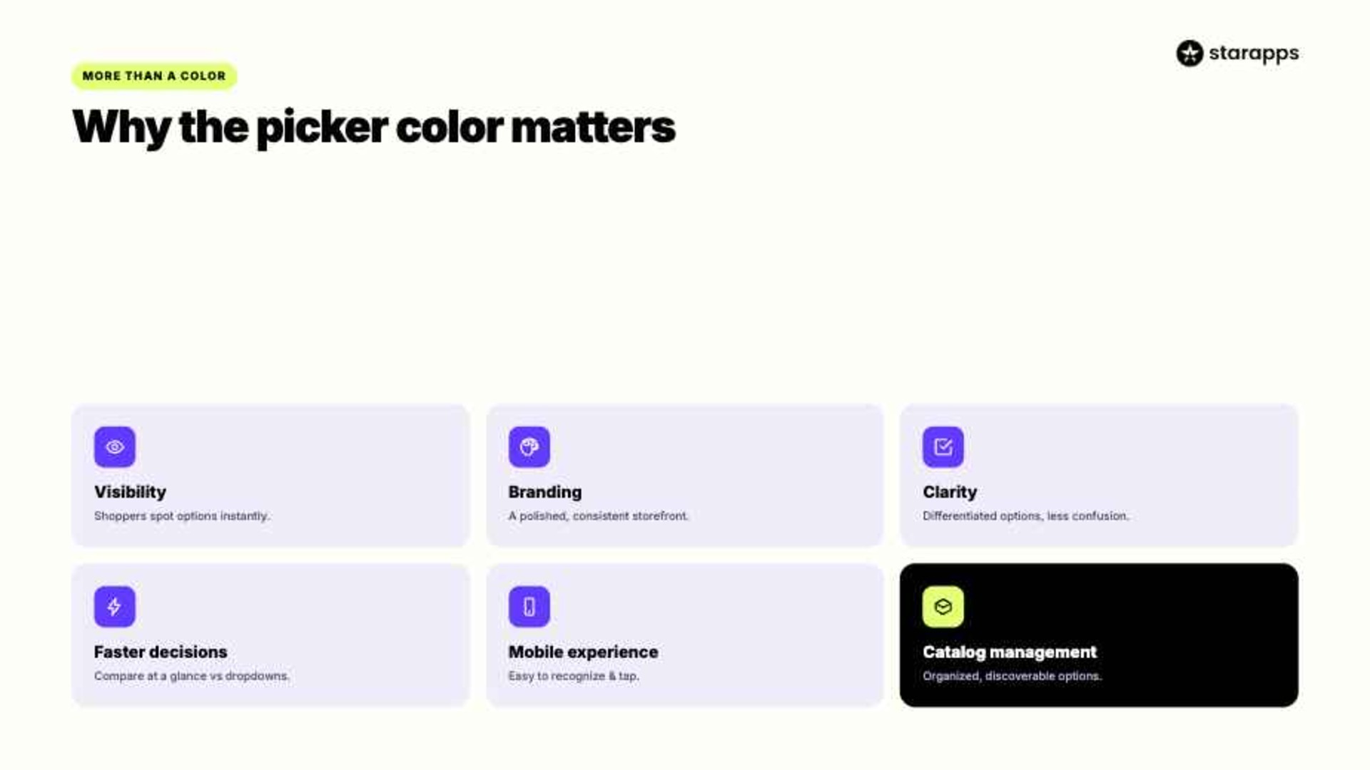
- Visibility: Color-based variant pickers help shoppers identify available options instantly. This is especially useful for products available in multiple colors, finishes, or patterns.
- Branding: Customized variant pickers create a more consistent visual experience. Matching swatch colors and styles with your brand helps your storefront look more polished and professional.
- Clarity: Clearly differentiated variant options reduce confusion during product selection. Customers can quickly understand their choices without relying solely on text labels.
- Faster Decisions: Visual swatches make comparing options easier than scrolling through dropdown menus. This can shorten the time customers spend deciding which variant to purchase.
- Mobile Experience: Well-designed color swatches are easier to recognize and tap on smaller screens. This improves usability for mobile shoppers and supports a smoother buying journey.
- Catalog Management: Stores with large numbers of variants can present options more efficiently. Visual selectors help keep product pages organized while improving variant discoverability.
Different Types of Variant Picker Color in Shopify
Modern Shopify themes support multiple ways of displaying variants. Each approach offers different levels of usability and visual appeal.
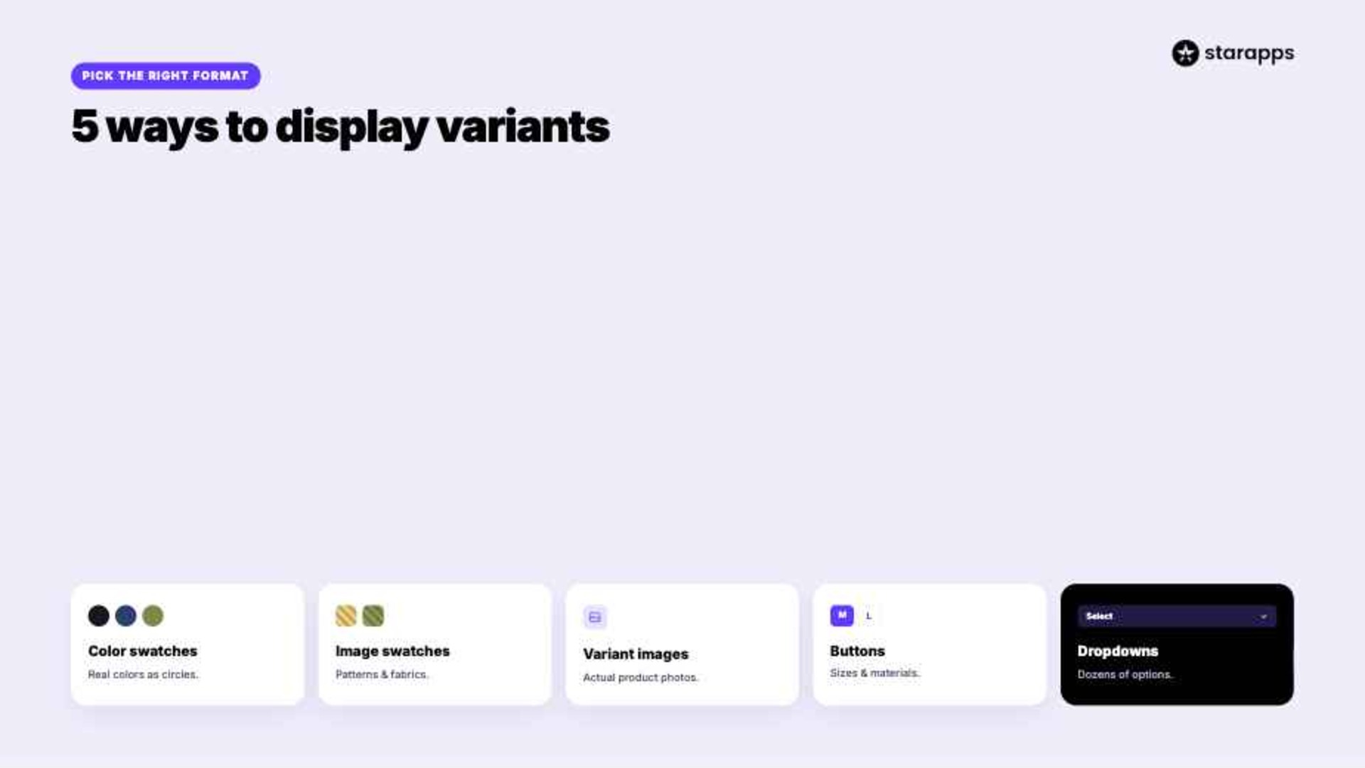
1. Color Swatches
Color swatches display actual colors as selectable circles or squares.
Example:
- Black
- White
- Navy Blue
- Olive Green
Customers can instantly identify options without reading text.
2. Image Swatches
Instead of solid colors, custom image swatches use uploaded images to represent variants.
This approach works well for:
- Patterns
- Fabrics
- Textures
- Printed products
3. Variant Image Swatches
Variant image swatches display actual product images linked to each variant.
Best for:
- Fashion products
- Home décor
- Luxury products
4. Button Pickers
Customers choose variants through labeled buttons.
Best for:
- Sizes
- Materials
- Subscription options
5. Dropdown Menus
Dropdown selectors conserve space and work well for products with many options.
Best for:
- Technical products
- Industrial equipment
- Products with dozens of variants
Each option serves a different purpose, so choosing the right format depends on your product catalog and how customers interact with your store.
Before You Change Variant Picker Colors in Shopify: Key Requirements
Before making changes, it helps to first understand how your Shopify theme handles variants. Different themes offer different levels of customization, and some adjustments may require basic technical handling.
Taking a few preparation steps can help prevent design issues and reduce rework later.
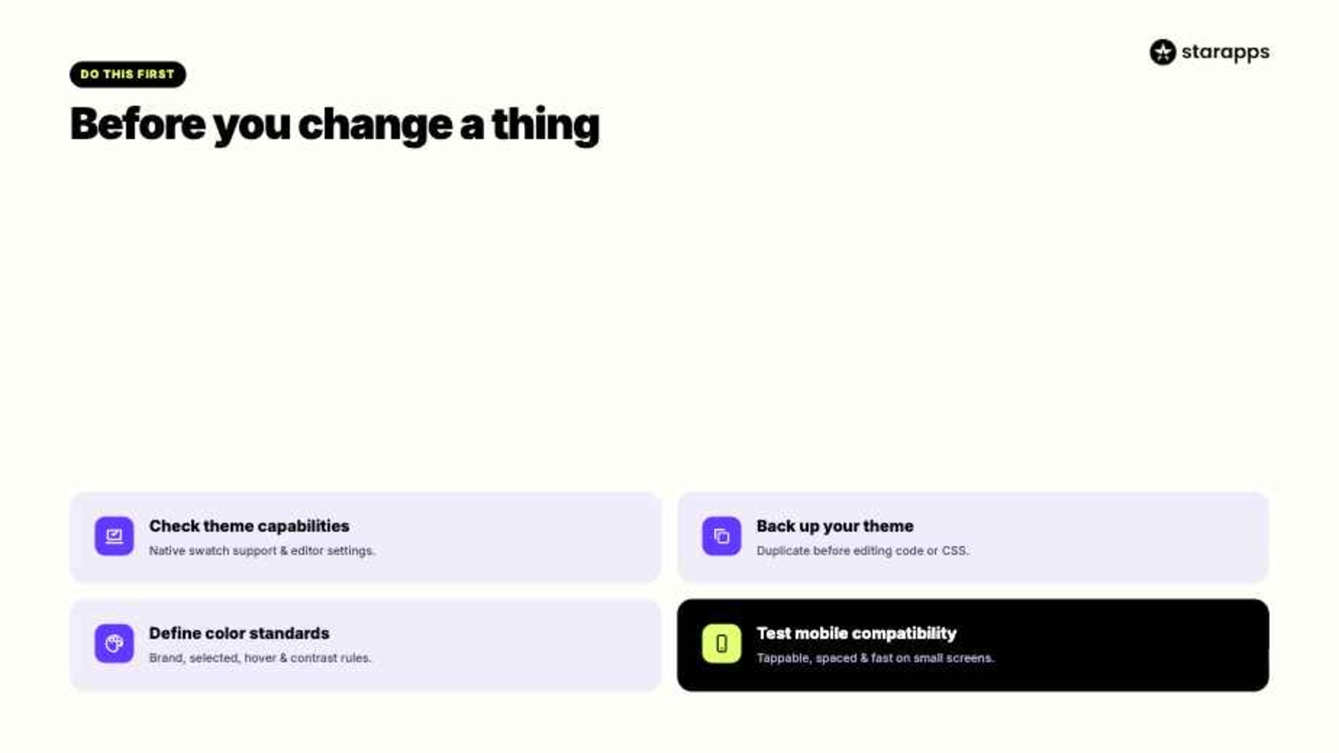
1. Check Your Shopify Theme Capabilities
Modern Shopify themes such as Dawn include built-in variant picker settings. However, not every theme provides direct control over swatch colors or styles.
Review your theme documentation to determine:
- Available variant picker options
- Native swatch support
- Theme editor customization settings
- Custom CSS support
2. Create a Theme Backup
Before editing theme files or CSS, duplicate your theme.
This allows you to:
- Restore previous settings if needed
- Test new styles safely
- Prevent accidental disruptions to your live store
A backup is particularly important when modifying code manually.
3. Define Your Color Standards
Many merchants customize variant pickers without considering brand consistency.
Before changing colors, establish:
- Primary brand colors
- Secondary accent colors
- Selected-state colors
- Hover-state colors
- Accessibility contrast requirements
Consistent design improves navigation and creates a more polished shopping experience.
4. Test Mobile Compatibility
A significant percentage of Shopify traffic comes from mobile devices.
Variant pickers should:
- Remain easy to tap
- Display clearly on smaller screens
- Maintain proper spacing
- Load quickly
Always test customization changes on both desktop and mobile devices.
Different Methods to Change Variant Picker Color in Shopify
There are several ways to customize variant picker colors in Shopify. The right approach depends on your theme, technical expertise, and store requirements.
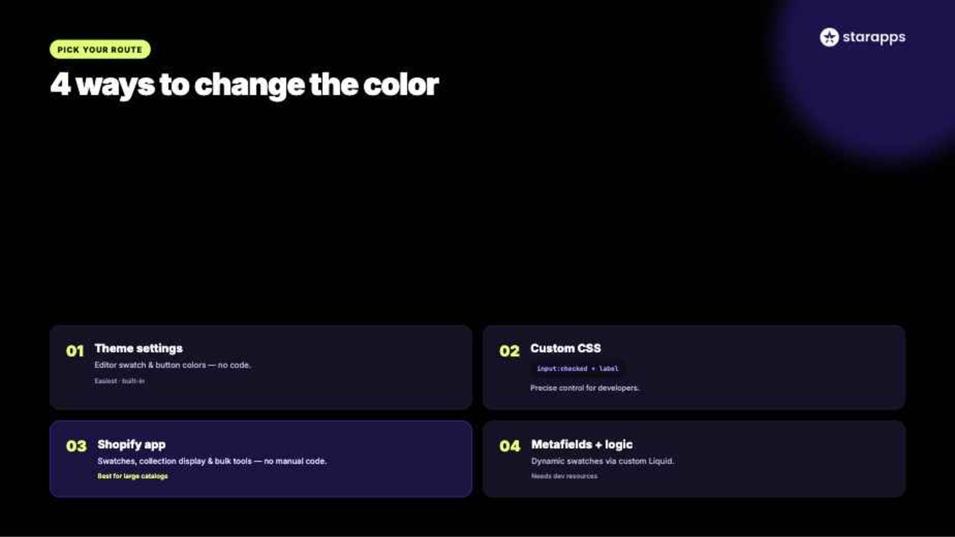
Method 1: Change Variant Picker Color Using Shopify Theme Settings
Many modern Shopify themes include built-in customization options.
To check available settings:
Step 1: Open Theme Editor
Navigate to:
Online Store → Themes → Customize
Step 2: Select a Product Template
Choose a product page where variant pickers are displayed.
Step 3: Locate Variant Settings
Depending on your theme, look for:
- Product Information
- Variant Picker
- Color Swatches
- Product Options
Step 4: Update Colors
Modify available settings such as:
- Button color
- Border color
- Selected variant color
- Hover effects
Step 5: Save and Preview
Review changes on desktop and mobile before publishing.
Method 2: Change Variant Picker Color Through CSS
If your theme does not provide enough customization options, CSS allows greater control.
This method is commonly used by developers who need precise design adjustments.
Step 1: Open Theme Code
Navigate to:
Online Store → Themes → Edit Code
Step 2: Locate Your CSS File
Common files include:
- base.css
- theme.css
- custom.css
Step 3: Identify Variant Picker Classes
Use browser developer tools to inspect variant elements.
Typical classes may include:
.product-form__input
.swatch
.variant-picker
Step 4: Add Custom Styling
Example:
.variant-picker input:checked + label {
border: 2px solid #000;
background-color: #f5f5f5;
}
Step 5: Test Thoroughly
Verify appearance across:
- Desktop
- Tablet
- Mobile
- Different browsers
Method 3: Use a Shopify Variant App
For stores with large catalogs or complex variant requirements, apps often provide a more practical option.
This approach reduces manual work while offering better control over swatches and variant display setup.
Apps can provide:
- Color swatches
- Image swatches
- Collection page swatches
- Automated variant displays
- Variant-specific merchandising tools
For merchants researching how to change variant picker color Shopify, apps can help address many of the limitations tied to theme settings and custom code setups.
Method 4: Use Metafields and Custom Variant Logic
Some Shopify stores require highly customized variant experiences.
Developers may use:
- Shopify metafields
- Custom Liquid code
- Dynamic swatch generation
This method offers flexibility but is generally better suited to stores with access to development resources or in-house technical support.
If managing variant colors across dozens or hundreds of products feels time-consuming, consider using a specialized Shopify variant app that centralizes swatch management and reduces manual updates.
How to Create Custom Color Swatches for Unique Brand Colors
Some brands use signature colors that cannot be represented accurately through Shopify's default settings. Custom swatches help create a more recognizable and consistent storefront experience.
Step 1: Identify Variant Attributes
Start by reviewing your product catalog.
Common color-related attributes include:
- Product color
- Finish
- Material
- Pattern
Examples:
- Sage Green
- Midnight Navy
- Sandstone Beige
- Rose Gold
These unique colors often require custom swatches rather than standard Shopify color settings.
Step 2: Create Swatch Assets
You can create swatches using:
- Solid color samples
- Pattern textures
- Product images
- Brand-approved color graphics
Many retailers design swatches using tools such as Adobe Illustrator or Canva.
Step 3: Assign Swatches to Variants
After creating assets, connect them to corresponding variants.
Depending on your setup, this may involve:
- Theme settings
- Variant apps
- Metafields
- Product option configurations
The goal is to ensure customers immediately recognize each variant option.
Step 4: Optimize Swatch Visibility
Swatches should be:
- Large enough to tap on mobile
- Clearly labeled
- Visually distinct
- Consistent across product pages
Poorly designed swatches can create confusion rather than improve usability.
Step 5: Monitor Customer Behavior
After implementing custom swatches, track metrics such as:
- Add-to-cart rate
- Product page engagement
- Bounce rate
- Variant selection frequency
These insights help determine whether your swatch strategy is improving the shopping experience.
Real-World Example: Zara uses visual color selection extensively throughout its product catalog. Rather than forcing customers to read color names, the brand presents visual options directly on product pages. This reduces decision-making time and improves browsing efficiency.
Best Practices for Shopify Variant Picker Color Design
Changing variant picker colors is only part of the process. The design should also support usability, accessibility, and conversion goals.
The following best practices help create a better customer experience.
Prioritize Visibility
Selected options should stand out immediately.
Use:
- Borders
- Checkmarks
- Highlight states
Customers should never wonder which option is active.
Maintain Brand Consistency
Variant pickers should align with:
- Store colors
- Product imagery
- Overall design system
Consistency creates a more professional experience.
Hide or Distinguish Unavailable Variants
Showing unavailable variants can help customers understand inventory options.
However, clearly indicate unavailable choices using:
- Strikethrough styling
- Reduced opacity
- Disabled states
Optimize for Mobile Shopping
Mobile shoppers interact differently than desktop users.
Best practices include:
- Larger touch targets
- Adequate spacing
- Simplified layouts
- Fast-loading swatches
Mobile optimization directly supports conversion performance.
Consider Accessibility Requirements
Accessible variant pickers help all customers navigate your store.
Recommendations:
- Maintain sufficient contrast
- Avoid relying solely on color
- Include descriptive labels
- Support screen readers where possible
Accessibility improvements often benefit overall usability as well.
Enhance Shopify Variant Picker Color with StarApps Studio Solutions

As your product catalog grows, manually managing variant presentation becomes more difficult. Stores with hundreds or thousands of SKUs often need a more scalable approach.
StarApps Studio offers Shopify apps used by 25,000+ active merchants, including 1,000+ Shopify Plus stores, with a 4.9★ rating, helping brands streamline product display, variant management, and storefront UX.
Color Swatch King: Variants
- Visual Swatches: Replaces dropdowns with color, image, and button swatches so customers can compare variants instantly without extra clicks.
- Collection Display: Shows variant options on collection pages, helping shoppers evaluate products earlier in the browsing journey.
- Bulk Management: Enables CSV uploads and automated swatch generation, making it easier to manage large product catalogs at scale.
Variant Image Automator
- Auto Image Mapping: Automatically assigns images to variants, removing the need for manual tagging and reducing setup time.
- Clean Galleries: Displays only relevant images for the selected variant, keeping product pages focused and easy to browse.
- Rich Media Support: Supports multiple images, videos, and zoom features for a more detailed product viewing experience.
SA Variants: Combined Listings
- Variant Listings: Splits variants into individual listings so each color or style becomes discoverable from search and collection pages.
- SEO Optimization: Creates unique URLs, titles, and descriptions for each variant, improving indexing and organic visibility.
- Better Filtering: Enhances search and filter accuracy, helping customers find exact product variants faster.
Variant Alt Text King: SEO
- Automated ALT Text: Generates optimized ALT text using product and variant attributes without manual effort.
- Daily Sync: Continuously updates ALT text as new products and images are added to the store.
- SEO & Accessibility: Improves image search visibility while supporting ADA and WCAG accessibility standards.
Variant Title King: Color, SKU
- Dynamic Titles: Updates product titles based on selected variants such as color, SKU, or product type.
- Custom Templates: Allows merchants to define title formats using variables like vendor, color, or SKU.
- Inventory Clarity: Helps teams track and manage products more easily across large catalogs.
Variant Descriptions King
- Variant-Specific Content: Displays detailed information like size charts, materials, and care instructions for each variant.
- Organized Layouts: Uses tabs and accordions to keep product pages clean while presenting rich information.
- Improved Confidence: Helps customers make informed decisions, reducing uncertainty and potential returns.
Conclusion
Customizing variant picker colors is a practical way to improve product presentation and simplify the buying process. Whether you're using built-in Shopify settings, custom CSS, metafields, or dedicated apps, the right approach depends on your store's complexity and merchandising goals.
As you customize your storefront, focus on usability, visual consistency, and performance. Clear color swatches, organized variant displays, and relevant product imagery all contribute to a smoother buying experience.
Looking for a more scalable way to manage variant colors and product options? Explore StarApps Studio's Shopify apps to create a clearer, more engaging shopping experience for your customers.
FAQs
1. What CSS selector should I use to target radio button (pill) style variant pickers in Shopify themes like Dawn?
In Shopify themes like Dawn, you typically target variant radio (pill) pickers using selectors such as .product-form__input input[type="radio"] + label, .variant-radios, or .product-form__input label. These control pill-style option appearance and interaction states across product pages.
2. How do I change the hover and active/selected state colors of variant picker options?
To change hover and selected colors, use CSS pseudo-classes like: hover, checked + label, and .selected states. Override background-color, border-color, and text color for labels in variant pickers. Ensure specificity matches theme styles for consistent behavior.
3. Which Liquid files or sections control the markup for the variant picker if I need deeper customization?
Key Liquid files include sections/main-product.liquid, snippets/variant-radios.liquid, and snippets/variant-selects.liquid in Dawn. These control variant picker markup and structure. Editing them allows deeper customization of layout, option rendering, and how product variant inputs are generated.
4. How do I reset the variant picker color back to the theme default if my custom CSS breaks the design?
To reset variant picker colors, remove or comment out custom CSS overrides in theme files or a custom stylesheet. Revert changes in base.css, ensure no !important rules remain, or restore a theme backup/version from Shopify theme history.
5. How do I document and organize my CSS changes for variant picker colors for future updates?
To document CSS changes, keep a dedicated custom stylesheet, add clear comments for each variant picker rule, and maintain version notes. Using structured naming conventions or a changelog helps future updates and prevents conflicts during theme upgrades.
Heading

End-to-end traceability
To ensure regulatory compliance, you must have a complete overview of your products from production to shipping. Book a demo to see how Katana can give you full visibility of your operations.
.png)

.svg)

.svg)

.svg)
.png)