
Boost UX with color swatches in Shopify. Confirm theme compatibility, customize with the theme editor, and enhance branding. Get started now!
Between 62% and 90% of a product's first impressions are determined by its colors. But if those color choices are buried in dropdowns or hidden behind vague labels, that first impression gets lost, and so does the sale.
Color swatches fix that by making variant options instantly visible and easy to compare. They let customers see exactly what they're getting, reduce friction in the buying process, and keep product pages clean, especially on mobile.
In this guide, you'll learn how to add color swatches to your Shopify store using supported themes, custom metafields, manual coding, and powerful third-party apps.
What Are Color Swatches in Shopify?
Color swatches are clickable visual selectors that let customers choose a product variant, typically color, by looking at a block, dot, or thumbnail instead of reading a dropdown label.
Instead of showing a dropdown with text like "Red," "Blue," or "Green," swatches display small colored circles or squares directly on the product page. Some stores also use pattern swatches, fabric textures, or custom image thumbnails to represent styles or finishes visually.
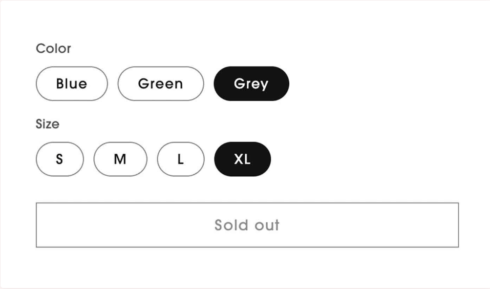
Example 1:
This is a more common theme-native setup. The color name is shown inside a button, and the styling depends on matching standard color names.
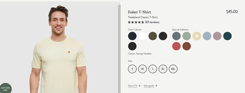
Example 2:
In the image below, the product offers a mix of Core Colours and Special Editions through swatches. Each color circle represents a variant. When a swatch like "Sunray Heather" is clicked, the main product image updates to reflect the selected color:
Swatches are particularly effective for fashion, cosmetics, and décor items where visual differences matter more than text labels. Swatches change how customers interact with your product listings. The shift from dropdowns to visuals has a direct impact on how people browse, choose, and buy.
Benefits of Using Color Swatches
Shopify color swatches come with several advantages. Here are some of the main benefits of using them:
- Makes options easier to scan: Customers can take in all available colors at a glance. They don't have to open a menu or read through names—they just see what's available and pick what they like.
- Speeds up product selection: With dropdowns, buyers have to read, select, and wait for an update. With swatches, a single click shows the matching image. This cuts down hesitation and keeps the buying process moving.
- Reduces the chance of confusion: Color names aren't always clear. "Ash," "Stone," or "Mint" might mean different things to different people. A swatch shows exactly what they'll get.
- Helps on mobile: Small screens make dropdowns harder to use. Swatches are more thumb-friendly and give mobile users better control without extra taps.
- Looks more professional: Shoppers expect a modern shopping experience. Swatches give the storefront a clean, product-focused layout that looks more polished than a plain dropdown.
Swatches clearly improve the way products are shown but Shopify doesn't make them automatic. Whether you can use them right away depends on your chosen theme and what kind of swatches you want to display.
Does Shopify Support Color Swatches by Default?
Shopify doesn't offer full color swatch support out of the box. By default, variant options like color or size appear as drop-down menus. If you want clickable color blocks instead, it depends on the theme you're using.
Some themes, like Dawn, Ride, or Sense, offer limited native support. They can automatically convert color variant names like "Red," "Black," or "Olive" into simple color swatches only if the name matches a standard CSS color. This is called native color mapping, and it has clear limits.
Limitations of Shopify's Native Color Swatches:
- No support for hex codes or custom colors: If you use a variant name like "Sunset Red" or define colors by hex (#cc4422), Shopify won't recognize it.
- No pattern or texture options: You can't display fabric swatches, wood grains, or patterned styles using native tools.
- No fallback or error handling: If a color isn't recognized, the theme may skip the swatch or show it as a blank circle.
- No tooltip or hover labels: Most native swatch setups don't show the color name when hovered, making it harder for users to identify certain tones.
- No image switching or advanced linking: Native swatches don't link directly to variant images unless your theme supports that separately.
To go beyond these basics, like using icons, handling multi-option products, or showing swatches on collection pages, you'll need to use code or install a dedicated app.
Most store owners want swatches, but not everyone gets them by default. Depending on your theme and setup, you'll need to take a few extra steps to get them working.
How to Add Color Swatches in Shopify (3 Methods)
There's no one-size-fits-all solution for color swatches in Shopify. Some themes support them out of the box, others need manual setup, and many store owners prefer apps for more flexibility. Below are the four main ways to add color swatches to your store—choose the method that fits your needs, skills, and theme.
1. Theme-Based Swatch Settings
Some Shopify 2.0 themes come with built-in swatch support. If you're using a theme like Dawn, Ride, Craft, or Sense, you can enable color swatches without touching any code.
These themes automatically create swatches based on the name of the color option. For example, if your variant is named "Red," the theme will generate a red circle. But this only works with standard CSS color names like "Black," "Green," "Olive," etc.
To enable this:
- Go to Online Store > Themes > Customize.
- Open a product page template.
- Select the product variant block.
- Make sure the variant picker is set to "Buttons" instead of dropdowns.
- If the variant name matches a recognized color, the swatch will appear.
If your color names are custom, like "Sunray Heather" or "Sky 2," Shopify won't generate the swatch automatically. You can use category meta fields to define custom swatch colors or images for those variants.
Adding Category Metafields for Color Swatches
If you're using a theme that supports dynamic sources (like Dawn), you can create color swatches using category metafields. This method allows you to map custom hex codes or image files to specific variant options—useful when color names aren't standard CSS colors.
Steps to set it up:
- Add a Product Category
- Go to Products > Select a product.
- Under the product details, find Category and assign a category like Shirt or T-Shirt.
- This links the product to Shopify's category-based metafield system.
- Add and Edit Entries for Your Category Metafields
- Go to Settings > Custom data > Categories.
- Select your assigned category (e.g., T-Shirt).
- Add a new metafield definition for Color (set type to Color or File).
- Create preset values (like "Sunray Heather") and link them to a hex code or swatch image.
- Connect Your Category Metafields to Variant Options
- Go back to Products, and select the same product.
- Scroll to the variant section, and use dynamic source binding to link the variant color option to the metafield entry.
- If your theme supports it, the storefront will now display swatches based on this linked value.
This method is especially useful for stores with custom color names or non-standard labels. It keeps swatches consistent across products using the same category.
In some cases, a color code isn't enough, especially when the variant represents a fabric, texture, or print. That's where image-based swatches come in.
Using Images as Swatches
If your product variants use textures, prints, or finishes instead of plain colors, you can assign image files as swatches using category metafields. Here's how to set it up:
1. Create a File-Type Metafield
- Go to Settings > Custom Data > Categories
- Select your category (e.g., "Shirt")
- Add a new metafield definition (e.g., "Swatch Image")
- Set the content type to File so you can upload an image
2. Upload Swatch Images
- Go to Settings > Files
- Upload small thumbnails for each swatch (e.g., fabric-denim.png, pattern-floral.jpg)
3. Link Swatch Images to Variant Values
- Go to Products > Product Name > Variants
- For each variant, assign the correct swatch image using the metafield you created
Themes like Dawn will use this image automatically if configured to display swatches from dynamic sources. This is useful for products where visual texture or print matters more than a basic color block.
Theme support only goes so far. If your theme doesn't handle swatches the way you need, or you want more control over how they look and behave, you can add them manually using Liquid, JS, and CSS.
2. Manual Swatch Coding Using Liquid, JavaScript, and CSS
If your theme doesn't support swatches by default, you can create your own using Liquid, JavaScript, and CSS, just like Shopify's Dawn theme. This method is built into Dawn v13 and can be reused or adapted in custom themes.
1. Section Settings
In main-product.liquid, Dawn provides schema settings where merchants can choose how swatches are displayed. The available styles include:
- Swatch only
- Dropdown with swatch
- Options without swatches
Merchants can also choose the swatch shape, either circle or square. This may differ in your custom theme.
2. Variant Picker and Options
The product-variant-picker snippet handles the logic for displaying swatches, buttons, or dropdowns. The code below checks whether the current variant values have swatches and adjusts the display type based on what's available and the selected theme settings:
Inside the fieldset, Dawn renders the product-variant-options snippet. This snippet handles how each variant option (swatch, button, or dropdown) is displayed.
This logic checks whether the swatch is an image or a color and generates the correct display value for it.
3. Rendering Swatches
Dawn separates swatch rendering into two parts:
- swatch-input.liquid: The input radio button and label
- swatch.liquid: The visual block showing the color or image
In swatch-input.liquid, the label includes the swatch's shape (square or circle), a tooltip with the color name, and a hidden span for accessibility:
The swatch.liquid file handles how the swatch looks:
If there's a valid swatch value, it sets the background color or image. If not, it shows the swatch as unavailable.
4. Expanded JavaScript
Dawn's global.js file includes a function called updateSelectedSwatchValue({ target }). It updates the selected swatch display when the customer picks a new variant. This function is triggered inside the existing onVariantChange(event) handler and changes either the swatch background or label content based on the selected option.
You can model your own implementation on this logic, but be sure to handle edge cases like unavailable variants or missing swatches.
5. New CSS
Dawn also includes dedicated CSS files (component-swatch-input.css and component-swatch.css) for styling swatches. These styles handle:
- Shape (e.g., 50% border-radius for circles)
- Hover and focus states
- Visual cues for sold-out variants (e.g., crossed-out overlay)
You can build on these rules in your own theme to provide clear feedback when variants are unavailable or selected. This method gives full control over how swatches appear and behave. It requires editing theme code but offers the same flexibility as Shopify's default themes.
If you don't want to edit code or your theme doesn't support metafields the way you need, using an app is often the simplest option.
3. Using a Shopify App
Shopify apps make it easy to add and manage swatches—no coding required. Many apps offer features beyond what themes can do, like auto-generating swatches from product images, showing swatches on collection pages, or linking multiple product listings under the same style.
These tools are especially useful for larger catalogs, stores with frequent updates, or merchants who want more control over swatch behavior without having to build it themselves.
Color Swatch King by StarApps Studio
Color Swatch King offers a complete app-based solution for store owners who want full swatch control without touching code. Built by StarApps Studio, it lets you display variant swatches using color blocks, custom icons, or variant images across both product and collection pages.
This app is ideal for Shopify stores with large catalogs, grouped products, or a need for quick visual comparison. It also supports B2B workflows, Shopify Markets, and collection-level variant previews, all directly inside the Shopify admin.
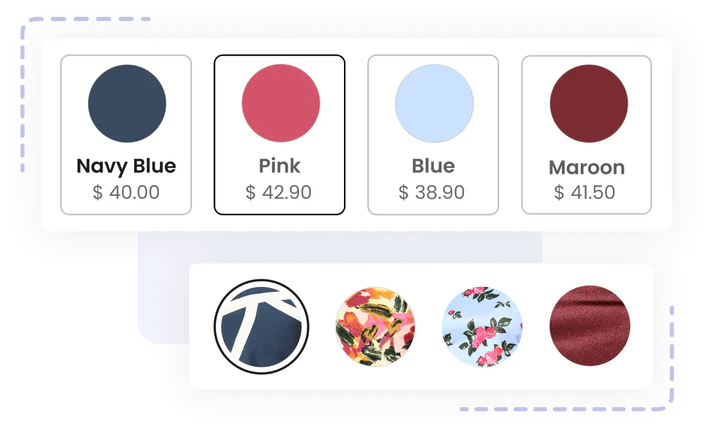
Variant Image Swatches with Price

Let customers compare variants instantly with swatches that show both images and prices. This setup simplifies the buying journey and speeds up decision-making on the product page.
Color & Custom Image Swatches
Choose from hex colors, uploaded images, or fabric patterns to represent each variant visually. This works well for fashion, textures, and other detail-heavy products.
Dynamic Collection Swatches

Let shoppers preview variant options like colors or sizes directly from collection pages. When a swatch is clicked, the product image, price, and availability update instantly.
Out-of-Stock Variant Handling

You can control how unavailable variants are displayed. You can grey them out, add a strike-through, or hide them entirely, making it easier for customers to focus on what's in stock.
Extensive Style Library
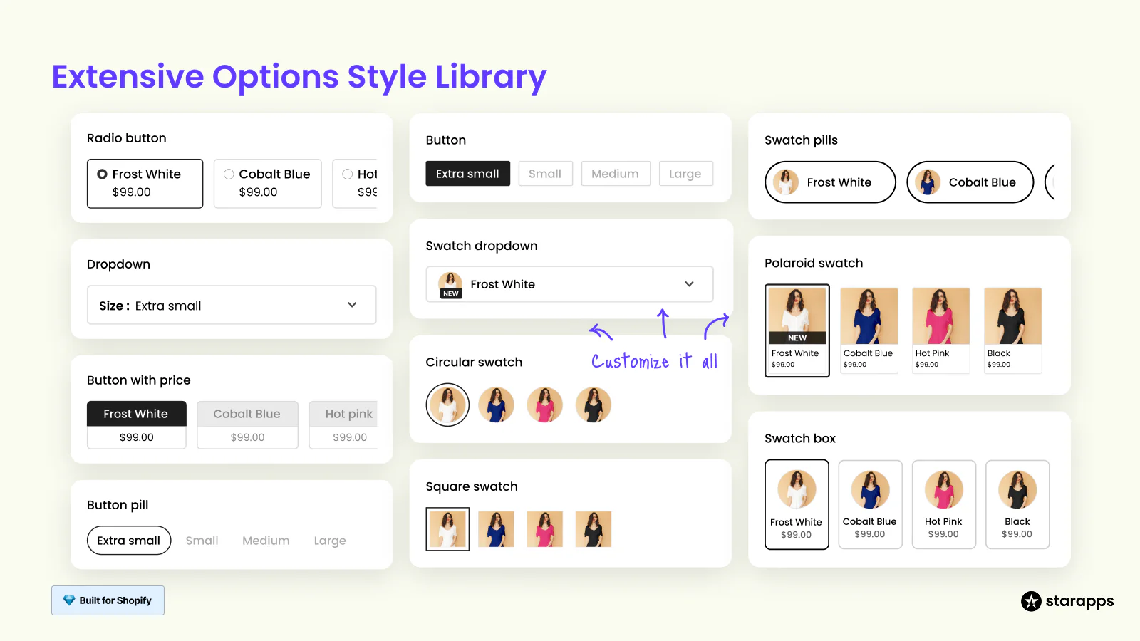
Choose from dropdowns, circles, squares, buttons, pills, and more. Swatch King gives you full flexibility to match your store's branding and product type.
Bring visual clarity and speed to your storefront with Color Swatch King: Variants by StarApps. From image-based swatches to real-time updates on collection pages, everything is built to help shoppers choose faster and buy with confidence.
Best Practices for Shopify Color Swatches
A well-structured swatch setup helps customers understand their options faster, especially when browsing on mobile or comparing multiple variants. Here are some key practices to follow:
Use Recognizable Color Labels
Stick to clear, common names like "Red" or "Charcoal Grey." Avoid product codes unless you're pairing them with a visual swatch or tooltip.
Match the Swatch Appearance to the Real Product
Swatches should reflect the actual variant, whether it's a flat color, texture, or fabric pattern. Use hex values or metafield-linked images to maintain accuracy.
Keep Shapes and Sizes Consistent
Swatches should maintain the same shape (circle or square), size, and spacing across all listings. Inconsistent layouts cause hesitation, especially when viewing multiple products.
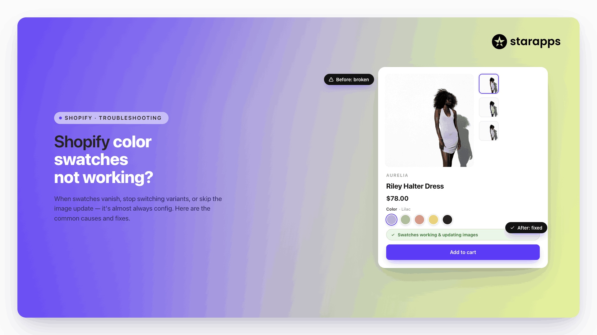
Use Visual Cues for Out-of-Stock Variants
Unavailable options should be visibly dimmed or crossed out, but still shown, so customers know what exists and what's currently unavailable.
Optimize Swatches for Mobile
On mobile, displaying swatches in a horizontally scrollable container helps conserve vertical space while keeping all options visible. It prevents clutter and allows for fast selection without overloading the product layout.
Even with a solid setup, things can go wrong, especially if swatches are added across multiple products, apps, or custom code. Here are some of the most common issues and how to fix them quickly
Common Issues and Fixes
Swatches are a visual upgrade, but they can break if the setup is incomplete or inconsistent. Here are some frequent issues and how to resolve them:
Swatches Not Appearing
- Confirm your theme supports swatches
- Check if variant names match valid color names or linked metafields
- For custom themes, verify that the swatch rendering logic is in place
Swatches Not Updating the Product Image
- Make sure variant images are assigned in the product editor
- If using an app, enable image switch on variant selection
- Check for JavaScript conflicts from other apps or custom code
Inconsistent Swatch Styling
- Review global CSS or app styling settings
- Avoid mixing circle and square swatches across different products unless intentional
- Use a shared swatch style library for consistency
Swatches Not Showing on Collection Pages
- Many themes don't support this by default—use a swatch app that includes collection-level swatches
- Ensure the feature is enabled in the app dashboard
Conclusion
Swatches aren't just a design upgrade—they directly shape how customers experience your products. Whether you're using theme support, metafields, manual coding, or a dedicated app like Color Swatch King, a well-implemented swatch system helps reduce friction, improve product clarity, and guide faster buying decisions.
Choose the method that fits your store's needs. For most merchants, a no-code app offers the best balance of control and ease. For developers, manual coding or metafield strategies offer deeper customization.
Ready to upgrade your variant experience? Try Color Swatch King: Variants by StarApps and start building smarter, faster storefronts, no code required.
FAQ
1. Can I add color swatches without using an app?
Yes, if you're using a supported Shopify 2.0 theme like Dawn, you can enable swatches through the theme editor. For more control or advanced styling, metafields or custom code are required.
2. What if my color names are custom or brand-specific?
You can use category metafields to link custom color names to specific hex values or image swatches. This keeps your branding intact while still delivering a clear visual selector.
3. Do swatches work on mobile devices?
Yes, but design matters. Use horizontally scrollable swatch containers to avoid clutter and keep the variant selector usable on smaller screens.
4. Can I display swatches on collection pages?
Not all themes support this by default. If you need swatches under product thumbnails in collections, use an app like Color Swatch King that supports this feature.
5. How do I make sure swatches match the product image?
Assign a unique image to each variant in Shopify's product editor, and make sure your theme or app is configured to switch the image when a swatch is selected.
Heading

End-to-end traceability
To ensure regulatory compliance, you must have a complete overview of your products from production to shipping. Book a demo to see how Katana can give you full visibility of your operations.

.png)
.svg)
.svg)
.svg)
.png)