
Optimize your Shopify store with alt text for color variant circles. Ensure accessibility, match text to variant names, and test for accuracy. Buy now!
Shopify makes it easy to add alt text to product images, but not to color variant swatches. If your store uses image-based color swatches, those image elements often skip alt text entirely. That creates a gap in both accessibility and SEO.
This guide explains why alt text matters for color swatches, how Shopify handles it (or doesn’t), and what you can do to fix it, whether through custom code or apps. You’ll learn how to ensure your swatches are readable by screen readers and indexable by search engines, without compromising the design or shopping experience.
TL;DR
- Shopify color swatches are often rendered as <ul> or <div> elements, not images—so you can’t add alt text directly like you can for product photos.
- There’s no native support for accessible swatch labeling out of the box; screen readers and search engines often skip them.
- You can improve accessibility by editing your theme’s HTML/CSS to add aria-labels or aria-hidden attributes.
- For SEO and user clarity, consider rendering swatches as labeled images or using tools that link variant images to swatches.
What Are Color Swatches in Shopify?
Color swatches are visual elements that allow customers to choose a product variant, typically color, by clicking on a small box, button, or image. Instead of selecting from a dropdown menu, users can quickly see and pick options like “Red,” “Navy Blue,” or “Olive Green” using intuitive visual cues.
Shopify themes typically generate swatches in one of three ways:
- Solid color boxes created using CSS (e.g., background-color styles)
- Image-based swatches (like fabric textures or thumbnails of the product)
- Third-party app-generated swatches with advanced configuration
Swatches are popular because they streamline the buying experience and help customers preview different variants visually. They can also trigger dynamic updates on the product page, such as displaying the correct size, price, or variant-specific description based on the selected swatch.
Here’s a real-world example from Allbirds showing how visually styled color swatches are presented alongside variant names, demonstrating how accessible design can enhance both aesthetics and usability:

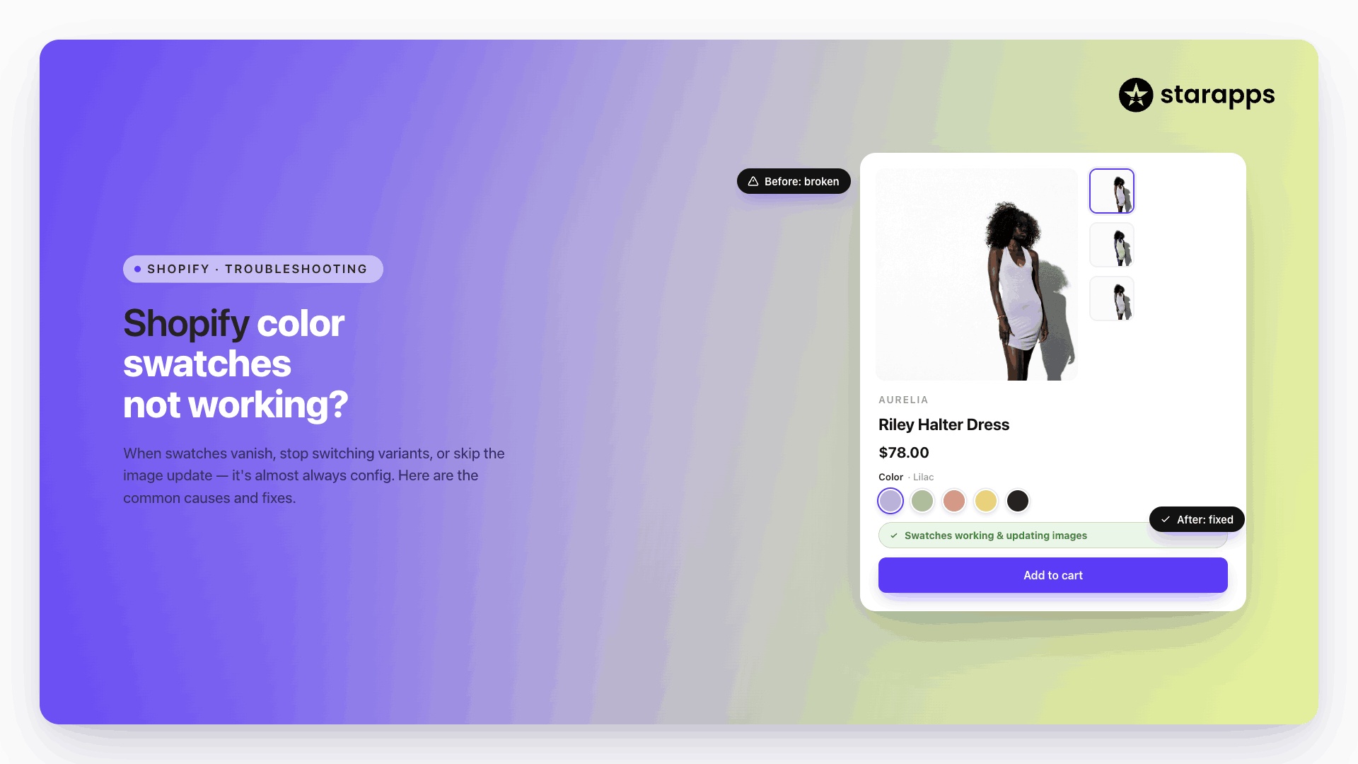
Here’s another approach from Starapps's demo store, this time using variant images as swatches. This method not only enhances accessibility with visual cues and labels but also helps shoppers preview product variations at a glance:

However, these elements are often designed purely for sighted users, which creates a gap in accessibility and usability for others.
Why Adding Alt Text to Color Swatches Matters
Alt text (alternative text) plays a crucial role in web accessibility. It provides a text-based description of visual elements so users relying on screen readers can understand what’s being displayed. For e-commerce, this isn’t just about compliance; it directly improves user experience (UX), supports WCAG accessibility standards, and helps search engines interpret images for SEO.
Shopify natively supports alt text for product images and variant images. When you upload an image, you can assign alt text that describes what the image shows, like “Black cotton hoodie, side view.” This helps both visually impaired users and Google understand your content.
But when it comes to color swatches, the rules change.
Swatches are typically custom UI elements, either styled HTML buttons, <div> blocks with background colors, or small images rendered by third-party apps. And while many of these swatches are image-based, Shopify does not automatically assign or require alt text for them.
This creates two major problems:
- Screen readers can’t interpret swatches without labels, making variant selection inaccessible.
- Search engines may ignore unlabeled swatch images, weakening long-tail SEO for variant-specific keywords like “Olive Green Backpack” or “Red Medium T-Shirt.”
To complicate things further, most swatches are powered by third-party apps or custom theme code, which often focus on visual design, not accessibility. If those swatches are rendered as images and lack alt text, you’re missing a key opportunity to serve users and improve performance.
That said, there are still workable alternatives that allow you to replicate the same function. With a few adjustments to your theme code or by choosing the right rendering method, you can make your color swatches accessible to screen readers and search engines alike.
How to Add Alt Text for Color Variant Swatches
Below are three ways to make your swatches screen reader–friendly and SEO-aware, depending on how your swatches are implemented (button elements, image tags, or styled <div>s).
1. Add aria-label to swatch buttons
If your swatches are built using <button> or <div> elements styled with background colors, you can add an aria-label to each swatch.
Where to apply: Inside your theme’s product template or swatch loop, wherever swatch buttons are rendered.
html
<button class="swatch" aria-label="Color: Navy Blue"></button>
Best for: CSS-based swatches (background-colour)
2. Use <img> tags with alt attributes
If your theme or app uses swatch images (like tiny thumbnails), make sure the <img> tag includes a descriptive alt text.
Where to apply: In your product option rendering logic, especially if you're looping through variant images.
html
<img src="swatch-navy.png" alt="Navy Blue">
Best for: Image-based swatches
3. Add hidden text with sr-only
If you’re working with custom HTML or CSS-only swatches and can’t modify the markup directly, you can inject visually hidden text using a span and an .sr-only class.
Where to apply: Inside or alongside each swatch wrapper in your theme or app’s liquid code.
html
<span class="sr-only">Color: Forest Green</span>
Best for: Static CSS swatches or complex UI components
Each of these approaches can improve accessibility if applied correctly within your theme or app’s codebase. If you're using a custom theme, you'll typically add these directly into your product.liquid or product-card.liquid templates. For third-party swatch apps, implementation depends on whether the app allows HTML overrides or custom attributes.
But these solutions have limits. Not all themes offer full control over swatch rendering, and not all apps expose their markup for editing.
Let’s explore some alternative ways to make swatches accessible even when direct code changes aren’t feasible.
Alternatives to Improve Swatch Accessibility (Without Editing Code)
If your theme or app doesn’t let you access or modify the underlying swatch markup, there are still practical ways to make variant swatches more accessible:
- Add visible text labels near swatches: Show the color or variant name just below or beside the swatch (e.g., "Olive Green", "XL", "Matte Black"). This helps both visually impaired users and users who struggle to distinguish colors.
- Use Shopify metafields to surface variant text: You can create metafields like product.metafields.custom.color_name or variant.metafields.custom.label_text and display them alongside the swatch using your theme’s built-in metafield support. This doesn’t require code if your theme supports drag-and-drop metafield blocks (e.g., Dawn, Sense, Refresh).
- Choose themes or apps that expose labeling controls: Some Shopify themes and third-party apps allow you to assign visible labels or tooltips to each swatch via the admin interface. Look for features like “custom swatch labels,” “display variant name on hover,” or “ARIA label support.”
- Use Liquid fallback text for non-color options: If your swatches are based on sizes or patterns (e.g., “Large” or “Striped”), ensure the label text is rendered even if the swatch design fails to load.
- Manually test using screen readers: Use VoiceOver (Mac), NVDA (Windows), or ChromeVox to test your storefront. Confirm that each swatch is announced clearly with its variant label.
Even without access to the swatch HTML, these techniques give you control over how your variants are presented and perceived, both visually and semantically.
These alternatives can help when direct HTML editing isn’t feasible, but they still require thoughtful implementation. Regardless of the method you choose, custom code, metafields, or third-party tools, good accessibility depends on following key design and markup standards.
Best Practices for Color Swatch Accessibility
To ensure your swatches are truly inclusive, follow these foundational guidelines:
- Never rely on color alone to convey meaning: Users with color vision deficiencies may not be able to distinguish between similar shades. Use shape patterns, outlines, or text to differentiate variants (e.g., adding a "Striped Blue" label vs. a solid blue).
- Maintain a strong contrast between swatches and their backgrounds: A light gray swatch on a white background is difficult for many users to see. Ensure a minimum contrast ratio of 3:1 for UI components. Use borders or shadows if needed.
- Avoid unlabeled interactive elements (like empty <div>s or <button>s): Swatches built using HTML elements without proper aria-label, alt, or visible text will confuse both screen readers and search engines. Every clickable swatch must expose its function.
- Ensure swatches are keyboard-navigable: Users should be able to select variant swatches using the Tab key and arrow keys. Highlight the active swatch with a clear focus outline.
- Use aria-selected and aria-checked to indicate selected states: For swatches in a group (e.g., radio button-like behavior), clearly indicate which swatch is currently selected using ARIA attributes.
- Announce variant changes to screen readers: When a swatch is selected, use aria-live="polite" regions to announce updates to variant names, prices, or stock status without needing a page reload.
- Avoid using only hover-based interactions: Relying on hover to display variant information (e.g., showing the color name only on hover) leaves out mobile and keyboard users. All labels must be accessible without a mouse.
- Support custom swatches with descriptive filenames or alt text: If your swatch is an uploaded image (e.g., fabric texture), use descriptive alt text like "Black cotton blend" Instead of generic names like "swatch1.png".
Conclusion
Getting accessibility right for swatches isn’t just about compliance, it’s about making variant selection clear and usable for everyone. Whether you're dealing with color, size, or material differences, swatch accessibility is a key part of overall variant management. Especially for stores with many visual variants, thoughtful UI decisions like labeling, contrast, and structure can significantly reduce confusion and bounce rates.
If you're scaling your variant strategy, a powerful swatch app can help maintain both usability and conversion. Our Color Swatch King: Variants app is built for Shopify merchants who want complete control over how variants are displayed, while still supporting accessibility needs. From variant images as swatches to bulk CSV uploads, out-of-stock hiding, and collection page swatches, we make visual merchandising at scale easier to manage. Explore the app now.
FAQs
1. Can I add alt text directly to Shopify color swatches?
No. Shopify color swatches are typically rendered as HTML elements like <li> or <div>, not <img>, so alt text isn’t supported by default.
2. Why do color swatches need alt text or accessible labels?
Without descriptive labels, screen readers can’t identify the swatch’s color or variant. This creates accessibility issues for users with visual impairments.
3. How do I make my color swatches accessible in Shopify?
You can manually edit your theme’s HTML to add aria-label, role="radio", or title attributes to each swatch element, describing the color name.
4. Can I use images instead of HTML blocks for swatches to add alt text?
Yes. If you replace swatch elements with <img> tags, you can assign standard alt text, but this requires editing the Liquid theme files.
5. Will accessible swatches improve SEO?
While alt text for swatches doesn’t directly impact rankings, improved accessibility and structured content can help with crawlability and user experience.
Heading

End-to-end traceability
To ensure regulatory compliance, you must have a complete overview of your products from production to shipping. Book a demo to see how Katana can give you full visibility of your operations.

.png)
.svg)
.svg)
.svg)
.png)