

Want clickable color swatches in your Prestige Shopify store? This guide shows how to set them up using theme settings, custom code, or powerful apps.
TL;DR:
The Prestige Shopify theme supports color swatches natively, letting you display variant options as clickable color blocks instead of dropdowns. You can enable this feature directly through the theme editor and product settings. For more advanced control—like image-based swatches, collection page previews, and out-of-stock visibility—consider using a Shopify app like Color Swatch King. This guide covers all three methods: built-in, manual coding, and app-based, so you can choose the right approach for your store.
In Shopify, your theme controls how your store displays product variants, whether through dropdown menus or clickable color swatches. Some themes offer only basic text selectors, while others, like Prestige, are designed for visual selling.
Prestige stands out for its clean design and built-in ability to show color swatches directly on both product and collection pages, giving shoppers a faster, more intuitive way to explore options.
But just enabling swatches isn’t always enough. If your color names aren’t mapped correctly, or you want to use fabric images or control how out-of-stock variants appear, you’ll need to go beyond the default setup. That’s where this guide comes in.
In this blog, we’ll walk you through everything you need to know about setting up and customizing color swatches in Prestige Shopify theme. You’ll learn how to activate the built-in swatch feature, when to consider custom coding, and how to use a third-party app for advanced features.
What Are Color Swatches and Why Use Them?
Color swatches in Shopify are clickable visual indicators, usually colored circles or image thumbnails, that represent product variant options like colors, patterns, or finishes. Instead of selecting a color from a dropdown menu, customers can simply click on a swatch to see the matching product image and variant details.
This visual selection method speeds up decision-making and makes the product experience feel more interactive. Shoppers don’t have to imagine what “Emerald Green” looks like; they can immediately see it.
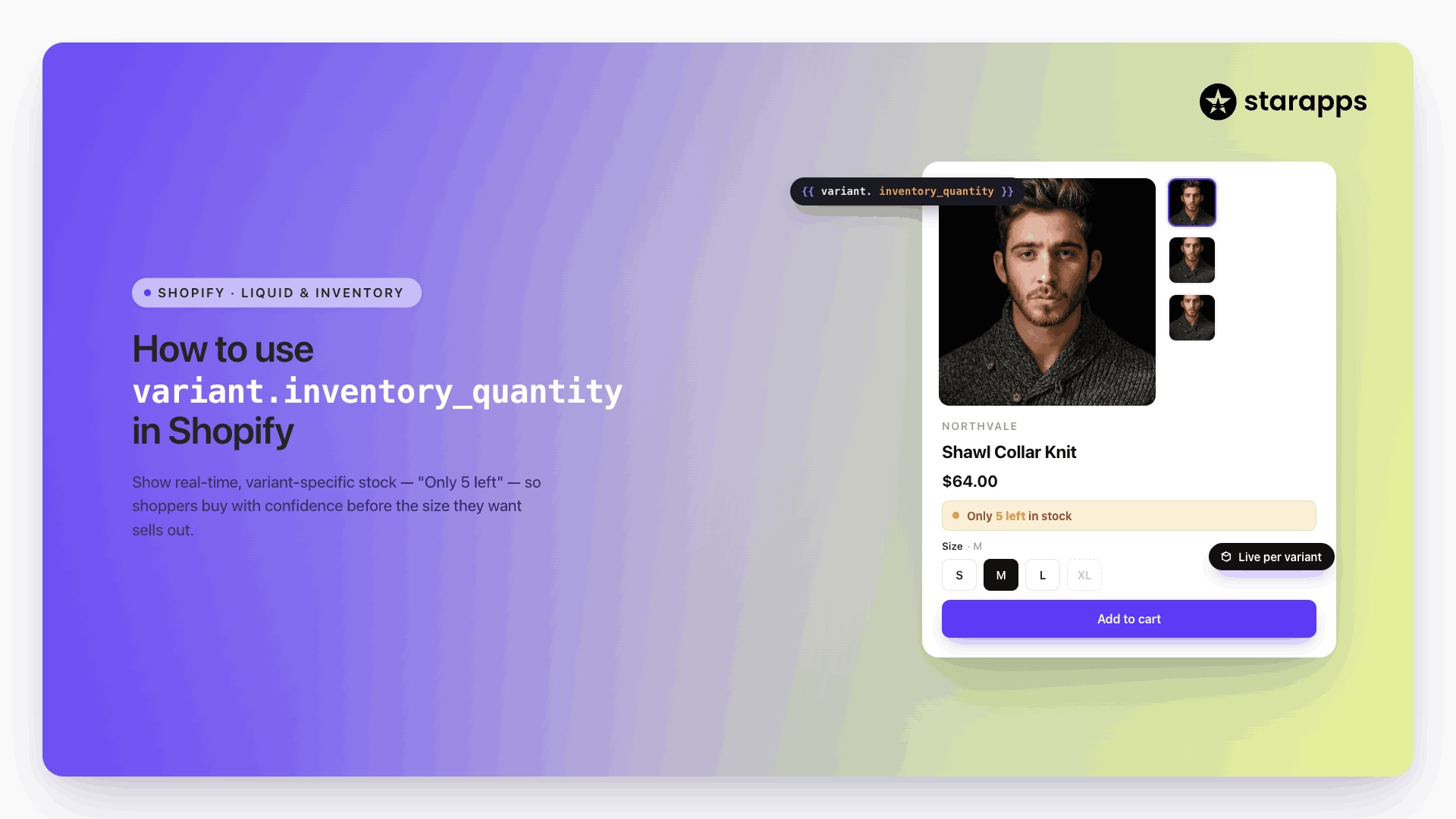
In high-conversion Shopify stores, swatches reduce cognitive load, minimize variant-related errors, and keep users engaged across mobile and desktop devices. This small UI change often leads to higher engagement and fewer returns for visually driven products like apparel, cosmetics, or home décor.
How the Prestige Shopify Theme Handles Color Swatches
Prestige is a premium Shopify theme built for visually rich brands, especially in fashion, luxury, and lifestyle retail. It includes elegant layouts, high-resolution media sections, and refined typography that help stores present their products with impact.
Here’s how the theme handles color swatches:
- Native support on both product and collection pages: Prestige automatically displays color swatches if your variant names match standard color terms like “Red,” “Black,” or “Blue.”
- Manual mapping for custom color names: For non-standard names (e.g., “Midnight Sky” or “Coral Rose”), you can assign color values directly in the theme settings.
- Basic swatch customization options: You can choose dot shape (round or square), adjust positioning, and define swatch size, but only within the limits of theme settings.
- No native support for image-based swatches: Prestige doesn’t let you assign pattern or texture thumbnails as swatches without editing code or using an app.
- Limited handling of out-of-stock variants: Hiding or visually disabling out-of-stock swatches requires custom code or a third-party solution, as this feature isn’t supported out of the box.
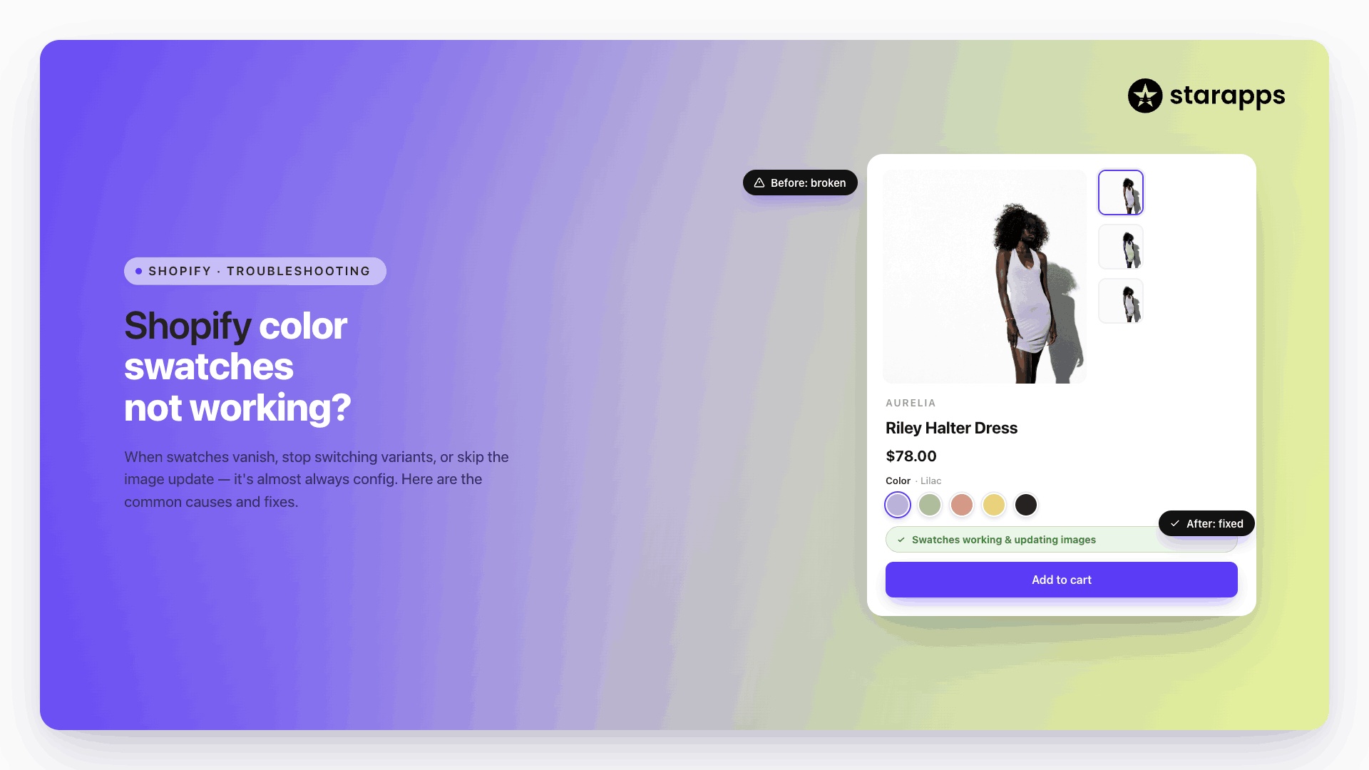
Example: Native Color Swatches in the Prestige Theme
In this product page from a Prestige-powered store, color variants are displayed as solid swatch blocks directly under the product title.

The selected color—“Black Liégé”—is shown with a bold border, and shoppers can preview other colors instantly by hovering or clicking on the swatches. This setup reflects Prestige’s built-in swatch support using manually mapped color values.
If you're ready to start using swatches in your store, the good news is that Prestige already includes a built-in feature. Let’s walk through how to set it up and what to do if you need more advanced control.
Methods to Add Color Swatches in Prestige Shopify Theme
You don’t need an app or custom code to get started; Prestige already supports basic color swatches through its theme settings. That’s the first step for most merchants.
But if you want more control, like image thumbnails, out-of-stock handling, or swatches on collection pages, you can move on to custom coding or apps. We’ll walk you through all three options, starting with the simplest and moving up in flexibility.
1. Use Shopify’s Built-in Swatch Feature
Prestige offers native swatch support right in the theme editor. This works best if your color variants are named using standard terms like “Black,” “White,” or “Green.”
Steps to enable built-in swatches:
- Go to Online Store > Themes.
- Click Customize next to the Prestige theme.
- In the theme editor, navigate to Product Page > Default Product.
- In the Template panel on the left, find the Variant Picker section.
- Under Selector Style, choose Block.
- In the dropdown, select Swatch.
- Click Save to apply the changes.
What you get:
- Color dots show up neatly under the product title.
- Variant selection updates the product image.
- Works on both product and collection pages.
Limitations:
- No image-based swatches.
- You can’t hide out-of-stock colors.
- Swatches are based only on the “Color” option label (case-sensitive).
Important Note: In Prestige, swatches must also be enabled at the product level. Go to the Settings section for each product and make sure the “Enable color swatches” checkbox is checked. If this is skipped, swatches won’t appear even if your theme settings are correct.
If this setup fits your needs, you’re good to go. If not, the next two options offer more control.
2. Manually Code Custom Color Swatches in Prestige
If the built-in settings don’t give you enough control—for example, if you want to show swatch images for textures, patterns, or specific fabrics—you can manually customize the theme code to build a more advanced swatch system.
This usually involves editing theme files like main-product.liquid or product-form.liquid to map each variant option to a custom image or hex color. You’ll also need CSS to style the swatches and JavaScript to make them interactive.
Dynamic collection page previews: Show all available colors directly from the collection page, with variant-based image updates.
Shopify’s theme files control how your product pages behave. Making edits without technical knowledge can break parts of your site. Always create a duplicate of your live theme before starting any changes (Online Store > Themes > Actions > Duplicate).
What you can achieve with custom code:
- Show image-based swatches (e.g., fabric swatches, textures).
- Add hover effects, tooltips, or labels to each swatch.
- Gray out or hide out-of-stock variants visually.
When to consider this route:
- You have a small catalog and want full visual control.
- You already work with a Shopify developer.
- You’re comfortable editing theme files—or hiring someone who is.
If you’re not sure how to code it yourself, consider hiring a Shopify Expert or asking a developer familiar with the Prestige theme.
Next, we’ll look at the app-based option, which is ideal if you want flexibility without any coding.
3. Use a Shopify App for Enhanced Swatch Control
Using a swatch app is the most efficient option if you want more visual flexibility without editing code. Shopify apps can unlock features beyond what Prestige or custom code can offer, especially if you're managing a large catalog or want swatches that reflect real textures, prices, and availability.
Color Swatch King: Variants by StarApps
Color Swatch King: Variants work out of the box with the Prestige theme and add powerful features without touching your theme files.
Key features:
- Image and price-based swatches: Let customers compare color variants using actual product images and prices.

Instantly display each variant's image and price to simplify decision-making.
- Dynamic collection page previews: Show all available colors directly from the collection page, with variant-based image updates.

Let shoppers explore color options without leaving the collection page.
- Out-of-stock handling: Gray out, cross out, or completely hide unavailable variant options.

Visually guide customers to what's actually in stock.
Additional features built into the app:
- Use hex codes, uploaded icons, or fabric textures as swatches
- Choose between rounded, square, pill-style, or dropdown swatch layouts
- Group swatches across different product listings (great for size or style variations)
- Compatible with Shopify Markets and B2B storefronts
If you're looking for speed, control, and compatibility with Prestige, Color Swatch King is a reliable solution.
Once your swatches are visible, the next step is making sure they look and behave the right way, across every page and device. Let’s go over some best practices to keep your color variants clear, fast, and easy to navigate.
Best Practices for Color Swatches in Prestige Shopify Theme
Once your swatches are in place, how they behave and look across devices plays a major role in user experience. These best practices help keep your color variants functional, fast-loading, and conversion-friendly, whether you're using Prestige's built-in tools or an app.
1. Keep naming consistent
Use clean, standardized color names in your product options, e.g., “Black,” not “black” or “Jet Black.” This avoids duplication and ensures swatches render correctly across product and collection pages.
2. Use high-quality thumbnails or accurate color codes
If you're using image-based swatches, make sure they reflect the actual product color or texture. Avoid overly stylized or inconsistent icons, which can confuse buyers.
3. Display swatches on collection pages
Let shoppers explore color variants without clicking into every product. This reduces friction in browsing and supports faster buying decisions, especially on mobile.
4. Hide or mark out-of-stock variants
Swatches shouldn’t be clickable if they lead to a sold-out or unavailable variant. Use gray-out effects, strikethroughs, or hide them entirely to reduce frustration.
5. Ensure mobile swatch usability
For smaller screens, use horizontally scrollable swatch sections or auto-wrap behavior. Avoid stacking too many swatches vertically—it clutters the layout and slows down navigation.
6. Match swatch design to your store aesthetic
Choose swatch shapes and styles (circles, squares, pills) that align with your brand. Prestige and compatible apps offer several presets; use them to maintain visual consistency.
Even with the right settings or app installed, swatches may not always display the way you expect. This section covers the most common issues Shopify merchants face when using the Prestige theme and how to fix them.
Troubleshooting Common Issues with Swatches in Prestige
Swatches not working as expected? Whether you’re using built-in settings or an app like Color Swatch King, here are the most common issues, along with quick fixes for each.
Swatches Not Showing on Product Pages
- Variant option not named “Color”: The swatch feature only works if the option label is exactly “Color” (case-sensitive). Labels like “Colours” or “Shade” won’t trigger swatch behavior.
- Swatch display not enabled in theme editor: Go to Product Page > Default Product > Variant Picker, and make sure Swatch is selected under Selector Style.
Swatches Not Appearing on Collection Pages
- Collection swatches not enabled in theme settings: Navigate to Theme Settings > Collection Pages and toggle on the option to show swatches.
- App-based swatches not configured for collections: Double-check that the collection-page display is turned on inside the app’s admin panel if you're using a third-party app.
Incorrect or Mismatched Swatch Colors
- No color mapping set: For non-standard names like “Ocean Blue,” go to Theme Settings > Swatches and assign a hex code manually.
- Incorrect image assigned (if using an app): Make sure each variant is mapped to the right image or icon inside the app settings.
Out-of-Stock Variants Still Clickable
- Shopify doesn’t hide unavailable variants by default: To control visibility, you’ll need a swatch app with stock-aware logic or custom Liquid coding.
- App visibility settings disabled: In apps like Swatch King, enable settings to gray out, cross out, or hide unavailable variants.
Swatches Breaking on Mobile
- Custom CSS conflict: If you've added manual styling, it might not be responsive. Check for overlapping styles or breakpoints.
- Too many swatches stacking vertically: Use horizontal scroll behavior (built into most apps) to prevent layout issues on small screens.
Conclusion
The Prestige theme gives you a solid foundation for using color swatches, but how far you take it depends on your store’s needs. For simple setups, the built-in swatch feature works right out of the box.
Suppose you need more control over swatch visuals, behavior, or placement. In that case, you can either add custom code or use an app like Color Swatch King: Variants to handle it without technical effort.
Install Color Swatch King and start upgrading your swatches in minutes.
FAQs
1. How do I enable color swatches in the Prestige Shopify theme?
Go to Online Store > Themes > Customize, then open the Product Page > Default Product template. Under Variant Picker, set the selector style to Swatch. Also, make sure the “Enable color swatches” option is checked inside each product’s settings.
2. Why aren’t my swatches showing on the product page?
The most common reasons are:
- The variant option must be labeled exactly “Color” (case-sensitive)
- Swatches must be enabled both in the theme editor and product settings
- For custom color names, hex codes must be assigned under Theme Settings > Swatches
3. Can I use image swatches in the Prestige theme without coding?
Not with the built-in settings. To use image-based swatches (e.g., fabric or texture icons), you must either edit theme code or use an app like Color Swatch King.
4. Do color swatches work on collection pages in Prestige?
Yes—Prestige supports showing swatches on collection pages. Ensure the setting is enabled in Theme Settings > Collection Pages, or configure it within your swatch app if you're using one.
5. How can I hide or disable out-of-stock swatches?
Prestige doesn’t hide out-of-stock variants by default. To visually gray them out or hide them, you’ll need a swatch app with stock handling features, such as Color Swatch King, or apply custom code.
6. What color names are supported automatically?
Common names like “Red,” “Blue,” and “Black” are recognized. Custom names like “Rosewood” must be manually mapped to a color code in Theme Settings.
7. Will custom swatches affect page speed?
If you're using high-resolution swatch images or loading too many variants, it can slow things down. Use optimized images and limit excessive options per product.
Heading

End-to-end traceability
To ensure regulatory compliance, you must have a complete overview of your products from production to shipping. Book a demo to see how Katana can give you full visibility of your operations.

.png)
.png)